React Hex Viewer Ts
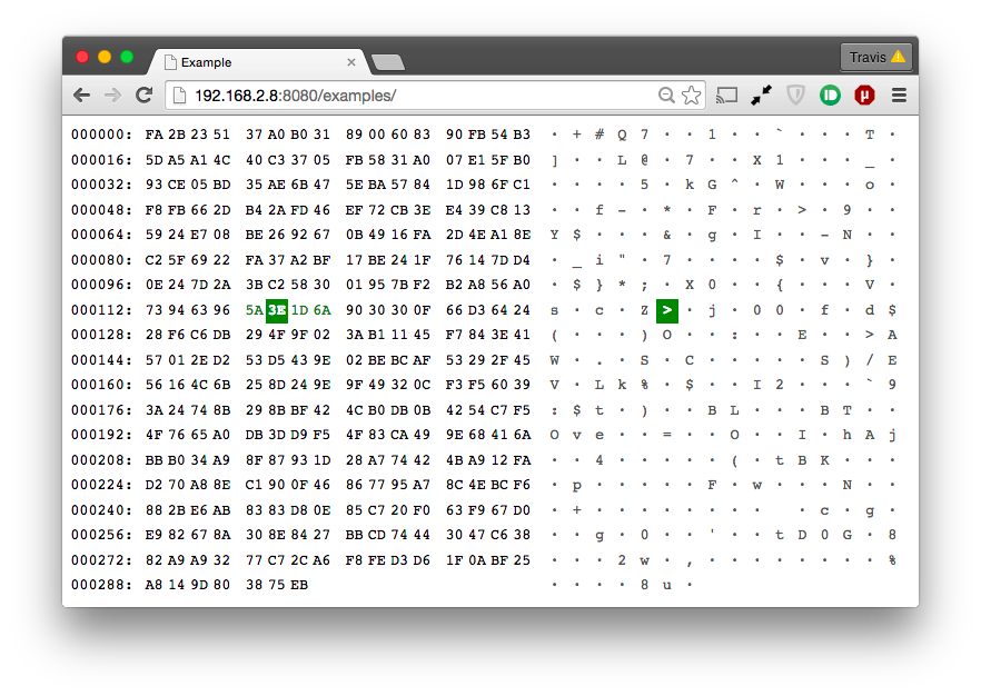
A component is a minor reworking and rethinking of a component react-hexviewer (thanks tperson) in the typescript
Example
import React from 'react';
import {HexViewer} from 'react-hex-viewer-ts';
// data is Buffer | number[] | base64 | hex
React.render(
    <HexViewer>{data}</HexViewer>,
    document.body);
The component has props interface HexViewerProps.
export interface HexViewerProps {
  /** number of bytes per row */
  rowLength?: number;
  /** number of bytes between a visible split */
  setLength?: number;
  /** Buffer | number[] | string as base64 or raw hex */
  children: string | Buffer | number[];
  /** sign that the data is hex */
  hex?: boolean;
  /** sign that the data is base64 */
  base64?: boolean;
  /** Component that will be displayed if there is no data */
  noData?: ReactNode;
  /** Component that will be displayed if data parsing is unsuccessful */
  errorData?: ReactNode;
}
Styling
In your projects, you can import less or scss styling from a package
Less
@import '../node_modules/react-hexviewer-ts/less/variables.less'; // for some reason ~react-hexviewer-ts does't work properly
@hex-color: rgb(189, 189, 189); // you can redefine variables from variables.less
@import '~react-hexviewer-ts/less/hex-viewer.less';
Sass
$hex-color: rgb(189, 189, 189); // you can redefine variables from variables.scss
@import '~react-hexviewer-ts/scss/hex-viewer.scss';
Storybook demo
Comments are welcome

