This is a time plugin for the datepicker material component from angular material. It allows you to integrate a time picker to select date and time values.
import { DatetimepluginModule, TIME_FORMAT, DATE_FORMAT  } from "@eyoelddefare/datetimeplugin";

@Component({
  selector: 'app-root',
  standalone: true,
  imports: [MatInputModule, MatNativeDateModule, MatDatepickerModule, DatetimepluginComponent],
  providers: [
    //en-150, am-ET, fa, en-US, ko-KR
    { provide: MAT_DATE_LOCALE, useValue: 'ko-KR' },
    {
      provide: TIME_FORMAT, useValue: {
        hour: '2-digit',
        minute: '2-digit',
      }
    },
    {
      provide: DATE_FORMAT, useValue: {
        year: 'numeric',
        month: 'short',
        day: '2-digit',
      }
    },
  ],
})

export class AppComponent {
  minDAte = new Date(2024, 1, 1, 9, 45)
  maxDAte = new Date(2025, 1, 1, 12, 54)
  startDate = new Date();
  readOnly = false;

  onDateTimePick(date: Date) {
    console.log(date);
  }
} <mat-form-field>
<mat-label>Choose a date</mat-label>
<input [min]="minDAte" [max]="maxDAte" matInput [matDatepicker]="picker1">
<mat-hint>MM/DD/YYYY</mat-hint>
<mat-datepicker-toggle matIconSuffix [for]="picker1"></mat-datepicker-toggle>
<mat-datepicker #picker1></mat-datepicker>
<ngx-datetime-plugin
(pickedDate)="onDateTimePick($event)"
[inputsReadOnly]="readOnly"
[minLocalDatetime]="minDAte"
[maxLocalDatetime]="maxDAte"
[for]="picker1">
</ngx-datetime-plugin>
</mat-form-field>To use this plugin, simply follow the example above. If you've provided a min, max, and start date for the <ngx-datetime-plugin/> component, you also must give the same values for the <mat-datepicker/> component as well to stay consistent.
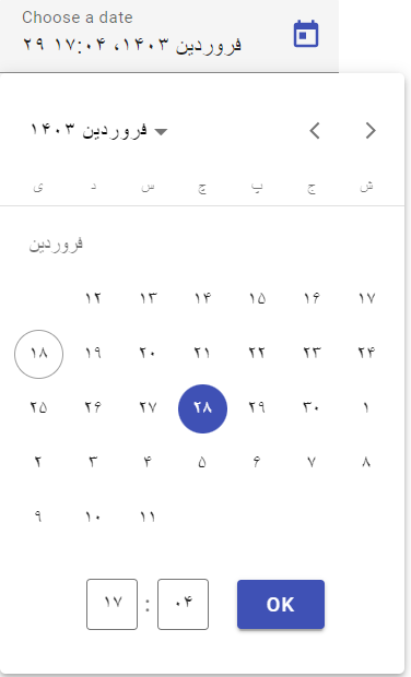
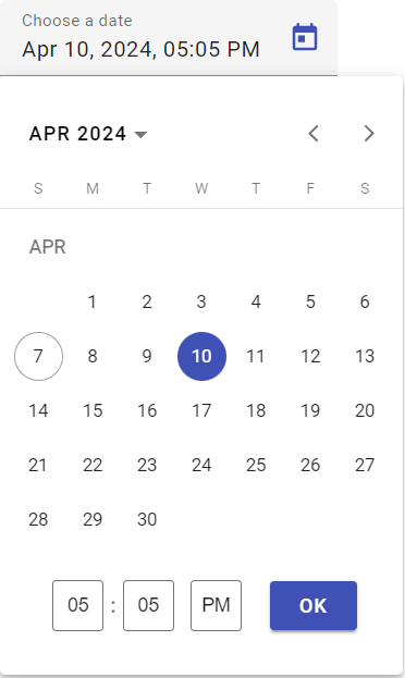
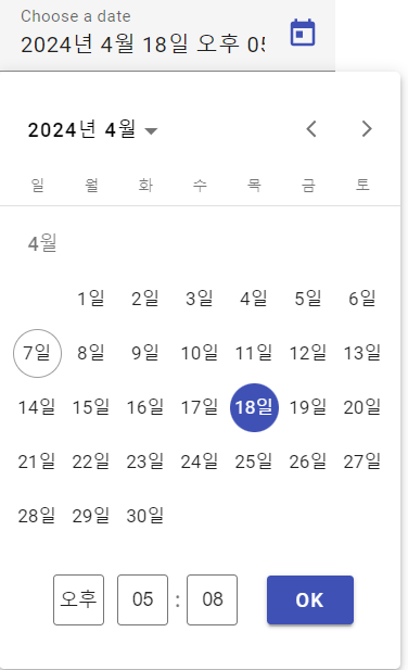
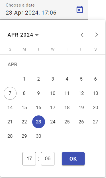
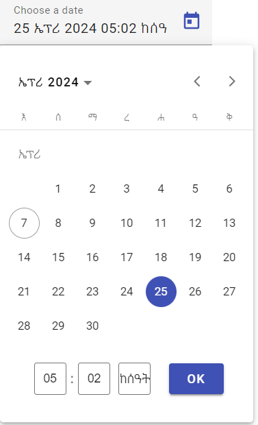
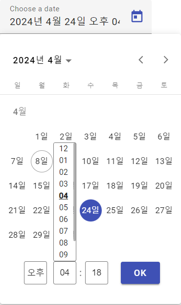
You can also change the locale, and the date and time format you want the <ngx-datetime-plugin/> component to display using the TIME_FORMAT, MAT_DATE_LOCALE, DATE_FORMAT tokens as the example above shows.
Note that the "OK" button uses the same theme provided for the <mat-datepicker/> component. Therefore if you want to change the button theme, provide a theme to the <mat-datepicker/> component. For example, <mat-datepicker [color]="'primary'"></mat-datepicker>.
Date range is not currently supported. I don't really have any use case for it and if anyone wants to PR or wish to integrate it into their own solution, it should be replicable using this same plugin component/service.
Visual examples with different locals