Improve the select element with this new purely native Javascript written library.
I made this project, because I was updating one of my projects to Bootstrap 5 and I was using boostrap-select (https://github.com/snapappointments/bootstrap-select) which states "Now with bootstrap 5 support" on it's readme file (April 2022).
Unfortunately I noticed that this wasn't the case even living in 2023. I already started to refactor my project and I didn't want to rollback just because of this. Therefore I decided to write from scratch native JS version and also without bootstrap.
Because maybe someone else may be in the similar situation I decided to publish this to free use.
It works pretty much the same as bootstrap-select, but this also adds few extra features.
-
Fixes single selection on menu which broke down from last patch
-
Support to Optgroups and their legend tags, also separate class itself to own file.
-
Fixes menu ul element height
-
MutationObserver
-
Reset select picker support
-
Added more variables to search input
-
Forgot to rebuild assets
-
Change event trigger, search now includes
data-descand fix for dynamic width calculation -
SASS coloring variables and defaults
-
disabled support, fix selected max and fixes data-dynamic to calculate element size better
-
data-search-focus-mobiledesktop and touch device difference, new defaults -
data-sizeattribute and auto focus on search -
ARIA-support, dynamic width and improved search
-
Distribution files were development format, updated to production and minified.
-
Menu fixes, SCSS variables and tweaks,
<option>extension.
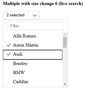
Multi select with default search. Limited select count 1 (more picked changes the dropdown text)
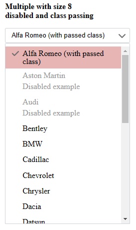
Multi select with disabled options and option with passed extra class with styling.
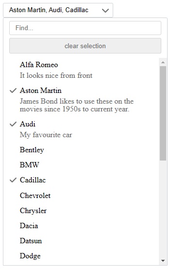
Multi select with search and clear. Also some options has data-desc attribute given with text.
npm install @ezmodus/select-picker --saveYou can use prebuilt javascript and styling or do modifications first by loading from source.
// from node modules
// from dist (prebuilt, minified)
@import '~@ezmodus/select-picker/dist/style.css';

// SCSS
@import '~@ezmodus/select-picker/src/_variables.scss';
// change variable settings here
$ezmodus-dropdown-tick-color: 'red';
// load rest of the styling
@import '~@ezmodus/select-picker/src/style.scss';
// from node modules
// from dist (prebuilt, minified)
import '@ezmodus/select-picker/dist/select';
// from source if you want to modify ezmodusSelectPicker-class
import '@ezmodus/select-picker/src/select';Simple just add the class ezmodus-select-picker to select-element.
You can pass any other class to new dropdown button by just adding extra classes to select-element.
<!-- single select -->
<select class="ezmodus-select-picker">...</select>

<!-- multi selection -->
<select class="ezmodus-select-picker" multiple>...</select>

<!-- more settings -->
<!--
Any other class than picker itself in select-element
will be passed to dropdown button as extra class.

Any class given to option will be passed to menu li-element.

If option is set as disabled, then li-element has data-disabled="true",
otherwise the attribute does not exist.

These helps developer even further to manipulate dropdown and items.
-->
<select class="ezmodus-select-picker another-class"
    data-size="6"
    title="Choose your role"
    data-tick="false"
    data-search="true"
    data-search-focus="true"
    data-search-from="both"
    data-search-placeholder="Find..."
    data-search-no-results="No results for {0}"
    data-selected-count="5"
    data-selected-text="{0} selected"
    data-selected-max= "5"
    data-clear-show="true"
    data-clear-text="clear"
    data-menu-item-height=""
     multiple>
    <!-- my option data -->
    <option value="1">Superuser</option>
    <option value="2">Normal user</option>
    <option value="3" data-desc="Special user, this is injected as subtext">
        Test user
    </option>
</select>
These can be modified a lot to give more richer tools to use.
SELECT ATTRIBUTES
| Attribute | Default | Description |
|---|---|---|
| size | 1 | How many items are shown when dropdown opens. If select has more items than defined size then show scrollbar. This can also set with data-attribute. |
| title | Select | Text, what to show on when no selection on dropdown |
| multiple | Activates multiple selection support |
SELECT DATA ATTRIBUTES
Add these attributes with prefix data-.
| Attribute | Default | Description |
|---|---|---|
| size | null | This is another way to setup how many items are shown when menu opens. This is is preferable way to setup without worrying browser to default render select with size and then hides it. On page load selects' with size may look bigger before transforming them to select picker. |
| tick | true | Shows tick on dropdown. |
| search | false | If 'true' then show search input for list items. Click here to see how search works |
| search-focus | true | If set, then automatically focus on search on desktop. |
| search-focus-mobile | false | If set, then automatically focus on search on touch devices. |
| search-from | null | Search from texts, if "values" then search looks values of "option value", if "both" then look for values or texts. |
| search-placeholder | Filter... | Placeholder text for search input. |
| search-no-results | No results matched "{0}" | When with given string search does not find anything, this is the message to show, {0} is magic and will be replaced with given input. |
| selected-count | 1 | How many items are shown until dropdown text is replaced with "selected-text" |
| selected-text | {0} selected | When too many items are selected this is the text shown in dropdown, {0} is magic and replaced with count of selected items. |
| selected-max | null | Integer, limits how many items are allowed to pick on multi select |
| clear-show | false | Only for multiple, but if 'true' then show button before the list to clear/reset existing selections |
| clear-text | clear selection | Default text for the clear selection button |
| menu-item-height | null | This is only for special cases where parent node is display:none. Picker normally uses offsetHeight to determine the height of the menu item. When select is already hidden, it cannot see the value correctly. If this is the case the default height is 31, but if you do custom styling then this is the way to correct it further. |
| dynamic | null | Integer as percent, eg "80", between 0-100. Finds out the longest list item's text content and calculates width and sets new min-width to be 80 percent of that. This is useful to show more beautiful look when options themselves are short, but they have long data-desc value. |
SELECT'S OPTION ATTRIBUTE
| Attribute | Default | Description |
|---|---|---|
| data-desc | Text data to show as extra description with own styling. If texts are used then size of the menu is directive because items heights varies. |
Super simple setup
- Git clone the project
- Run
npm install - Run
npm run build|watch|production - View Demo under
demo/index.html


