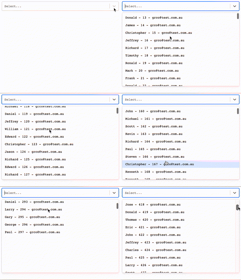
react-select-virtualized
react-select v4 + react-virtualized + react hooks!
This project came up after hours of trying to find an autocomplete component that supports large sets of data to be displayed and searched for while maintain performance. The only libraries out there that allow this functionality are either not maintained anymore, use outdated libraries or are poorly performant.
I created a component that uses the Airbnb library called react-virtualized for the virtual data loading of elements and plugged it to the react-select (the most used autocomplete library for react) menu list.
Install
npm install --save react-select-virtualizedPeer Dependencies
{
    "react",
    "react-dom",
    "react-virtualized",
    "react-select"
}
Note
The select component will be the same from react-select v4 so you will be able to use it with any select you already have.
For using this package with react-select 3.x, please use version 2.5.11.
Try It!!!
Check Storybook for more examples
What we do support and don't from react-select
Components: Select, Async, Creatable
-
[x] We support all the UI related props for the input. Extension also.
-
[x] We do not support any related prop to the popup list. We extend it. *Sorry no extension of any component inside the list.*
-
[x] Sorry no multi selection yet. (no
isMulti)
Examples
Options Shape
const options = [
  {
    value: 1,
    label: `guiyep`,
  },
  ...
];

const opsGroup = [
  { label: `Group Name Header`, options },
  ...
]
Basic
import React from 'react';

import Select from 'react-select-virtualized';

const Example1 = () => <Select options={options} />;
With group
import React from 'react';

import Select from 'react-select-virtualized';

const Example1 = () => <Select options={opsGroup} grouped />;
Usage Async
import React from 'react';

import { Async } from 'react-select-virtualized';

const loadOptions = (input, callback) => {...};

const Example1 = () => <Async loadOptions={loadOptions}/>

const Example2 = () => <Async defaultOptions={options} loadOptions={loadOptions}/>

const Example3 = () => <Async defaultOptions={opsGroup} loadOptions={loadOptions} grouped/>
Async - No Group
Async - Grouped
Usage with creatable
import React from 'react';

import { Creatable } from 'react-select-virtualized';

const Example1 = () => <Creatable options={options} />;
Usage with creatable and group
NOT YET DONE.
Custom Styles
For custom styling of the Input component read the react-select documentation.
The styling in the menu list is by css.
How to leave the menu open so I can style my menu?
Set the menuIsOpen prop to true, create an options list with less than 100 elements and use css for adjusting your css.
Use this example as a guidance
Possible classes
react-select-virtualized grouped-virtualized-list-item flat-virtualized-item fast-option fast-option fast-option-focused fast-option-selected fast-option-create
Documentation - this are special to this library and none is required
Toggle
| Props | Type | Default | Description |
|---|---|---|---|
| grouped | boolean | false | Specify if options are grouped |
| formatGroupHeaderLabel | function({ label, options}) => component | Will render a custom component in the popup grouped header (only for grouped) | |
| formatOptionLabel (coming from react-select) | function(option, { context }) => component | Will render a custom component in the label | |
| optionHeight | number | 31 | Height of each option |
| groupHeaderHeight | number | Header row height in the popover list | |
| maxHeight (coming from react-select) | number | auto | Max height popover list |
| defaultValue | option | Will set default value and set the component as an uncontrolled component | |
| value | option | Will set the value and the component will be a controlled component | |
| onCreateOption (Only for Creatable) | function(option) => nothing | Will be executed when a new option is created , it is only for controlled components |
Roadmap
Toggle
- [x] useCallback everywhere.
- [x] Move fast options to group.
- [x] Fix minimum input search on grouped component.
- [x] Upgrade alpha version.
- [x] Review all the TODOs.
- [x] Improve filtering function in
fast-react-select.- [x] Improved performance by 50%
- [x] Add gzip.
- [x] Review support to all the react-select props. Should all work but multi-val.
-- v 1.0.0 --
- [x] Add support to AsyncSelect.
-- v 1.1.0 --
- [x] Add support to AsyncSelect with group.
-- v 1.2.0 --
- [x] Upgrading packages and hooks.
-- v 2.0.0 --
- [x] Adding react-select v3.
- [x] Fixing addon-info.
- [x] Remove classnames.
- [x] Improve packaging.
- [x] Remove react-hover-observer.
- [x] Added controlled components support.
-- v 2.1.0 --
- [x] Better debouncing
-- v 2.2.0 --
- [x] Add support to create element props.
- [x] Add better error handling.
-- v 2.3.0 --
- [x] Move modules to lib.
- [x] Improve debounce.
-- v3.0.0 --
- [x] Move internal state of select and async select to reducer like creatable.
-- v 3.1.0 --
- [ ] Add support to create element props with group.
- [ ] Add testing so we do not only relay on storybook.
More from me :)
This is a React form state management library that works with React/Redux/React-Native.
License
MIT © guiyep


