Crafty-app
Made by Crafty-app
React native slider
A fully custimizable slider for react native
Installation
npm:
npm i @khaledz370/slider-react-nativeyarn:
yarn add @khaledz370/slider-react-nativeUsage
List of possible values:
maxValue:
    Maximum slider value
    default = 1
minValue:
   Minimum slider value
   default = 0
width:
Slider widthvalue:
Current slider value default minimum valuestep:
   Step at which slider move
   you can also use step in persentage Ex:"17%" as a string
   default 0
height:
  Slider height
  default 20
trackStyle
  Style of the full track
  takes a style object
progressBarStyle
  Style of the progress slider
  takes a style object
panStyle:
  Style of the pan
  takes a style object
trackBackgroundImage:
  Changes backGround image of the full track
  default null
  takes an image value
progressBarBackgroundImage:
  Changes backGround image of the progress track
  default null
  takes an image value
panBackgroundImage:
  Changes backGround image of the pan
  default null
  takes an image value
vertical
  Chages the slider to a vertical slider
  default false
flip
  Will flip the slider verticaly or horizontaly
  default false
disabled
  will disable the slider
  default false
onChange
  required!
  returns a value based on the slider position
Usage/Examples
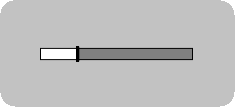
Slider basic example
import Slider from "@khaledz370/slider-react-native";

export default function App() {
  const [value, setValue] = useState(50);
  return (
    <View style={styles.container}>
      {showModal && (
        <Slider
          value={value}
          step={10}
          maxValue={500}
          minValue={30}
          onChange={e => setValue(e)}
          width={300}
        />
      )}
    </View>
  );
}
const styles = StyleSheet.create({
  container: {
    flex: 1,
    backgroundColor: "skyblue",
    alignItems: "center",
    justifyContent: "space-around"
  }
});
Screenshots
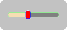
Slider custom example
        <Slider
          ...
          height={50}
          trackStyle={{
            borderRadius: 50,
            borderColor: "lightgreen",
            borderWidth: 5
            }}
          panStyle={{
            backgroundColor: "red",
            borderColor: "blue",
            borderWidth: 5,
            width: 50,height: 80,
            borderRadius: 15
            }}
          progressBarStyle={{
            backgroundColor: "wheat"
            }}
        />
Screenshots