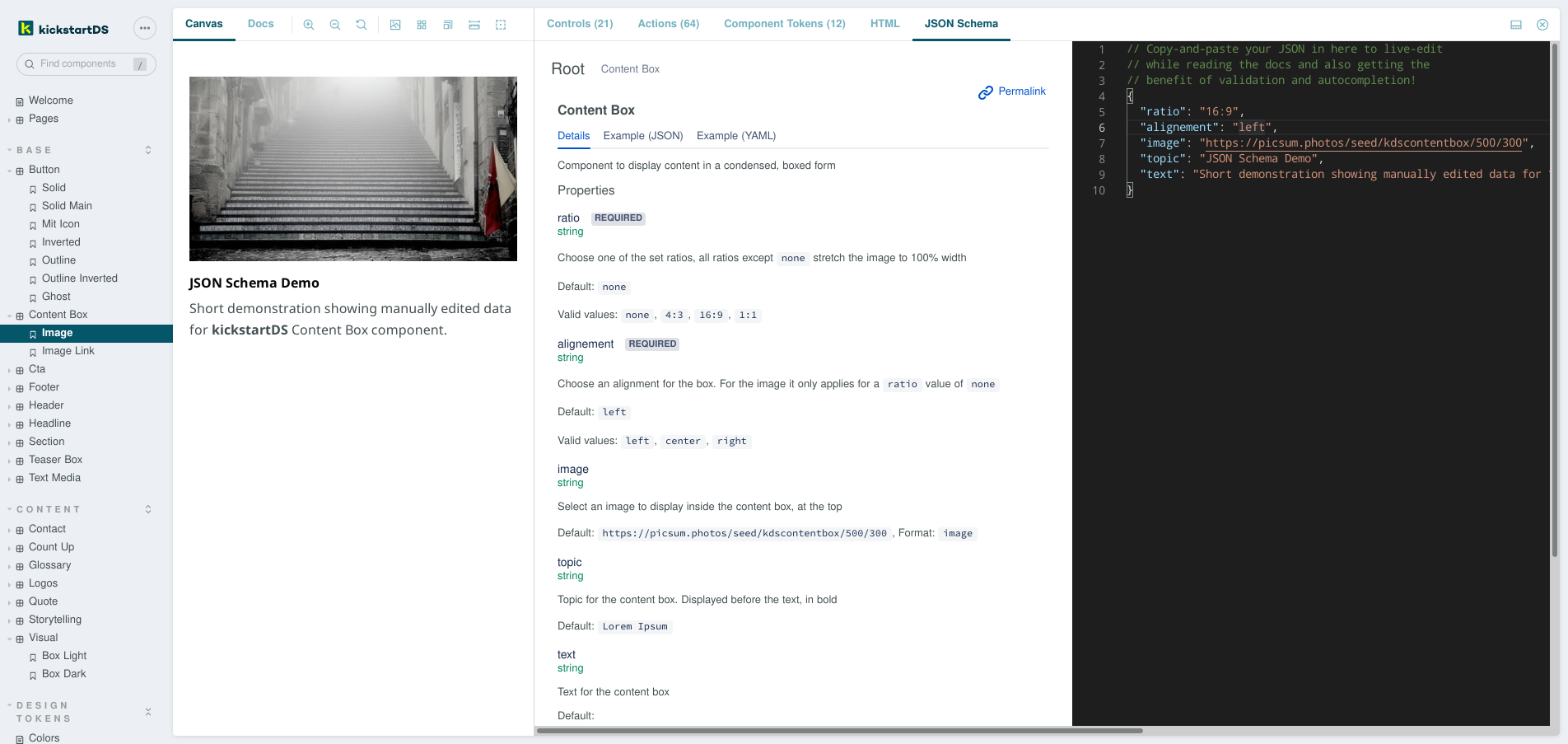
Displays associated JSON Schema documentation using a rich JSON Schema Explorer interface, and adds a validating JSON Code Editor with semantic auto-complete to interact with your components, and copy configurations with ease.
JSON Schema Explorer is based on the excellent Atlassian JSON Schema Viewer.
It was slightly modified to generate bundles that can be imported for partial use, like this addon does.
JSON Code Editor is based on @monaco-editor/react. The editor is connected to your story state / args, so changing props through Controls is reflected in the code shown. Vice-versa if you edit the JSON, and the result is valid according to the schema, your changed args are applied to the story, too.
Show me a working demo (click on the JSON Schema addon tab)
Table of contents:
Three things you can use this addon for:
- Explore associated JSON Schema documentation, in a nicely organized fashion in the
JSON Schema Explorer - Configure components through Controls, copy the resulting JSON as a starting point or template for API-usage / data generation purposes in the
JSON Code Editor - Paste JSON to validate data or preview component state in the
JSON Code Editor
Prerequesite: Your components need to have JSON Schema files associated with them. Additionally schemas need to be dereferenced already, as $ref-resolution is not (a tested) part of this addon (yet? ... let us know in the issues if you need this).
First step is to install the addon:
$ yarn add --dev @kickstartds/storybook-addon-jsonschemaSecond step, register the addon inside your .storybook/main.js (just add it to the list):
module.exports = {
  addons: ["@kickstartds/storybook-addon-jsonschema"],
};
Third step, export the schema as component- or story parameter:
export default {
  title: "Button",
  component: Button,
  parameters: {
    jsonschema: {
      schema: {
        $schema: "http://json-schema.org/draft-07/schema#",
        $id: "https://my-components/button.schema.json",
        type: "object",
        properties: {
          primary: {
            type: "boolean",
            default: false,
          },
          label: {
            type: "string",
          },
        },
      },
    },
  },
};This addon is still early, advanced configuration options will be added at a later date. Feel free to let us know in the issues if something specific is unclear, or doesn't work!
This addon was made with 🍋 by the team behind kickstartDS - the frontend first framework!
kickstartDS is a comprehensive component and pattern library
We enable web development teams to create consistent and brand compliant web frontends super efficiently. With a built-in Design System to serve all your digital touch points. Easy like squeeeeezing a lemon.
We use the addon to let users of our Design System solution interact with their components through our core JSON Schema property-layer. View our landing page to learn more! 👋

