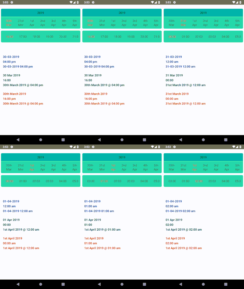
React Native horizontal date picker
Installation and Usage
Please check this blog for installation and usage this link
Basic Properties
| Prop | Default | Type | Description |
|---|---|---|---|
| pickerType | datetime | enum of ["date","time","datetime"]
|
Type of the picker user want to display. |
| minDate | current date | Date |
Minimum date from picker value start. |
| maxDate | 3 months from current date | Date |
Maximum date upto picker value display. |
| defaultSelected | null | Date |
By default selected date and time. |
| isShowYear | true | bool |
Dispay year above picker. |
| yearContainerStyle | null | style |
Style of the year container. |
| datePickerContainerStyle | null | style |
Style of the date picker. |
| timePickerContainer | null | style |
Style of the time picker. |
| yearTextStyle | null | style |
Style of the year display. |
| selectedTextStyle | null | style |
Style of the selected date or time. |
| unSelectedTextStyle | null | style |
Style of the non selected date or time. |
| datePickerBG | null |
object or reference
|
Background image of date picker. |
| timePikerBG | null |
object or reference
|
Background image of time picker. |
| dayFormat | Do | string |
Format of date to display. |
| monthFormat | MMM | string |
Format of month to display. |
| yearFormat | yyyy | string |
Format of year to display. |
| timeFormat | HH:mm | string |
Format of time to display. |
| timeStep | 60 | number |
Amount of the time divide in minutes for time picker. |
| returnDateFormat | DD-MM-YYYY | string |
Return formate of the date selected. |
| returnTimeFormat | hh:mm a | string |
Return formate of the time selected. |
| returnDateTimeFormat | DD-MM-YYYY hh:mm a | string |
Return formate of the full datetime selected. |
| onDateSelected | () => {} | function |
Return date when date is selected. |
| onTimeSelected | () => {} | function |
Return time when date is selected. |
| onDateTimeSelected | () => {} | function |
Return object of date, time and datetime when date or time is selected. |


