Selection controls: radio buttons
Selection controls allow the user to select options.
Use radio buttons to:
- Select a single option from a list
- Expose all available options
- If available options can be collapsed, consider using a dropdown menu instead to use less space.
Contents
Using radio buttons
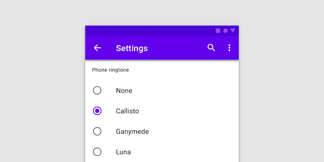
Radio buttons allow the user to select one option from a set. Use radio buttons when the user needs to see all available options. If available options can be collapsed, consider using a dropdown menu because it uses less space.
Installing radio buttons
npm install @loipham/material-radio
Styles
@use "@loipham/material-radio/styles";
@use "@loipham/material-form-field";

@include form-field.core-styles;
Note: The form field styles are only required when the radio button is used with the form field.
JavaScript instantiation
The radio button will work without JavaScript, but you can enhance it with a ripple interaction effect by instantiating MDCRadio on the mdc-radio element. To activate the ripple effect upon interacting with the label, you must also instantiate MDCFormField on the mdc-form-field element and set the MDCRadio instance as its input.
import {MDCFormField} from '@loipham/material-form-field';
import {MDCRadio} from '@loipham/material-radio';

const radio = new MDCRadio(document.querySelector('.mdc-radio'));
const formField = new MDCFormField(document.querySelector('.mdc-form-field'));
formField.input = radio;
Note: See Importing the JS component for more information on how to import JavaScript.
Making radio buttons accessible
Material Design spec advises that touch targets should be at least 48px x 48px.
To meet this requirement, add the mdc-radio--touch class to your radio as follows:
<div class="mdc-touch-target-wrapper">
  <div class="mdc-radio mdc-radio--touch">
    <input class="mdc-radio__native-control" type="radio" id="radio-1" name="radios" checked>
    <div class="mdc-radio__background">
      <div class="mdc-radio__outer-circle"></div>
      <div class="mdc-radio__inner-circle"></div>
    </div>
    <div class="mdc-radio__ripple"></div>
    <div class="mdc-radio__focus-ring"></div>
  </div>
</div>
Note that the outer mdc-touch-target-wrapper element is only necessary if you want to avoid potentially overlapping touch targets on adjacent elements (due to collapsing margins).
The mdc-radio__focus-ring element ensures that a focus indicator is displayed in high contrast mode around the active/focused radio button.
Radio buttons
We recommend using MDC Radio with MDC Form Field for enhancements such as label alignment, label activation of the ripple interaction effect, and RTL-awareness.
Radio button example
<div class="mdc-form-field">
  <div class="mdc-radio">
    <input class="mdc-radio__native-control" type="radio" id="radio-1" name="radios" checked>
    <div class="mdc-radio__background">
      <div class="mdc-radio__outer-circle"></div>
      <div class="mdc-radio__inner-circle"></div>
    </div>
    <div class="mdc-radio__ripple"></div>
    <div class="mdc-radio__focus-ring"></div>
  </div>
  <label for="radio-1">Radio 1</label>
</div>
Radio button states
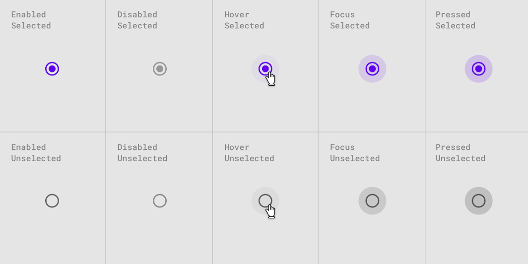
Radio buttons can be selected or unselected. Radio buttons have enabled, disabled, hover, focused, and pressed states.
Other variants
Disabled radio buttons
To disable a radio button, add the mdc-radio--disabled class to the root element and set the disabled attribute on the <input> element.
Disabled radio buttons cannot be interacted with and have no visual interaction effect.
<div class="mdc-form-field">
  <div class="mdc-radio mdc-radio--disabled">
    <input class="mdc-radio__native-control" type="radio" id="radio-1" name="radios" disabled>
    <div class="mdc-radio__background">
      <div class="mdc-radio__outer-circle"></div>
      <div class="mdc-radio__inner-circle"></div>
    </div>
    <div class="mdc-radio__ripple"></div>
    <div class="mdc-radio__focus-ring"></div>
  </div>
  <label for="radio-1">Radio 1</label>
</div>
API
Sass mixins
MDC Radio uses MDC Theme's secondary color by default. Use the following mixins to customize it.
| Mixin | Description |
|---|---|
unchecked-stroke-color($color) |
Sets the stroke color of an unchecked, enabled radio button |
checked-stroke-color($color) |
Sets the stroke color of a checked, enabled radio button |
ink-color($color) |
Sets the ink color of an enabled radio button |
disabled-unchecked-stroke-color($color) |
Sets the stroke color of an unchecked, disabled radio button |
disabled-checked-stroke-color($color) |
Sets the stroke color of a checked, disabled radio button |
disabled-ink-color($color) |
Sets the ink color of a disabled radio button |
focus-indicator-color($color) |
Sets the color of the focus indicator |
touch-target($size, $ripple-size) |
Sets radio touch target size which can be more than the ripple size. Param $ripple-size is required for custom ripple size, defaults to $ripple-size. |
ripple-size($size) |
Sets custom ripple size of radio. |
density($density-scale) |
Sets density scale for radio. Supported density scale values are -3, -2, -1 and 0 (default). |
MDCRadio properties and methods
| Property | Value Type | Description |
|---|---|---|
checked |
Boolean | Setter/getter for the radio's checked state |
disabled |
Boolean | Setter/getter for the radio's disabled state. Setter proxies to foundation's setDisabled method |
value |
String | Setter/getter for the radio's value |
Usage within web frameworks
If you are using a JavaScript framework, such as React or Angular, you can create a Radio button for your framework. Depending on your needs, you can use the Simple Approach: Wrapping MDC Web Vanilla Components, or the Advanced Approach: Using Foundations and Adapters. Please follow the instructions here.
MDCRadioAdapter
| Method Signature | Description |
|---|---|
setNativeControlDisabled(disabled: boolean) => void |
Sets the input's disabled property to the given value |
addClass(className: string) => void |
Adds a class to the root element |
removeClass(className: string) => void |
Removes a class from the root element |
MDCRadioFoundation
| Method Signature | Description |
|---|---|
setDisabled(disabled: boolean) => void |
Sets the disabled value of the native control |

