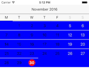
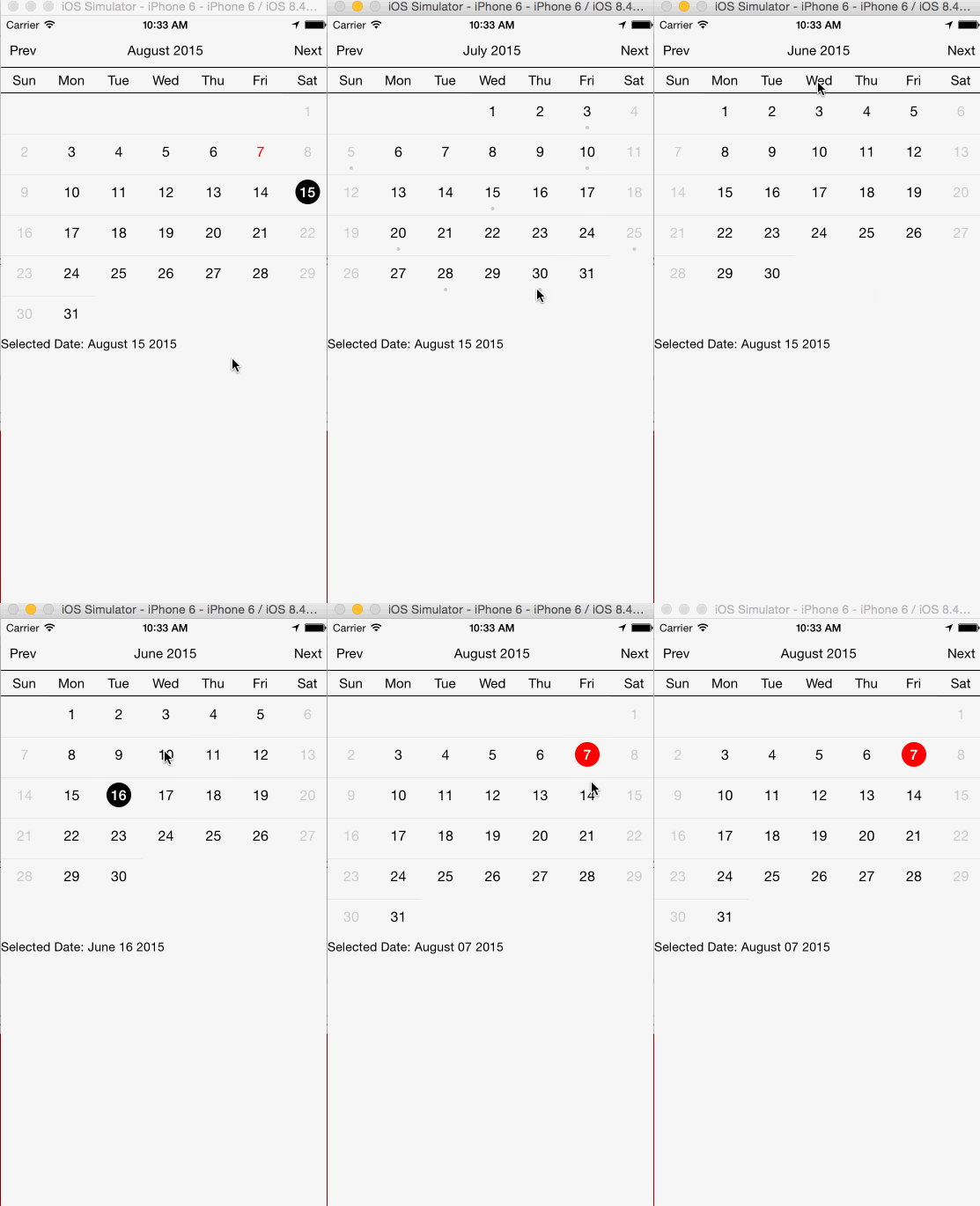
react-native-calendar
A <Calendar> component for React Native
Portrait mode only
Installation
npm install react-native-calendar --save
Usage
<Calendar
  currentMonth={'2015-08-01'}       // Optional date to set the currently displayed month after initialization
  customStyle={{day: {fontSize: 15, textAlign: 'center'}}} // Customize any pre-defined styles
  dayHeadings={Array}               // Default: ['S', 'M', 'T', 'W', 'T', 'F', 'S']
  eventDates={['2015-07-01']}       // Optional array of moment() parseable dates that will show an event indicator
  events={[{date:'2015-07-01', ..}]}// Optional array of event objects with a date property and custom styles for the event indicator
  monthNames={Array}                // Defaults to english names of months
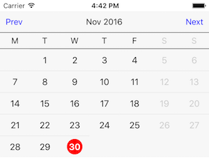
  nextButtonText={'Next'}           // Text for next button. Default: 'Next'
  onDateSelect={(date) => this.onDateSelect(date)} // Callback after date selection
  onSwipeNext={this.onSwipeNext}    // Callback for forward swipe event
  onSwipePrev={this.onSwipePrev}    // Callback for back swipe event
  onTouchNext={this.onTouchNext}    // Callback for next touch event
  onTouchPrev={this.onTouchPrev}    // Callback for prev touch event
  onTitlePress={this.onTitlePress}  // Callback on title press
  prevButtonText={'Prev'}           // Text for previous button. Default: 'Prev'
  removeClippedSubviews={false}     // Set to false for us within Modals. Default: true
  scrollEnabled={true}              // False disables swiping. Default: False
  selectedDate={'2015-08-15'}       // Day to be selected
  showControls={true}               // False hides prev/next buttons. Default: False
  showEventIndicators={true}        // False hides event indicators. Default:False
  startDate={'2015-08-01'}          // The first month that will display. Default: current month
  titleFormat={'MMMM YYYY'}         // Format for displaying current month. Default: 'MMMM YYYY'
  today={'2017-05-16'}              // Defaults to today
  weekStart={1} // Day on which week starts 0 - Sunday, 1 - Monday, 2 - Tuesday, etc, Default: 1
/>
Available custom styles
There are a number of pre-defined styles in the calendar. Below, we will give an example of how each of them can be changed depending on your use case.
calendarContainer
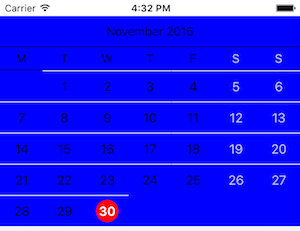
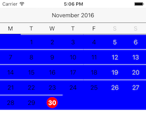
calendarContainer changes the background of the calendar.
const Schedule = () => {
  const customStyle = {
    calendarContainer: {
      backgroundColor: 'blue',
    },
  }
  return <Calendar customStyle={customStyle} />
}
calendarControls
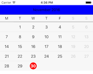
calendarControls changes only the bar on the top that contains the month and year by default, but can also contain controls for changing the month.
const Schedule = () => {
  const customStyle = {
    calendarControls: {
      backgroundColor: 'blue',
    },
  }
  return <Calendar customStyle={customStyle} />
}
calendarHeading
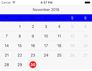
calendarHeading changes the bar that contains the days of the week.
const Schedule = () => {
  const customStyle = {
    calendarHeading: {
      backgroundColor: 'blue',
    },
  }
  return <Calendar customStyle={customStyle} />
}
controlButton
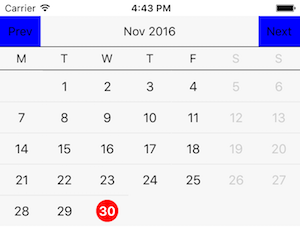
controlButton shows the next and previous buttons that allow you to change the current month. The showControls prop must be passed through to <Calendar /> in order for this style to take effect.
const Schedule = () => {
  const customStyle = {
    controlButton: {
      backgroundColor: 'blue',
    },
  }
  return (
    <Calendar
      showControls
      customStyle={customStyle} />
  )
}
controlButtonText
controlButtonText applies styles to the text that is rendered when the showControls prop is true. The text can also be changed using the prevButtonText and nextButtonText props.
const Schedule = () => {
  const customStyle = {
    controlButtonText: {
      color: 'blue',
    },
  }
  return (
    <Calendar
      showControls
      customStyle={customStyle} />
  )
}
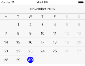
currentDayCircle
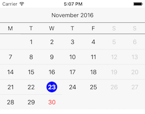
currentDayCircle changes the style of the background behind the currently-selected day when the currently-selected day is today.
const Schedule = () => {
  const customStyle = {
    currentDayCircle: {
      backgroundColor: 'blue',
    },
  }
  return <Calendar customStyle={customStyle} />
}
currentDayText
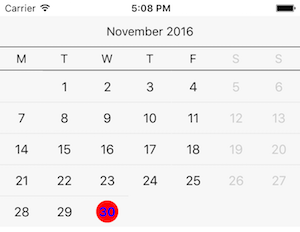
currentDayText changes the style of the current day (defaults to red) to differentiate it from other days.
const Schedule = () => {
  const customStyle = {
    currentDayText: {
      color: 'blue',
    },
  }
  return <Calendar customStyle={customStyle} />
}
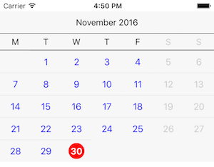
day
day changes the text of every day other than today and weekend days.
const Schedule = () => {
  const customStyle = {
    day: {
      color: 'blue',
    },
  }
  return <Calendar customStyle={customStyle} />
}
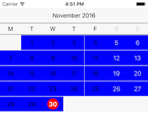
dayButton
dayButton changes the background behind all valid days.
const Schedule = () => {
  const customStyle = {
    dayButton: {
      backgroundColor: 'blue',
    },
  }
  return <Calendar customStyle={customStyle} />
}
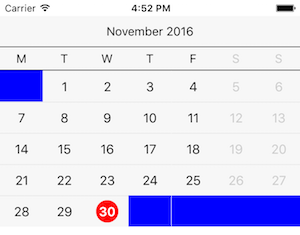
dayButtonFiller
dayButtonFiller styles the background behind all invalid days.
const Schedule = () => {
  const customStyle = {
    dayButtonFiller: {
      backgroundColor: 'blue',
    },
  }
  return <Calendar customStyle={customStyle} />
}
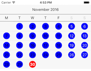
dayCircleFiller
dayCircleFiller styles a circle around all days other than the active day.
const Schedule = () => {
  const customStyle = {
    dayCircleFiller: {
      backgroundColor: 'blue',
    },
  }
  return <Calendar customStyle={customStyle} />
}
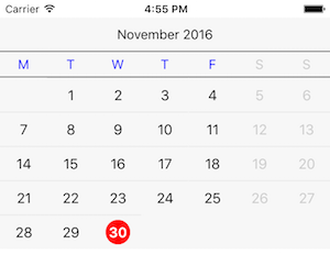
dayHeading
dayHeading styles the text for non-weekend days in the day of the week bar.
const Schedule = () => {
  const customStyle = {
    dayHeading: {
      color: 'blue',
    },
  }
  return (
    <Calendar
    showEventIndicators
    customStyle={customStyle} />
  )
}
eventIndicator
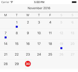
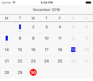
eventIndicator styles the event indicator bubble for days that have events. Must pass either an events array or eventDates array and have showEventIndicators passed as true for the event indicators to display.
const Schedule = () => {
  const customStyle = {
    eventIndicator: {
      backgroundColor: 'blue',
      width: 10,
      height: 10,
    },
  }
  return (
    <Calendar
      showEventIndicators
      eventDates={['2016-11-01', '2016-11-07', '2016-11-19']}
      customStyle={customStyle} />
  )
}
eventIndicatorFiller
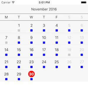
eventIndicatorFiller styles the event indicator space for days that do not have events. Must pass showEventIndicators as true for the event indicators to display.
const Schedule = () => {
  const customStyle = {
    eventIndicatorFiller: {
      backgroundColor: 'blue',
      width: 10,
      height: 10,
    },
  }
  return (
    <Calendar
      showEventIndicators
      eventDates={['2016-11-01', '2016-11-07', '2016-11-19']}
      customStyle={customStyle} />
  )
}
hasEventCircle
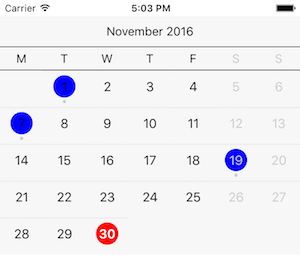
hasEventCircle styles the circle around the days that have events associated with them. Must pass either an events array or eventDates array and have showEventIndicators passed as true for the event indicators to display.
const Schedule = () => {
  const customStyle = {
    hasEventCircle: {
      backgroundColor: 'blue',
    },
  }
  return (
    <Calendar
      showEventIndicators
      eventDates={['2016-11-01', '2016-11-07', '2016-11-19']}
      customStyle={customStyle} />
  )
}
hasEventDaySelectedCircle
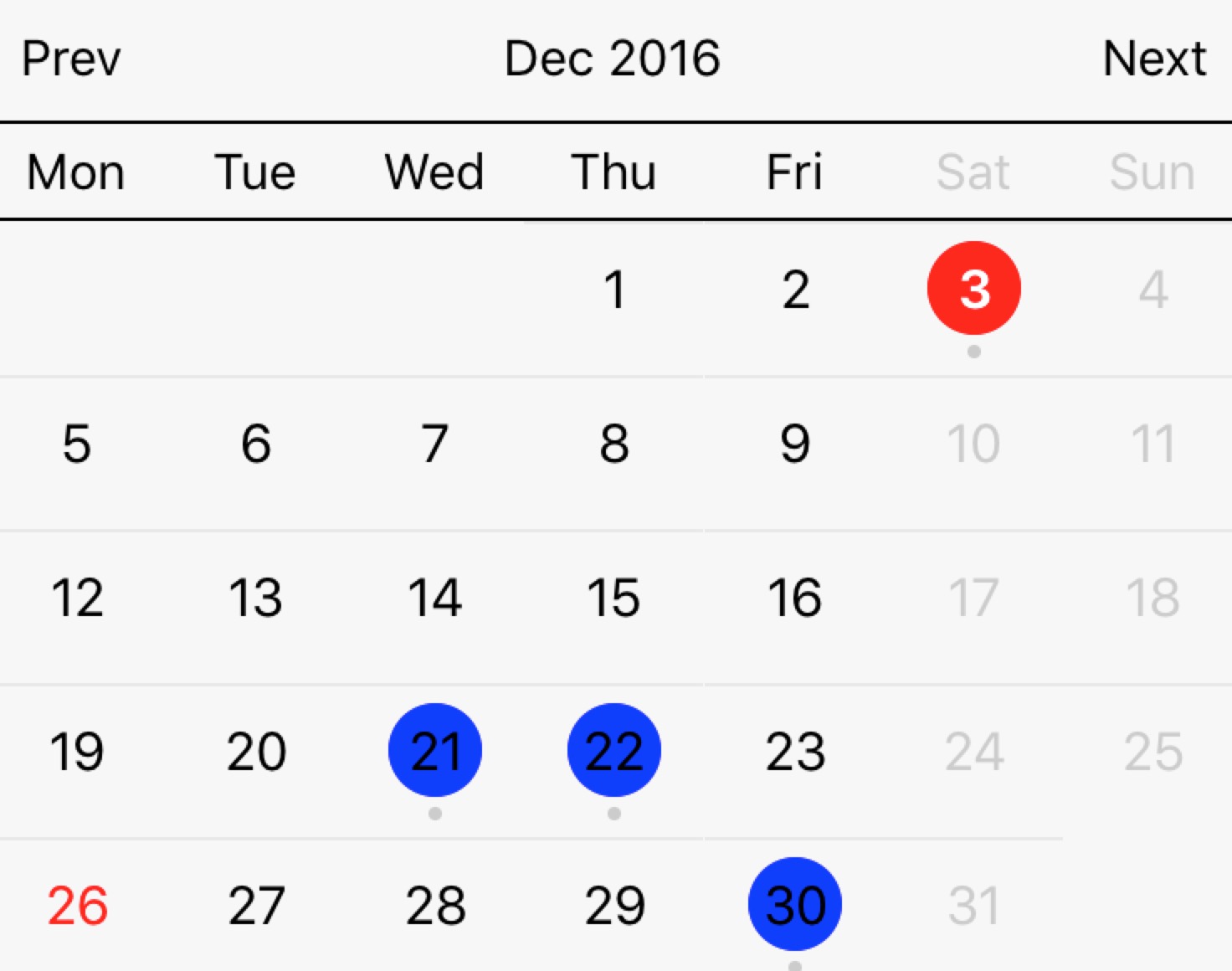
hasEventDaySelectedCircle styles the circle around the selected day that have events associated with them. Must pass either an events array or eventDates array and have showEventIndicators passed as true for the event indicators to display.
const Schedule = () => {
  const customStyle = {
    hasEventCircle: {
      backgroundColor: 'blue',
    },
    hasEventDaySelectedCircle: {
      backgroundColor: 'red',
  	},
  }
  return (
    <Calendar
      showEventIndicators
      eventDates={['2016-12-03', '2016-12-21', '2016-12-22', '2016-12-30']}
      customStyle={customStyle} />
  )
}
hasEventText
hasEventText styles the text of the days that have events associated with them. Must pass either an events array or eventDates array and have showEventIndicators passed as true for the event indicators to display.
const Schedule = () => {
  const customStyle = {
    hasEventText: {
      backgroundColor: 'blue',
    },
  }
  return (
    <Calendar
      showEventIndicators
      eventDates={['2016-11-01', '2016-11-07', '2016-11-19']}
      customStyle={customStyle} />
  )
}
monthContainer
monthContainer styles the background behind the month.
const Schedule = () => {
  const customStyle = {
    monthContainer: {
      backgroundColor: 'blue',
    },
  }
  return <Calendar customStyle={customStyle} />
}
selectedDayCircle
selectedDayCircle styles the circle behind any selected day other than today.
const Schedule = () => {
  const customStyle = {
    selectedDayCircle: {
      backgroundColor: 'blue',
    },
  }
  return <Calendar customStyle={customStyle} />
}
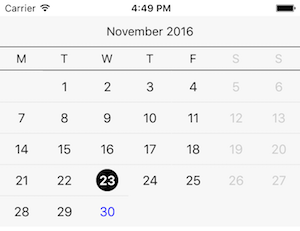
selectedDayText
selectedDayText styles the text of the currently-selected day.
const Schedule = () => {
  const customStyle = {
    selectedDayText: {
      color: 'blue',
    },
  }
  return <Calendar customStyle={customStyle} />
}
title
title styles the title at the top of the calendar.
titleText styles text within title.
const Schedule = () => {
  const customStyle = {
    title: {
      color: 'blue',
    },
    titleText: {
      fontSize: 12,
    },
  }
  return <Calendar customStyle={customStyle} />
}
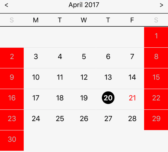
weekendDayButton
weekendDayButton styles the weekends background.
const Schedule = () => {
  const customStyle = {
    weekendDayButton: {
      backgroundColor: 'red',
    },
  }
  return <Calendar customStyle={customStyle} />
}
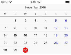
weekendDayText
weekendDayText styles the text of weekends.
const Schedule = () => {
  const customStyle = {
    weekendDayText: {
      color: 'blue',
    },
  }
  return <Calendar customStyle={customStyle} />
}
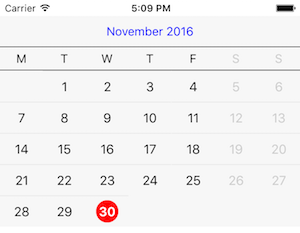
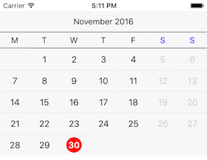
weekendHeading
weekendHeading styles the text of the weekend heading.
const Schedule = () => {
  const customStyle = {
    weekendHeading: {
      color: 'blue',
    },
  }
  return <Calendar customStyle={customStyle} />
}
weekRow
weekRow styles the background of the row associated with each week.
const Schedule = () => {
  const customStyle = {
    weekRow: {
      backgroundColor: 'blue',
    },
  }
  return <Calendar customStyle={customStyle} />
}
TODOS
- [ ] Improve swipe feature
- [ ] Landscape support
- [ ] Language support
