


Are you eager to dive into coding? Follow these steps to kickstart a new project with Storyblok and Nuxt, and get started in just a few minutes!
Are you looking for a hands-on, step-by-step tutorial? The Nuxt Ultimate Tutorial has you covered! It provides comprehensive instructions on building a complete, multilingual website using Storyblok and Nuxt from start to finish.
Install @storyblok/nuxt:
npx nuxi@latest module add storyblokAdd following code to modules section of nuxt.config.js and replace the accessToken with API token from Storyblok space.
import { defineNuxtConfig } from 'nuxt';

export default defineNuxtConfig({
  modules: [
    ['@storyblok/nuxt', { accessToken: '<your-access-token>' }]
    // ...
  ]
});
You can also use the storyblok config if you prefer:
import { defineNuxtConfig } from 'nuxt';
export default defineNuxtConfig({
modules: ['@storyblok/nuxt'],
storyblok: {
accessToken: '<your-access-token>'
}
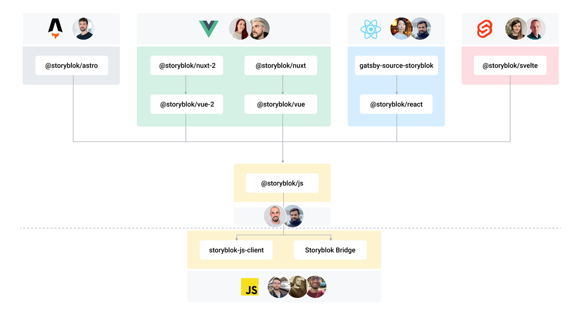
});Warning This SDK uses the Fetch API under the hood. If your environment doesn't support it, you need to install a polyfill like isomorphic-fetch. More info on storyblok-js-client docs.
When you initialize the module, you can pass all @storyblok/vue options plus a bridge option explained in our JS SDK Storyblok bridge section and a enableSudoMode option to define your own plugin (see below).
Note If you want to use Storyblok inside
nuxt-devtoolsyou can use the optiondevtools, if enabled, make sure to have installed the @nuxt/devtools module and enable it on your nuxt config.
// Defaults
["@storyblok/nuxt", {
  {
    accessToken: "<your-access-token>",
    bridge: true,
    devtools: true,
    apiOptions: {}, // storyblok-js-client options
  }
}]While the recommended approach covers most cases, there are specific instances where you may need to use the enableSudoMode option and disable our plugin, allowing you to incorporate your own.
// nuxt.config.ts
modules: [
  [
    '@storyblok/nuxt',
    {
      accessToken: '<your-access-token>',
      enableSudoMode: true
    }
  ]
];
To include additional functionalities in the SDK's apiOptions, such as custom cache methods, you can implement the following solution inside the plugins folder (autoimported):
// plugins/storyblok.js
import { apiPlugin, StoryblokVue } from '@storyblok/vue';

export default defineNuxtPlugin(({ vueApp }) => {
  vueApp.use(StoryblokVue, {
    accessToken: '<your-access-token>',
    apiOptions: {
      cache: {
        type: 'custom',
        custom: {
          flush() {
            console.log('all right');
          }
        }
      }
    },
    use: [apiPlugin]
  });
});Possible values:
-
eu(default): For spaces created in the EU -
us: For spaces created in the US -
ap: For spaces created in Australia -
ca: For spaces created in Canada -
cn: For spaces created in China
Full example for a space created in the US:
["@storyblok/nuxt", {
  {
    accessToken: "<your-access-token>",
    apiOptions: {
      region: "us"
    }
  }
}]
Important For spaces created in the United States or China, the
regionparameter must be specified.
To link your Vue components to the equivalent one in your Storyblok space:
-
First, you need to load them globally adding them to the
~/storyblokdirectory. It's important to name them with Pascal case in your codeExampleComponent.vueand with a hyphen inside your Storyblok spaceexample-component, so they will be imported automatically.If you want to define your own directory for the Storyblok related components, you can use the option
componentsDirin thenuxt.config.js:// nuxt.config.ts modules: [ [ "@storyblok/nuxt", { accessToken: "<your-access-token>", componentsDir: '~/components', } ] ], components: { dirs: [ { path: '~/components/storyblok', global: true, } ] },
Otherwise, you can set another directory and load them manually (for example, by using a Nuxt plugin).
Warning Take into account that if you name a component inside the
storyblokfolder the same as another in thecomponentsfolder, it won't work properly. Tip: Keep the components in your Nuxt project with different names. -
For each component, use the
v-editabledirective on its root element, passing theblokproperty that they receive:
<div v-editable="blok"></div>- Finally, use
<StoryblokComponent>which is available globally in the Nuxt app:
<StoryblokComponent :blok="blok" />The
blokis the actual blok data coming from Storblok's Content Delivery API.
The simplest way is by using the useAsyncStoryblok one-liner composable (it's autoimported). Where you need to pass as first parameter the slug, while the second and third parameters, apiOptions and bridgeOptions respectively, are optional.
Check the available apiOptions in our API docs and bridgeOptions passed to the Storyblok Bridge.
Note If you want to know more about versioning
{ version: "draft" /* or "publish" */ }then go to the section Working with preview and/or production environments
<script setup>
  const story = await useAsyncStoryblok(
    "vue",
    { version: "draft", resolve_relations: "Article.author" }, // API Options
    { resolveRelations: ["Article.author"], resolveLinks: "url" } // Bridge Options
  );

  if (story.value.status) {
    throw createError({
      statusCode: story.value.status,
      statusMessage: story.value.response
    });
  }
</script>

<template>
  <StoryblokComponent v-if="story" :blok="story.content" />
</template>
Which is the short-hand equivalent to using useStoryblokApi inside useState and useStoryblokBridge functions separately:
<script setup>
  const story = useState();
  const storyblokApi = useStoryblokApi();

  const { data } = await storyblokApi.get(
    `cdn/stories/vue`,
    {
      version: "draft"
    }
  );
  story.value = data.story;

  onMounted(() => {
    useStoryblokBridge(
      story.value.id,
      (evStory) => (story.value = evStory),
      { resolveRelations: ["Article.author"], resolveLinks: "url" } // Bridge Options
    );
  });
</script>

<template>
  <StoryblokComponent v-if="story" :blok="story.content" />
</template>
The
useStateis an SSR-friendlyrefreplacement. Its value will be preserved after server-side rendering (during client-side hydration).
You can render rich text fields by using the StoryblokRichText component:
<template>
  <StoryblokRichText :doc="blok.articleContent" />
</template>
Or you can have more control by using the useStoryblokRichText composable:
<script setup>
  const { render } = useStoryblokRichText({
    // options like resolvers
  })

  const root = () => render(blok.articleContent);
</script>

<template>
  <root />
</template>
For more incredible options you can pass to the useStoryblokRichText, please consult the Full options documentation.
You can override the default resolvers by passing a resolver prop to the StoryblokRichText component, for example, to use vue-router links or add a custom codeblok component: :
<script setup>
  import { NuxtLink } from '#components';
  import type { StoryblokRichTextNode } from '@storyblok/vue';
  import CodeBlok from "./components/CodeBlok.vue";

  const resolvers = {
    // NuxtLink example:
    [MarkTypes.LINK]: (node: StoryblokRichTextNode<VNode>) =>
      h(NuxtLink, {
        to: node.attrs?.href,
        target: node.attrs?.target,
      }, node.text),
    // Custom code block component example:
    [BlockTypes.CODE_BLOCK]: (node: Node) => {
      return h(CodeBlock, {
        class: node?.attrs?.class,
      }, node.children)
    },
  }
</script>

<template>
  <StoryblokRichText :doc="blok.articleContent" :resolvers="resolvers" />
</template>
If you want to use the useStoryblokRichText composable, you can pass the resolvers via the options object:
<script setup>
  import CodeBlok from "./components/CodeBlok.vue";

  const { render } = useStoryblokRichText({
    resolvers: {
      // NuxtLink example:
      [MarkTypes.LINK]: (node: StoryblokRichTextNode<VNode>) =>
        h(NuxtLink, {
          to: node.attrs?.href,
          target: node.attrs?.target,
        }, node.text),
      // Custom code block component example:
      [BlockTypes.CODE_BLOCK]: (node: Node) =>
        h(CodeBlock, {
          class: node?.attrs?.class,
        }, node.children)
    }
  });

  const root = () => render(blok.articleContent);
</script>Remember that the bridge only works using version: 'draft' and the Preview Access Token.
For the production site, NOT used as a preview for content editors, version: 'published' and Public Access Token should be used.
Note If you're using production as a preview for marketeers and your public site, you will need a plugin to handle different .env variables, or versions using the Preview Access Token, checking if you are inside Storyblok or not. For example, something like
if (window.location.search.includes(_storyblok_tk[token]=<YOUR_TOKEN>).
Check the official docs on how to access different content versions.
The recommended way to handle different content versions with Nuxt is by using environment variables in combination with Nuxt runtime config to expose configuration and secrets within your application
In your nuxt.config.ts:
export default defineNuxtConfig({
  runtimeConfig: {
    public: {
      storyblokVersion: process.env.STORYBLOK_VERSION || 'published'
    }
  }
});
Then you can access the runtime config in your components:
const config = useRuntimeConfig();

const story = await useAsyncStoryblok(
  'blog',
  {
    version: config.public.storyblokVersion,
    resolve_relations: 'overview.featured_story'
  },
  { resolveRelations: 'overview.featured_story' }
);

// or

const { data: articles } = await storyblokApi.get('cdn/stories', {
  version: config.public.storyblokVersion,
  starts_with: 'blog',
  is_startpage: false
});(Recommended Option) Uses useState under the hood to help with SSR compatibility.
Check the available apiOptions (passed to storyblok-js-client) and bridgeOptions (passed to the Storyblok Bridge).
It could be helpful to use useStoryblok instead of useAsyncStoryblok when we need to make full client-side requests, for example, getting personalized data for a logged user.
Check the available apiOptions (passed to storyblok-js-client) and bridgeOptions (passed to the Storyblok Bridge).
Returns the instance of the storyblok-js-client.
Use this one-line function to cover the most common use case: updating the story when any kind of change happens on Storyblok Visual Editor.
- Bugs or Feature Requests? Submit an issue;
- Do you have questions about Storyblok or you need help? Join our Discord Community.
Please see our contributing guidelines and our code of conduct. This project use semantic-release for generate new versions by using commit messages and we use the Angular Convention to naming the commits. Check this question about it in semantic-release FAQ.