@typeskill/typer
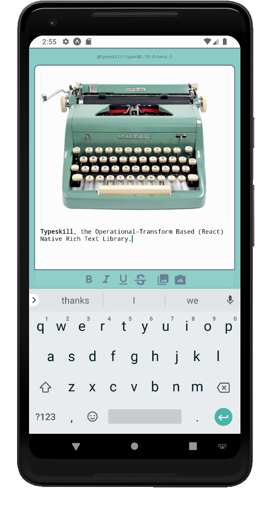
Typeskill, the Operational-Transform Based (React) Native Rich Text Library.
npm install --save @typeskill/typer
Give it a try on Expo

You can also run it locally in seconds
Features & design principles
Design
- Extensively modular architecture: Typeskill handles the logic, you chose the layout;
- No bloated/clumsy
WebView; this library only relies on (React) Native components; - Fully controlled components;
- Based on the reliable Delta operational transform library from quilljs.
Features
- Support for arbitrary embedded contents;
- Support for arbitrary controllers with the
Bridgeclass; - JSON-serializable rich content.
Trying locally
Prerequisite: you must have npm and expo-cli globally installed
git clone https://github.com/typeskill/examples/tree/master
cd examples/expo-showcase
npm install
expo start
You can also cd examples/expo-debugger to understand how the document is represented!
Architecture & example
Introduction
The library exposes two components to render documents:
- The
Typercomponent is responsible for editing a document; - The
Printcomponent is responsible for displaying a document.
Definitions
- A document is a JSON-serializable object describing rich content;
- A document renderer is any controlled component which renders a document—i.e.
TyperorPrint; - The master component is referred to as the component containing and controlling the document renderer;
- A document control is any controlled component owned by the master component capable of altering the document—i.e.
TyperorToolbar; - An external [document] control is any document control which is not a document renderer—i.e.
Toolbaror any custom control.
The shape of a Document
A document is an object describing rich content and the current selection. Its op field is an array of operational transforms implemented with delta library. Its schemaVersion guarantees retro-compatibility in the future and, if needed, utilities to convert from one version to the other.
To explore the structure in seconds, the easiest way is with the debugger: @typeskill/debugger.
Controlled components
Document renderers and controls are controlled components, which means you need to define how to store the state from a master component, or through a store architecture such as a Redux. You can study Editor.tsx, a minimal example master component.
A domain of shared events
Document renderers need an invariant Bridge instance prop.
The bridge has two responsibilities:
- To convey actions such as insert an image at selection or change text attributes in selection from external controls;
- To notify selection attributes changes to external controls.
A Bridge instance must be hold by the master component, and can be shared with any external control such as Toolbar to operate on the document.
Remarks
- The
Bridgeconstructor is not exposed. You must consume thebuildBridgefunction oruseBridgehook instead; - To grasp how the bridge is interfaced with the
Toolbarcomponent, you can read its implementation.
Robustness
This decoupled design has the following advantages:
- the logic can be tested independently from React components;
- the library consumer can integrate the library to fit its graphical and architectural design;
- support for arbitrary content in the future.
Minimal example
Bellow is a simplified snippet from the minimal expo example to show you how the Toolbar can be interfaced with the Typer component.
You need a linked react-native-vector-icons or @expo/vector-icons if you are on expo to make this example work.
import React from 'react';
import { View } from 'react-native';
import {
  Typer,
  Toolbar,
  DocumentControlAction,
  buildVectorIconControlSpec,
  useBridge,
  useDocument,
} from '@typeskill/typer';
/** NON EXPO **/
import { MaterialCommunityIcons } from 'react-native-vector-icons/MaterialCommunityIcons';
/** EXPO **/
// import { MaterialCommunityIcons } from '@expo/vector-icons'

function buildMaterialControlSpec(actionType, name) {
  return buildVectorIconControlSpec(MaterialCommunityIcons, actionType, name);
}

const toolbarLayout = [
  buildMaterialControlSpec(
    DocumentControlAction.SELECT_TEXT_BOLD,
    'format-bold',
  ),
  buildMaterialControlSpec(
    DocumentControlAction.SELECT_TEXT_ITALIC,
    'format-italic',
  ),
  buildMaterialControlSpec(
    DocumentControlAction.SELECT_TEXT_UNDERLINE,
    'format-underline',
  ),
  buildMaterialControlSpec(
    DocumentControlAction.SELECT_TEXT_STRIKETHROUGH,
    'format-strikethrough-variant',
  ),
];

export function Editor() {
  const [document, setDocument] = useDocument();
  const bridge = useBridge();
  return (
    <View style={{ flex: 1 }}>
      <Typer
        document={document}
        onDocumentUpdate={setDocument}
        bridge={bridge}
        maxMediaBlockHeight={300}
      />
      <Toolbar document={document} layout={toolbarLayout} bridge={bridge} />
    </View>
  );
}
API Contract
You need to comply with this contract to avoid bugs:
- The
Bridgeinstance should be instantiated by the master component withbuildBridge, during mount or withuseBridgehook; - There should be exactly one
Bridgeinstance for one document renderer.
API Reference
Typescript definitions provide an exhaustive and curated documentation reference. The comments are 100% compliant with tsdoc and generated with Microsoft famous API Extractor utility. These definitions follow semantic versioning.
Please note that props definitions are namespaced. For example, if you are looking at Toolbar component definitions, you should look for Props definition inside Toolbar namespace.
Inspecting and reporting bugs
@typeskill/debugger is a tool to inspect and reproduce bugs. If you witness a bug, please try a reproduction on the debugger prior to reporting it.
Customizing
Integrating your image picker
Typeskill won't chose a picker on your behalf, as it would break its commitment to modular design.
You can check Editor.tsx component from the showcase expo example to see how to integrate your image picker.


