angular-material-dynamic-themes

1.0.4 • Public • Published

npm (scoped) Dependencies Status Known Vulnerabilities install size
Commitizen friendly
GitHub

Angular-Material-Dynamic-Themes

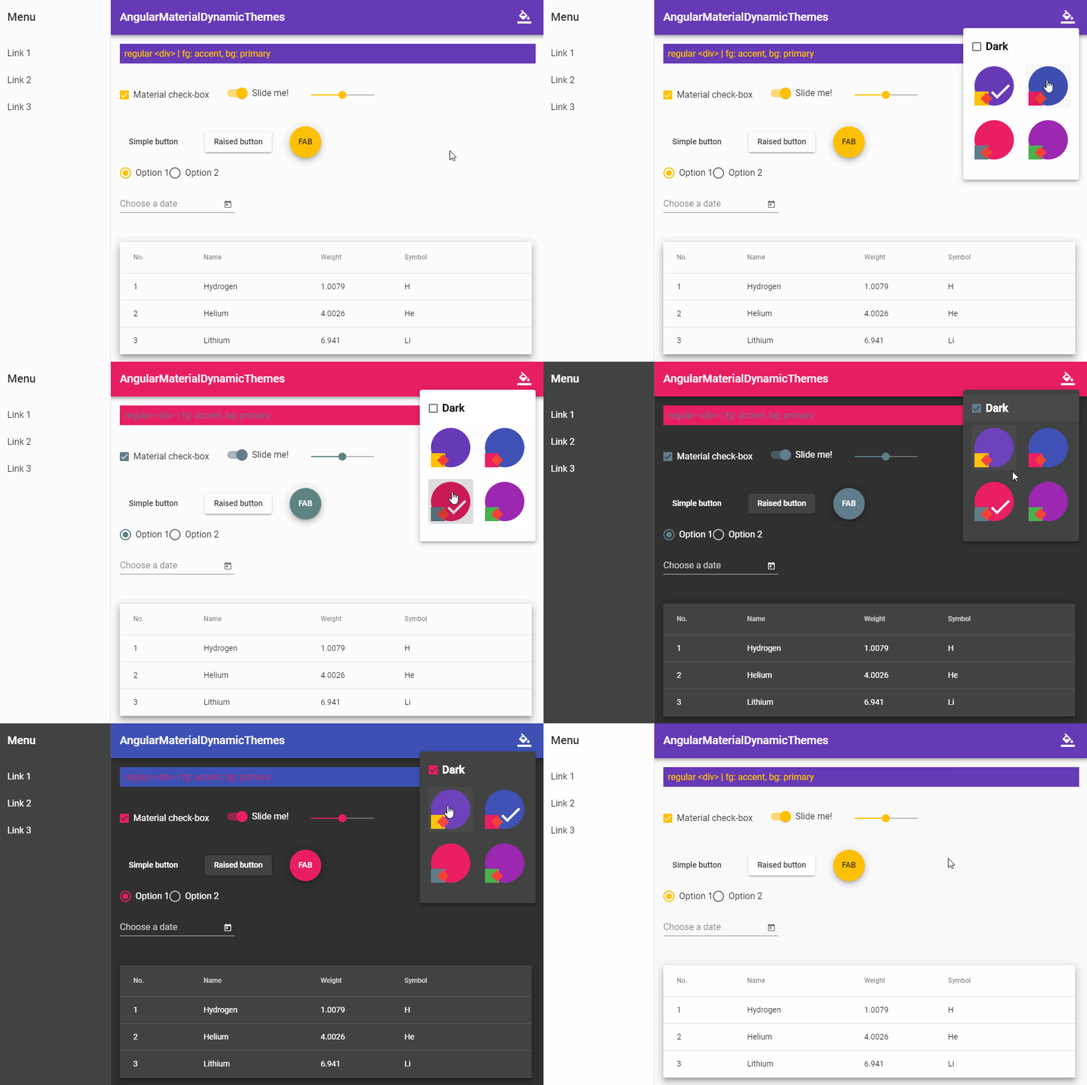
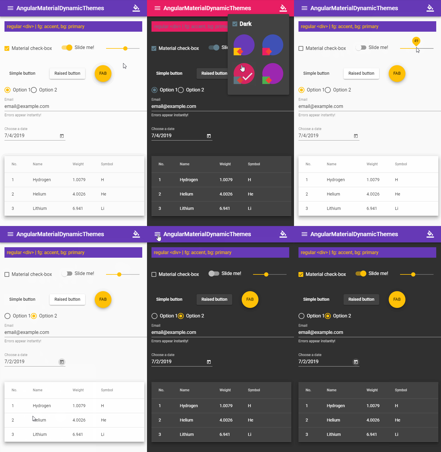
Making able the app to switch between material themes at run-time

Video


Table of Contents

Installation

In your Angular Material project:

npm install angular-material-dynamic-themes

NOTE: This solution is only compatible with SASS/SCSS preprocessor.

Basic Usage

In your styles.scss (or themes.scss if you have):

// Below codes should only be included ONCE in your application. 
 
@import '~@angular/material/theming';
 
@include mat-core();
 
// Add your desired themes to this map. 
$themes-map: (
  indigo-pink: (
    primary-base: $mat-indigo,
    accent-base: $mat-pink,
  ),
 
  deeppurple-amber: (
    primary-base: $mat-deep-purple,
    accent-base: $mat-amber,
  ),
 
  pink-bluegrey: (
    primary-base: $mat-pink,
    accent-base: $mat-blue-gray,
  ),
 
  purple-green: (
    primary-base: $mat-purple,
    accent-base: $mat-green,
  ),
);
 
// Import the module and do the job: 
@import '~angular-material-dynamic-themes/themes-core';
@include make-stylesheets($themes-map);

For more information about $themes-map and adding more customizations to your themes, see Advanced Usage.

In your main component:

import {Component, HostBinding} from '@angular/core'
import {OverlayContainer} from '@angular/cdk/overlay'
 
const THEME_DARKNESS_SUFFIX = `-dark`
 
export class AppComponent {
    @HostBinding('class') activeThemeCssClass: string
    isThemeDark = false
    activeTheme: string
 
    constructor(private overlayContainer: OverlayContainer) {
        // Set default theme here:
        this.setActiveTheme('deeppurple-amber', /* darkness: */ false)
    }
 
    setActiveTheme(theme: string, darkness: boolean = null) {
        if (darkness === null)
            darkness = this.isThemeDark
        else if (this.isThemeDark === darkness) {
            if (this.activeTheme === theme) return
        } else
            this.isThemeDark = darkness
 
        this.activeTheme = theme
 
        const cssClass = darkness === true ? theme + THEME_DARKNESS_SUFFIX : theme
 
        const classList = this.overlayContainer.getContainerElement().classList
        if (classList.contains(this.activeThemeCssClass))
            classList.replace(this.activeThemeCssClass, cssClass)
        else
            classList.add(cssClass)
 
        this.activeThemeCssClass = cssClass
    }
    
    toggleDarkness() {
        this.setActiveTheme(this.activeTheme, !this.isThemeDark)
    }
}

And change the theme using setActiveTheme() (or toggleDarkness()) whenever you want. ✓

A more detailed instruction can be found here:

https://medium.com/@s.m.mirismaili/angular-material-dynamic-themes-compatible-with-angular-7-8-e642ad3c09f4

Advanced Usage

Possible configurations

make-stylesheets() is the only thing in the API and gets a single parameter named $themes-map that was a map like what you saw in Basic Usage. You can see its documentation in the sources. But we bring the most important section of it here, that is the schema of each member (of the map):

css-class-name: (
    primary-base: base-palette,   // example: $mat-purple  // will be ignored if you set corresponding mat-palette (primary). Set it to `null` in this case.
    accent-base:  base-palette,   // example: $mat-green   // will be ignored if you set corresponding mat-palette (accent). Set it to `null` in this case.
    warn-base?:   base-palette,   // DEFAULT: $mat-red     // will be ignored if you set corresponding mat-palette (warn). Set it to `null` in this case.
    primary?: mat-palette,   // DEFAULT: mat-palette(primary-base)
    accent?:  mat-palette,   // DEFAULT: mat-palette(accent-base)
    warn?:    mat-palette,   // DEFAULT: mat-palette(warn-base)
    light-or-dark?: {'light' | 'dark' | ''},   // DEFAULT: '' => "Both light & dark"
),

Use material themes for other elements (non-material elements)

Define themed-stylesheets() mixin before invoking make-stylesheets() with one important input: $mat-theme (that would be what you want):

/**
 * // IMPORTANT NOTE: This mixin is just for other elements (non-material elements) that you want use material themes 
 * // for them. If you don't have such elements, simply remove this mixin.
 *
 * This is a *callback-mixin* and will be called in `make-stylesheets` with a argument ($mat-theme). The schema of this
 * only argument would be:
 *   {
 *     primary: mat-palette,
 *     accent:  mat-palette,
 *     warn:    mat-palette,
 *     background: mat-theme-background,
 *     foreground: mat-theme-foreground,
 *     is-dark: boolean,
 *   }
 */
@mixin themed-stylesheets($mat-theme) {
  // We only need "primary-color" and "accent-color" in this example. So commented out other (not-necessary) 
  // things. Uncomment each you need. 
 
  $primary: map-get($mat-theme, primary);
  $accent: map-get($mat-theme, accent);
  //$warn: map-get($mat-theme, warn); 
  //$background: map-get($mat-theme, background); 
  //$foreground: map-get($mat-theme, foreground); 
 
  $primary-color: mat-color($primary);
  $accent-color: mat-color($accent);
  //$warn-color: mat-color($warn); 
 
  //// Background colors: 
  //$status-bar-color:               map-get($background, 'status-bar'              ); 
  //$app-bar-color:                  map-get($background, 'app-bar'                 ); 
  //$background-color:               map-get($background, 'background'              ); 
  //$hover-color:                    map-get($background, 'hover'                   ); 
  //$card-color:                     map-get($background, 'card'                    ); 
  //$dialog-color:                   map-get($background, 'dialog'                  ); 
  //$disabled-button-color:          map-get($background, 'disabled-button'         ); 
  //$raised-button-color:            map-get($background, 'raised-button'           ); 
  //$focused-button-color:           map-get($background, 'focused-button'          ); 
  //$selected-button-color:          map-get($background, 'selected-button'         ); 
  //$selected-disabled-button-color: map-get($background, 'selected-disabled-button'); 
  //$disabled-button-toggle-color:   map-get($background, 'disabled-button-toggle'  ); 
  //$unselected-chip-color:          map-get($background, 'unselected-chip'         ); 
  //$disabled-list-option-color:     map-get($background, 'disabled-list-option'    ); 
 
  //// Foreground colors: 
  //$base-color:              map-get($foreground, 'base'             ); 
  //$divider-color:           map-get($foreground, 'divider'          ); 
  //$dividers-color:          map-get($foreground, 'dividers'         ); 
  //$disabled-color:          map-get($foreground, 'disabled'         ); 
  //$disabled-button-color:   map-get($foreground, 'disabled-button'  ); 
  //$disabled-text-color:     map-get($foreground, 'disabled-text'    ); 
  //$elevation-color:         map-get($foreground, 'elevation'        ); 
  //$hint-text-color:         map-get($foreground, 'hint-text'        ); 
  //$secondary-text-color:    map-get($foreground, 'secondary-text'   ); 
  //$icon-color:              map-get($foreground, 'icon'             ); 
  //$icons-color:             map-get($foreground, 'icons'            ); 
  //$text-color:              map-get($foreground, 'text'             ); 
  //$slider-min-color:        map-get($foreground, 'slider-min'       ); 
  //$slider-off-color:        map-get($foreground, 'slider-off'       ); 
  //$slider-off-active-color: map-get($foreground, 'slider-off-active'); 
 
  //$is-dark: map-get($mat-theme, is-dark); 
 
  // Define themed-stylesheets here: 
  
  // Example themed-stylesheet: 
  .themed-element {
    background: $primary-color;
    color: $accent-color;
  }
}

Demo

https://github.com/mirismaili/AngularMaterialDynamicThemes

Video

Versions

Current Tags

VersionDownloads (Last 7 Days)Tag
1.0.4151latest

Version History

VersionDownloads (Last 7 Days)Published
1.0.4151
1.0.32
1.0.24
1.0.02
0.0.32

Package Sidebar

Install

npm i angular-material-dynamic-themes

Weekly Downloads

161

Version

1.0.4

License

MIT

Unpacked Size

15.8 kB

Total Files

4

Last publish

Collaborators

  • mirismaili