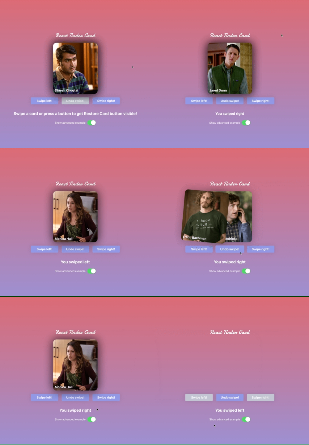
React Tinder Card
A react component to make swipeable elements like in the app tinder.
Compatibility
- React
- React Native
The import and api is identical for both Web and Native.
Demo
Try out the interactive demo here.
Check out the Web demo repo here.
Check out the Native demo repo here.
Contributing
Want to contribute? Check out the contributing.md.
Installation
npm install --save react-tinder-cardUsage
Import TinderCard and use the component like the snippet. Note that the component will not remove itself after swipe. If you want that behaviour implement that on the onCardLeftScreen callback. It is recommended to have overflow: hidden on your #root to prevent cards from being visible after they go of screen.
import TinderCard from 'react-tinder-card'

// ...

const onSwipe = (direction) => {
  console.log('You swiped: ' + direction)
}

const onCardLeftScreen = (myIdentifier) => {
  console.log(myIdentifier + ' left the screen')
}

return (
  <TinderCard onSwipe={onSwipe} onCardLeftScreen={() => onCardLeftScreen('fooBar')} preventSwipe={['right', 'left']}>Hello, World!</TinderCard>
)
If you want more usage help check out the demo repository code: Web / Native
The simple example is the minimum code needed to get you started.
The advanced example implements a state to dynamically remove swiped elements as well as using buttons to trigger swipes.
Both Web code examples can be tested on the demo page. The Native code examples can be cloned and runned using expo start.
Props
flickOnSwipe
- optional
- type:
boolean - default:
true
Whether or not to let the element be flicked away off-screen after a swipe.
onSwipe
- optional
- type:
SwipeHandler
Callback that will be executed when a swipe has been completed. It will be called with a single string denoting which direction the swipe was in: 'left', 'right', 'up' or 'down'.
onCardLeftScreen
- optional
- type:
CardLeftScreenHandler
Callback that will be executed when a TinderCard has left the screen. It will be called with a single string denoting which direction the swipe was in: 'left', 'right', 'up' or 'down'.
preventSwipe
- optional
- type:
Array<string> - default:
[]
An array of directions for which to prevent swiping out of screen. Valid arguments are 'left', 'right', 'up' and 'down'.
swipeRequirementType
- optional
- type:
'velocity' | 'position' - default:
'velocity'
What method to evaluate what direction to throw the card on release. 'velocity' will evaluate direction based on the direction of the swiping movement. 'position' will evaluate direction based on the position the card has on the screen like in the app tinder. If set to position it is recommended to manually set swipeThreshold based on the screen size as not all devices will accommodate the default distance of 300px and the default native swipeThreshold is 1px which most likely is undesirably low.
swipeThreshold
- optional
- type:
number - default:
300
The threshold of which to accept swipes. If swipeRequirementType is set to velocity it is the velocity threshold and if set to position it is the position threshold. On native the default value is 1 as the physics works differently there. If swipeRequirementType is set to position it is recommended to set this based on the screen width so cards can be swiped on all screen sizes.
onSwipeRequirementFulfilled
- optional
- type:
SwipeRequirementFufillUpdate
Callback that will be executed when a TinderCard has fulfilled the requirement necessary to be swiped in a direction on release. This in combination with onSwipeRequirementUnfulfilled is useful for displaying user feedback on the card. When using this it is recommended to use swipeRequirementType='position' as this will fire a lot otherwise.
It will be called with a single string denoting which direction the user is swiping: 'left', 'right', 'up' or 'down'.
onSwipeRequirementUnfulfilled
- optional
- type:
SwipeRequirementUnfufillUpdate
Callback that will be executed when a TinderCard has unfulfilled the requirement necessary to be swiped in a direction on release.
className
- optional
- type:
string
HTML attribute class
API
swipe([dir])
-
dir(Direction, optional) - The direction in which the card should be swiped. One of:'left','right','up'and'down'. - returns
Promise<void>
Programmatically trigger a swipe of the card in one of the valid directions 'left', 'right', 'up' and 'down'. This function, swipe, can be called on a reference of the TinderCard instance. Check the example code for more details on how to use this.
restoreCard()
- returns
Promise<void>
Restore swiped-card state. Use this function if you want to undo a swiped-card (e.g. you have a back button that shows last swiped card or you have a reset button. The promise is resolved once the card is returned

