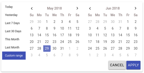
ngx-daterangepicker-material
Pure Angular 2+ Date range picker.
This plugin is compatible with Angular 2+ , work fine with the latest version of angular. This plugin uses moment.js.
This plugin is a rewrite to angular from bootstrap daterangepicker, so it doesn't depends on jquery nor bootstrap.
This plugin have an independant theme which looks more close to material design, so the material design is just a style.

demo: https://fetrarij.github.io/ngx-daterangepicker-material/
Installation
Install the plugin from npm:
npm install ngx-daterangepicker-material --save .
import NgxDaterangepickerMd in your module:
...;;; Usage example
Html:
Typescript:
selected: ;with some options:
Html:
Typescript:
selected: ;You can play with our online demo here and browse our demo code here.
Inline usage
You can use the component directly in your templates, which will set its inline mode to true, in which case the calendar won't hide after date/range selection. You can then use the events: rangeClicked or datesUpdated or choosedDate to get its selection state.
Available options
autoApply, showDropdowns, singleDatePicker, showWeekNumbers, showISOWeekNumbers, alwaysShowCalendars, showClearButton, showCancel
These options are booleans
isCustomDate
(function) A function that is passed each date in the calendars before they are displayed, and may return a string or array of CSS class names to apply to that date's calendar cell
isInvalidDate
(function) A function that is passed each date in the two calendars before they are displayed, and may return true or false to indicate whether that date should be available for selection or not.
minDate, maxDate
To set the minimal and maximal date, these options are a moment date
dateLimit
To set max number of the date we can choose
locale
the locale options is an object with:
format: 'MM/DD/YYYY' direction: 'ltr' // could be rtl weekLabel: 'W' separator: ' To ' // default is ' - ' cancelLabel: 'Cancel' // detault is 'Cancel' applyLabel: 'Okay' // detault is 'Apply' clearLabel: 'Clear' // detault is 'Clear' customRangeLabel: 'Custom range' daysOfWeek: moment monthNames: moment firstDay: 1 // first day is mondayCheck here for setting the global locale
startKey and endKey
Theses 2 options are for the key you want for the value, default are startDate and endDate, it means the value we have from ngModel are: {startDate: Date, endDate: Date} by default;
Specifiyng startKey and endKey would have different model:
example:
the model we got would be: {start: Date, end: Date}
ranges
(object) Set predefined date ranges the user can select from. Each key is the label for the range, and its value an array with two dates representing the bounds of the range. As an example:
ranges: any = 'Today': 'Yesterday': 'Last 7 Days': 'Last 30 Days': 'This Month': 'Last Month': Other options with ranges
You can use bellow options when using the ranges. The default are false.
| Attribut | Type | Description |
|---|---|---|
| alwaysShowCalendars | boolean | set to true if you want to display the ranges with the calendar |
| keepCalendarOpeningWithRange | boolean | set to true if you want the calendar won't be closed after choosing a range |
| showRangeLabelOnInput | boolean | set to true if you want to display the range label on input |
| customRangeDirection | boolean | set to true if you want to allow selection range from end date first |
| lockStartDate | boolean | set to true if you want to lock start date and change only the end date |
Timepicker
You have to set the attribute timePicker to true if you want to enable the timepicker.
You can use theses options:
| Attribut | Type | Description |
|---|---|---|
| timePicker24Hour | boolean | set to true if you want to set the timepicker to 24h instead of having AM and PM |
| timePickerIncrement | number | set the value increment of the minutes (eg: for 12 there would be 0mn, 15mn, 30mn, 45mn,) |
| timePickerSeconds | boolean | set true if you want do display second's select |
Customisation
| Attribut | Type | Description |
|---|---|---|
| firstMonthDayClass | string | add a custom class for all first day of the month |
| lastMonthDayClass | string | add a custom class for all last day of the month |
| emptyWeekRowClass | string | add a custom class for all date in a week not in the current month |
| lastDayOfPreviousMonthClass | string | add a custom class for the last day of the previous month |
| firstDayOfNextMonthClass | string | add a custom class for the first day of the next month |
Positioning
| Attribut | Possible values | Description |
|---|---|---|
| opens | left, center, right | position the calendar from the input element |
| drops | up, down | position the calendar to the up or down of the calendar |
Available events
(rangeClicked)
Fired when clicked on range, and send an object with range label and dates value, eg:
{label: 'This Month', dates: [Moment, Moment]}
(datesUpdated)
Fires when the date model is updated, like applying (if you have activated the apply button), or when selecting a range or date without the apply button, and sends an object containing start and end dates, eg:
{startDate: Moment, endDate: Moment}
Global locale
For setting the global locale, pass this object to NgxDaterangepickerMd.forRoot().
eg:
@NgModule({
    imports: [
        ... ,
        FormsModule,
        NgxDaterangepickerMd.forRoot({
            separator: ' - ',
            applyLabel: 'Okay',
        })
    ],
    declarations: [App],
    bootstrap:    [App]
})
Development
Prepare your environment
Install local dependencies: npm install.
Development server
Run npm start to start a development server on a port 4200.
Open http//:localhost:4200 on your browser.
Tests
Run npm test or ng test to run tests.
Donation
License
MIT


