Bulma Dashboard
Bulma Dashboard is extension for the Bulma CSS framework that enables you to easily write dashboard-style interfaces with fixed horizontal panels.
Installing
The Bulma Dashboard extension is available as an npm package:
npm install bulma-dashboardYou can also download or link to the Sass or CSS files directly.
Usage
All functionality is used inside of the dashboard class, which is intended to take up the entire page. Here's an example:
<div class="dashboard is-full-height">
  <!-- left panel -->
  <div class="dashboard-panel is-one-quarter">
  </div>

  <!-- main section -->
  <div class="dashboard-main is-scrollable">
    <nav class="navbar is-fixed-top">
      <div class="navbar-brand">
        <span class="navbar-item">
          Bulma Dashbaord
        </span>
      </div>
    </nav>

    <section class="section">
      <p class="title">
        Main
      </p>
    </section>

    <!-- the footer will take up all unused space at the bottom -->
    <footer class="footer">

    </footer>
  </div>

  <!-- right panel -->
  <div class="dashboard-panel is-small">
  </div>
</div>
Example
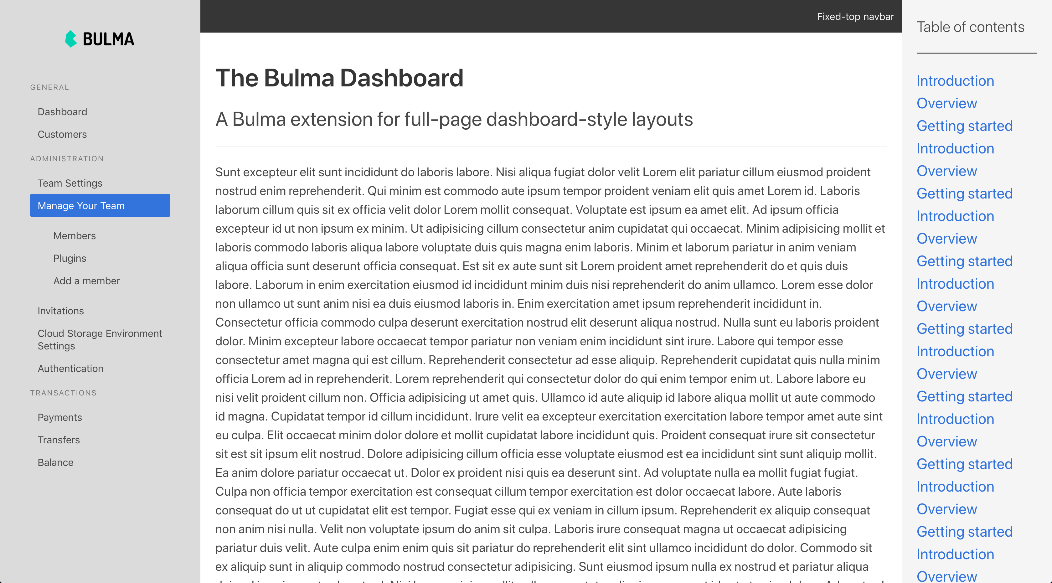
You can see an example page in docs/index.html. Here's a screenshot:
You can visit that page here.
Footer
If you add a Bulma footer in the dashboard main section, it will "stick" to the bottom and fill up all remaining space.
Sizes
There are a variety of widths available for panels:
| Class | Width |
|---|---|
is-one-quarter |
1/4 |
is-half |
1/2 |
is-one-third |
1/3 |
is-small |
15rem |
is-medium |
25rem |
is-large |
30rem |
By default, panels are 25rem wide. You can change that default using the
$dashboard-default-panel-widthvariable.
Scrolling
You can add the is-scrollable class to any element to make it scrollable.
Padding
You can add the has-thick-padding class to a panel to bulk up the padding to double the default.
Variables
| Variable | Default | Meaning |
|---|---|---|
$dashboard-default-panel-width |
25rem | The default panel width if no size modifier is added |
$dashboard-default-panel-padding |
1.5rem | The padding in panels |
