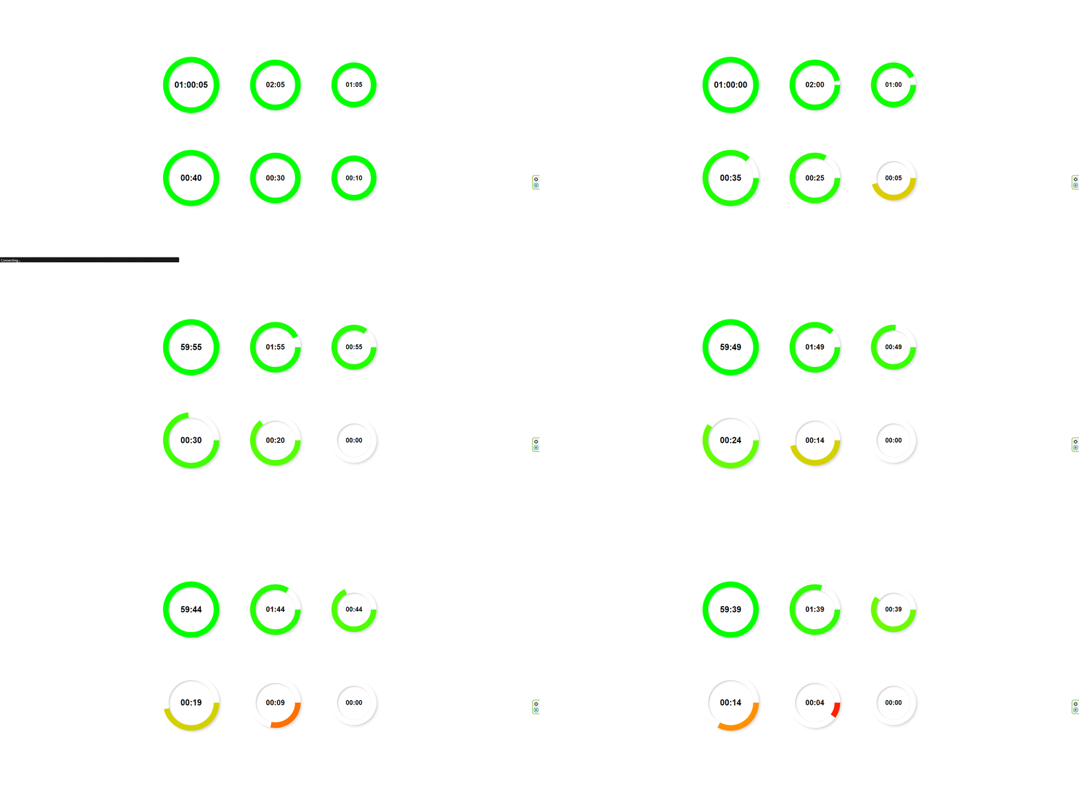
Countdown-React
This NPM package offers a reusable countdown timer component tailored for ReactJS applications, enabling developers to effortlessly integrate a countdown feature with customizable options. The component is developed using ReactJS, Styled-Components, and ESLint, ensuring a seamless blend of design and functionality.
Live demo: circular-countdown-react
Configuration Options
The countdown component offers a variety of configuration options to customize its appearance and functionality, including:
- size: You have the option to showcase the countdown face in 3 sizes: large, medium, small.
- totalSeconds: The countdown duration is specified in total seconds.
- onDone: You have the flexibility to optionally provide a function that will be executed when the countdown finishes.
- shouldStop: Allows for a more responsive countdown by accepting a changing state, while also supporting static countdown usage.
Usage
import React from "react";
import { Countdown } from "circular-countdown-react";

function App() {
  return (
    <div className="app-container">
      <Countdown
        size="large"
        totalSeconds={60}
        onDone={() => console.log("Done!")}
        shouldStop={false}
      />
    </div>
  );
}

export default App;
Installation:
-
npm install circular-countdown-react
Include the package in your project's dependencies.
Peer dependencies:
- styled-components
Development:
-
npm run build-jsdocsFor JSDocs of the utils functions, after running open the 'index.html' file located inside the 'js-docs' folder.
Here's an example showcasing the utilization of the countdown component:
Author
![]() Afek Sakaju
Afek Sakaju
- LinkedIn: @afeksa
- GitHub: @Afek-Sakaju

