This is a lightweight and modular SCSS flexbox library. It is inspired by Angular's Flex-Layout and can replace the most popular functions of the (by now deprecated) Angular library.
Info: This library is actively maintained and is already feature-complete, functioning as intended. Future releases will focus primarily on providing bug fixes and addressing similar issues to ensure a smooth user experience.
This library gives you the option between using CSS classes or data-attributes. Both options give you the same features but the CSS classes can be more verbose when you want a more complex layout.
Please refer to the documentation on https://philmtd.github.io/css-fx-layout for a full list of all available selectors and features.
Using the data attributes is the easiest way to use this library and easier to migrate to from Angular Flex-Layout:
For example css-fx-layout provides attributes like the following, which can be configured through the values passed to them:
-
data-layoutanddata-layout-align data-layout-gap-
data-hide-...anddata-show-... data-flex
Using the CSS classes is more verbose and the more "CSS-y" way of styling your HTML:
For example css-fx-layout provides classes with naming patterns like:
-
fx-layout-...andfx-align-... fx-gap-...-
show-...andhide-... fx-flex-...
The library provides a responsive API which allows to create different layouts for different screen sizes using known breakpoints
like xs, sm, md, lg, xl and including lt- and gt- variations of them. Please check out the documentation
for details on how to use it.
Add the library to your project's package.json:
npm i -s css-fx-layoutThen follow the Getting Started guide in the documentation.
These are just two simple examples how to use css-fx-layout. Visit the examples page for more and live-rendered
examples.
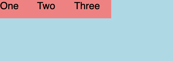
This is the simplest example. It will make the div a flex container and align the three spans in a row:
| CSS Classes | Data Attributes |
|---|---|
<div class="fx-layout-row">
    <span>One</span>
    <span>Two</span>
    <span>Three</span>
</div> |
<div data-layout="row">
    <span>One</span>
    <span>Two</span>
    <span>Three</span>
</div> |
The resulting layout:
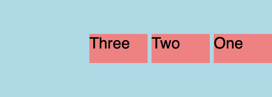
An advanced example that aligns the items in reverse order with a gap of four pixels and vertically centered:
| CSS Classes | Data Attributes |
|---|---|
<div class="fx-layout-row
            fx-layout-reverse
            fx-align--start-x
            fx-align--x-center
            fx-gap--4px">
    <span>One</span>
    <span>Two</span>
    <span>Three</span>
</div> |
<div data-layout="row reverse"
     data-layout-align="start center"
     data-layout-gap="4px">
    <span>One</span>
    <span>Two</span>
    <span>Three</span>
</div> |
The resulting layout:
Initially I created this library because I liked the convenient syntax of Angular Flex-Layout and wanted to use it in non-Angular projects and without JavaScript.
By now Angular Flex-Layout has been deprecated and this library can be a replacement for most of the popular parts.

