
Ng2-loading-spinner
Customisable loading spinner for angular applications

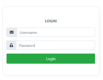
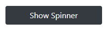
Table of contents
Installation
npm install --save ng2-loading-spinnerUsage
Import Ng2LoadingSpinnerModule in your module
; then, use the ng2-loading directive on the element you want to have a spinner on:
...the directive expects a boolean for showing and removing Loading spinner:
API
Input parameters
| Input | Type | Required | Description |
|---|---|---|---|
| ng2-loading | boolean | Required | A boolean, which will determine when spinner is added to the DOM |
| config | INg2LoadingSpinnerConfig | Optional | Configuartion object for spinner. If no config options are set, the default config options will be used. |
| template | TemplateRef | Optional | If provided, the custom template will be shown in place of the default spinner animations. You can use this for rendering custom spinners instead of default spinner animations |
Configurable options
Config options can be set globally using the forRoot module import statement as well as being passed into each loader instance.Options passed to the instance of loader will override each global options.
| Option | Required | type | Default value | Description | Examples |
|---|---|---|---|---|---|
| animationType | Optional | string | ANIMATION_TYPES.fadingCircle | The spinner animation to be used. import ANIMATION_TYPES constant to select valid options. | ANIMATION_TYPES.chasingDots |
| backdropColor | Optional | string | rgba(0, 0, 0, 0.3) | Background color of backdrop element | 'red', 'rgb(120, 0, 171)', '#434343' |
| backdropBorderRadius | Optional | string | 0 | The border-radius property to be aplied to the spinner | '10px', '1rem', '50%' |
| spinnerColor | Optional | string | white | Color of spinner | 'red', 'rgb(120, 0, 171)', '#434343' |
| spinnerPosition | Optional | string | 'center' | Position the spinner into the host view | 'top', 'right', 'bottom', 'left', 'top-right', 'bottom-left' |
| spinnerSize | Optional | string | 'md' | Option that indicates size of spinner | 'sm', 'md', 'lg' |
| spinnerFontSize | Optional | string | Option for controlling size of spinner.If provided spinnerSize option will be ignored |
'10px', '1rem' |
Available spinner positions:
| Position |
|---|
| center |
| top |
| right |
| bottom |
| left |
| top-right |
| left-right |
| top-left |
| bottom-left |
Available spinner sizes:
| Size |
|---|
| xs |
| sm |
| md |
| lg |
| xl |
Examples
Example 1 - with custom configuration options
; ;;;
Show SpinnerExample2 - using custom template
;;;
LoginPlease wait
and style this custom loader in example2.component.css: