React Animated Popup
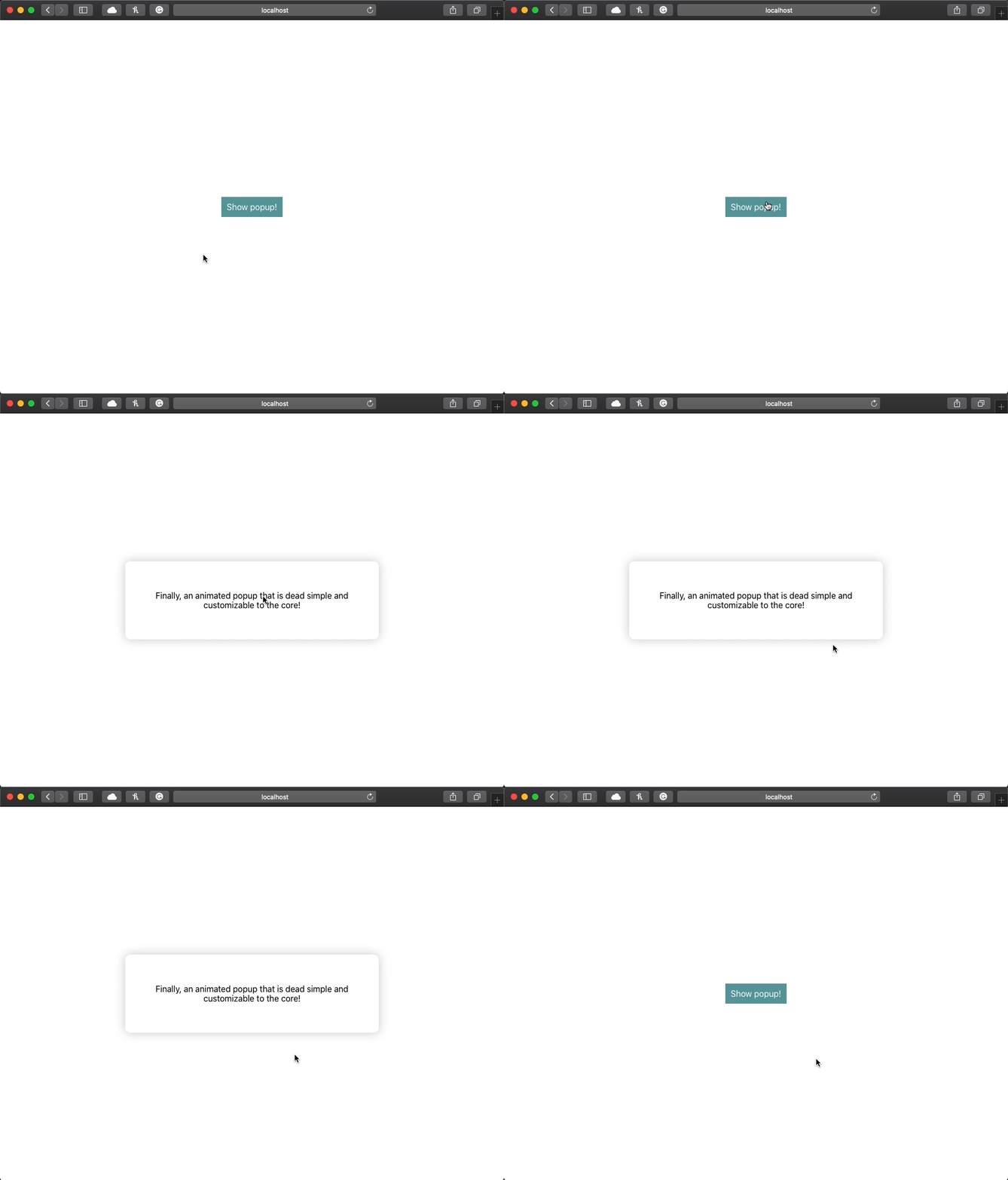
React animated popup is a lightweight zero-dependency module to make elements become popups and animate in and out.
Demo
Try the interactive demo here.
Installation
npm install --save react-animated-popupUsage
Import Popup and use the component like the snippet. Note that you will need to update your visibility state on the onClose event.
The Popup element can be placed anywhere in your DOM! Just make sure it is not inside a position: absolute/relative element.
The children can be anything you want! Create a popup for your purpose.
If you want more usage help check out the demo repository code here.
import Popup from 'react-animated-popup'

// ...

const [visible, setVisible] = useState(false)

return (
  <Popup visible={visible} onClose={() => setVisible(false)}>
    <p>I am a popup!</p>
  </Popup>
)
Props
children
- optional
- type:
ReactNode
Children to make up the popup.
visible
- required
- type:
boolean
The prompt state, make true to make the prompt appear.
onClose
- required
- type:
CloseHandler
Function called when closing. It is recommended to update your visible state to false on this callback.
animationDuration
- optional
- type:
number - default:
100
The duration of the animations in ms.
style
- optional
- type:
CSSProperties
Override styling to the popup div. Per default, it has a white background, rounded corners, and shadow. Everything can be overridden and it can be designed however you like!
className
Classname to add to the popup div.

