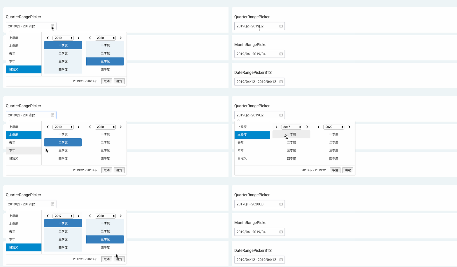
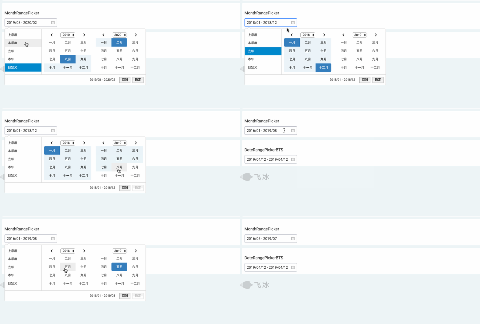
React Month & Quater & Year Range Picker for Bootstrap
Edit from react-bootstrap-daterangepicker;
Add one parameter :
- monthOrQuarter:[number]0 for monthRangePicker(default) ,1 for quarterRangePicker , 2 for yearRangePicker
Delete showWeekNumbers,date and time picker , if you want to use daterangepicker, you can see the package react-bootstrap-daterangepicker;
If your project is not React , you can see the package bootstrap-monthrangepicker;
Screenshots
monthOrQuarter:2
monthOrQuarter:1
monthOrQuarter:0
Description
A month/quarter picker for react (using bootstrap). This is a react wrapper around an existing jQuery/bootstrap library (it is not a pure react port):
Getting Started
-
Install the needed peer dependencies:
npm install --save bootstrap-monthrangepicker react jquery moment prop-types -
Install the module with:
npm install --save react-bootstrap-monthrangepicker -
Include the bootstrap@3 css and fonts in your project. (aka
import 'bootstrap/dist/css/bootstrap.css';) -
Include the bootstrap-monthrangepicker css in your project. (aka
import 'bootstrap-monthrangepicker/daterangepicker.css';) -
This is a commonjs library. You will need a tool like browserify/webpack/etc to build your code.
;;// you will need the css that comes with bootstrap@3. if you are using// a tool like webpack, you can do the following:;// you will also need the css that comes with bootstrap-daterangepicker; //monthOrQuarter:0 monthRangePicker(default);1 quarterRangePicker { var Locale = format: 'YYYY/MM' separator: ' - ' applyLabel: '确定' cancelLabel: '取消' fromLabel: '从' toLabel: '至' customRangeLabel: '自定义' monthNames: '一月' '二月' '三月' '四月' '五月' '六月' '七月' '八月' '九月' '十月' '十一月' '十二月' quarterNames: '一季度' '二季度' '三季度' '四季度' firstDay: 1 ; return <Monthrangepicker locale=Locale startDate="1/1/2014" endDate="3/1/2014" monthOrQuarter=1> <button>Click Me To Open Picker!</button> </Monthrangepicker> ; }Documentation
For in depth documentation, see the original bootstrap-monthrangepicker project page. bootstrap-daterangepicker project page.
You can pass all the same props as the original plugin:
- <input>, alwaysShowCalendars, applyClass, autoApply, autoUpdateInput, buttonClasses, cancelClass, dateLimit, drops, endDate, isCustomDate, isInvalidDate, linkedCalendars, locale, maxDate, minDate, opens, parentEl, ranges, showCustomRangeLabel, showDropdowns, showISOWeekNumbers, singleDatePicker, startDate, template,monthOrQuarter
You can listen to the following 7 events:
- onShow: thrown when the widget is shown
- onHide: thrown when the widget is hidden
- onShowCalendar: thrown when the calendar is shown
- onHideCalendar: thrown when the calendar is hidden
- onApply: thrown when the apply button is clicked
- onCancel: thrown when the cancel button is clicked
- onEvent: thrown when any of the 4 events above are triggered
All 7 of the events above should take a handler that is passed 2 arguments: event and picker
Example event handler:
Component { console; } { return <Monthrangepicker onEvent=thishandleEvent />; }There are 2 additional props you can pass, that are not part of the wrapped
bootstrap-daterangepicker project.
Every <Monthrangepicker /> element emits a div element for the wrapper project to initialize itself against.
The emitted div looks like this by default:
The 2 props you can pass to modify this behavior are:
- containerStyles [object]: the styles of the container
<div />(default:{ display: 'inline-block' }) - containerClass [string]: the class of the container
<div />(default:'react-bootstrap-daterangepicker-container')
Links
- github : Original bootstrap-monthrangepicker Plugin
- github : Original react-bootstrap-daterangepicker Plugin
- github : Original bootstrap-daterangepicker Plugin
License
Copyright (c) 2019 gntyu
Uses the original bootstrap-daterangepicker license.