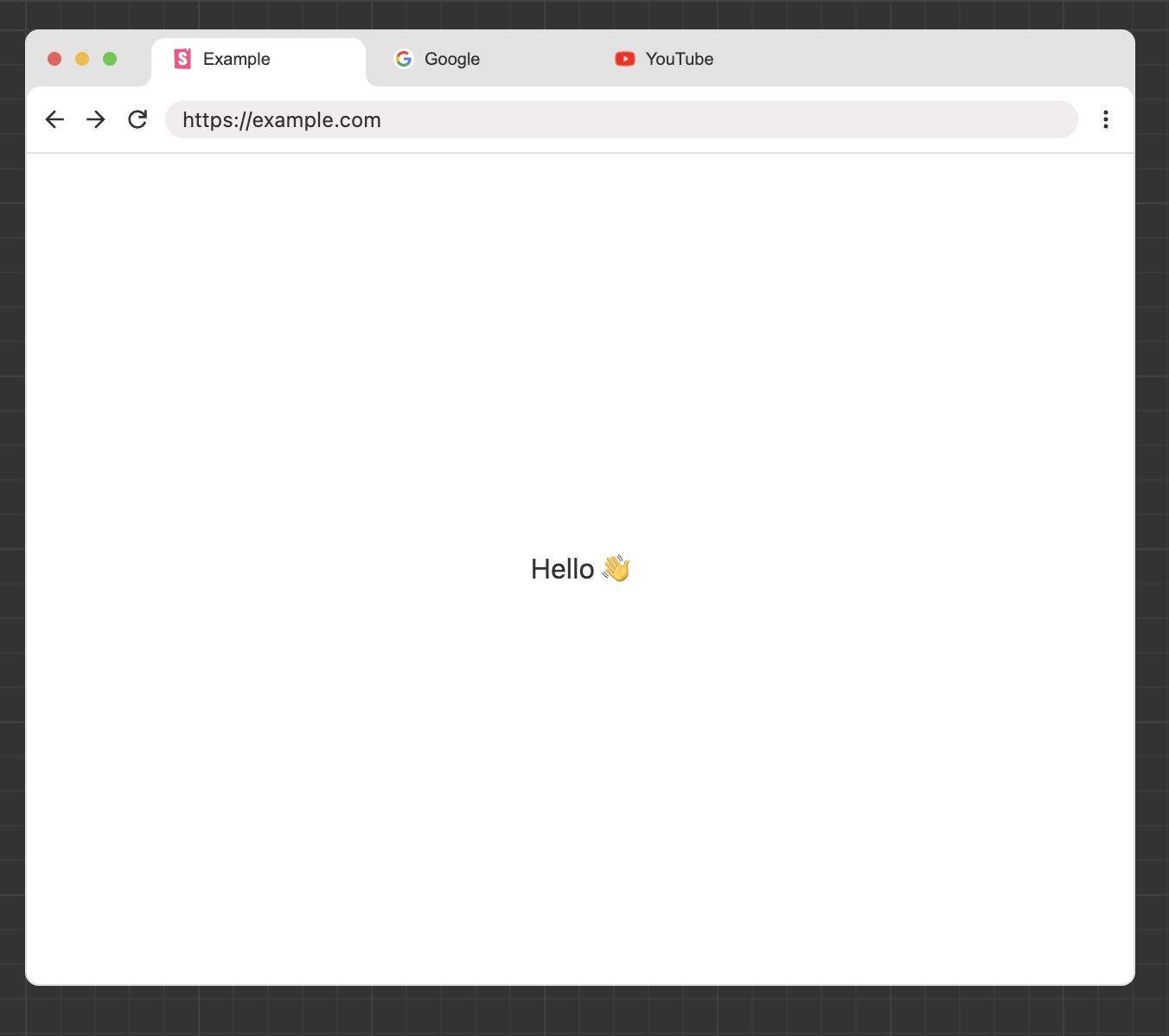
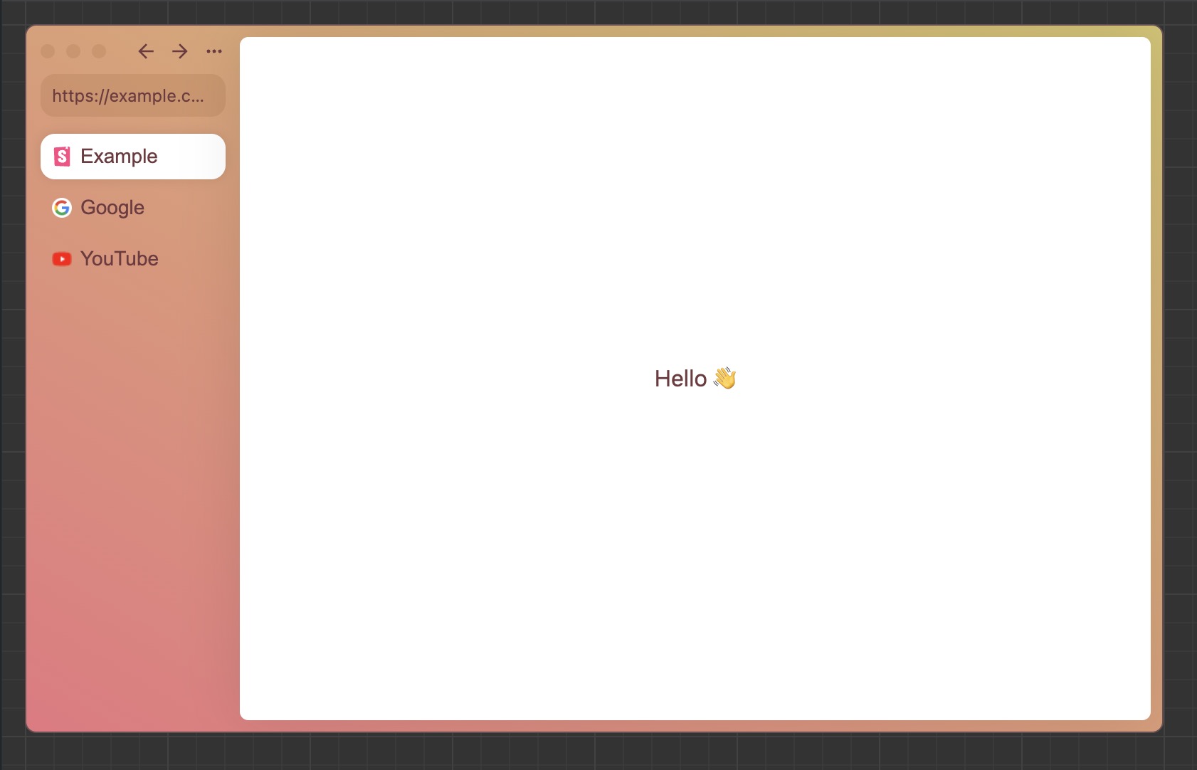
React component for browser-windows like containers, with tabs functionality.
npm i react-browser-components
 ChromeBrowser ChromeBrowser |
 ArcBrowser ArcBrowser |
|---|---|
 |
 |
You can use the components to demonstrate functionality with browsers, or as decorative elements in your project. The components are not designed to be used as actual browsers.
import { ChromeBrowser, ArcBrowser } from "react-browser-components";
import { useState } from "react";

const App = () => {
  const [tab, setTab] = useState(0);
  const tabs = [
    {
      name: "Google",
      link: "https://google.com",
      content: <div>Content</div>,
      icon: (
        <img
          src="https://google.com/favicon.ico"
          style={{ width: "100%", height: "100%" }}
        />
      ),
    },
  ];

  return (
    <>
      <ChromeBrowser tabs={tabs} tab={tab} setTab={setTab} />
      <ArcBrowser tabs={tabs} tab={tab} setTab={setTab} />
    </>
  );
};| Name | Type | Description |
|---|---|---|
| theme | "light" | "dark" |
Theme of the browser, default is light. The light and dark theme of ArcBrowser is the same. |
| tabs | Array<{name: string;link: string;content: React.ReactNode;icon: React.ReactNode;}> |
Pages in the browser. |
| shadow | boolean |
Shadow of the browser, default is true. |
| useContentSize | boolean |
Default is false: browser will be the size of its parent element. True: browser will be the size of its content. |
| contentScroll | boolean |
If content inside the container should be scrollable, default is true. |
| leftIcons | React.ReactNode |
Leave empty for default icons. |
| rightIcons | React.ReactNode |
Leave empty for default icons. |
| lightTheme | Theme |
Changes the light theme of the browser. |
| darkTheme | Theme |
Changes the dark theme of the browser. |
| children | React.ReactNode |
Content displayed over all pages. |
| tab | number |
Active tab index. |
| setTab | (tab: number) => void |
Function to set the active tab index. |
export default interface Theme {
  theme: string;
  bg: string;
  text: string;
  contentBg: string;
  contentText: string;
  border: string;
  searchBarBg: string;
  tabBarBg: string;
  tabDivider: string;
  tabHoverBg: string;
  tabSelectedBg: string;
}To get started:
git clone https://github.com/EnhancedJax/react-browser-components.git
cd react-browser-components
npm i
Actions:
npm run storybook # start storybook
npm run build # build the library
npm run test # test the librarynpm run build
npm link
npm link "../your-project/node_modules/react"
cd ../your-project
npm link react-browser-components


