react-debounce-input 
React component that renders an Input, Textarea or other element with debounced onChange. Can be used as drop-in replacement for <input type="text" /> or <textarea />
Live design system demo
Simple web demo
http://nkbt.github.io/react-debounce-input
Codepen demo
http://codepen.io/nkbt/pen/VvmzLQ
Installation
NPM
npm install --save react-debounce-inputyarn
yarn add react-debounce-input 1998 Script Tag:
<script src="https://unpkg.com/react@16.0.0/umd/react.production.min.js"></script>
<script src="https://unpkg.com/react-debounce-input/build/react-debounce-input.js"></script>
(Module exposed as `DebounceInput`)
Usage
import React from 'react';
import ReactDOM from 'react-dom';
import {DebounceInput} from 'react-debounce-input';

class App extends React.Component {
  state = {
    value: ''
  };

  render() {
    return (
      <div>
        <DebounceInput
          minLength={2}
          debounceTimeout={300}
          onChange={event => this.setState({value: event.target.value})} />

        <p>Value: {this.state.value}</p>
      </div>
    );
  }
}

const appRoot = document.createElement('div');
document.body.appendChild(appRoot);
ReactDOM.render(<App />, appRoot);
Options
element : PropTypes.string or React.PropTypes.func (default: "input")
You can specify element="textarea". For Example:
<DebounceInput element="textarea" />Will result in
<textarea />Note: when rendering a <textarea /> you may wish to set forceNotifyByEnter = {false} so the user can make new lines without forcing notification of the current value.
This package has only been tested with <input /> and <textarea /> but should work with any element which has value and onChange props.
You can also use a custom react component as the element. For Example:
<DebounceInput element={CustomReactComponent} />Will result in
<CustomReactComponent />
onChange: PropTypes.func.isRequired
Function called when value is changed (debounced) with original event passed through
value: PropTypes.string
Value of the Input box. Can be omitted, so component works as usual non-controlled input.
minLength: PropTypes.number (default: 0)
Minimal length of text to start notify, if value becomes shorter then minLength (after removing some characters), there will be a notification with empty value ''.
debounceTimeout: PropTypes.number (default: 100)
Notification debounce timeout in ms. If set to -1, disables automatic notification completely. Notification will only happen by pressing Enter then.
forceNotifyByEnter: PropTypes.bool (default: true)
Notification of current value will be sent immediately by hitting Enter key. Enabled by-default. Notification value follows the same rule as with debounced notification, so if Length is less, then minLength - empty value '' will be sent back.
NOTE if onKeyDown callback prop was present, it will be still invoked transparently.
forceNotifyOnBlur: PropTypes.bool (default: true)
Same as forceNotifyByEnter, but notification will be sent when focus leaves the input field.
inputRef: PropTypes.func (default: undefined)
Will pass ref={inputRef} to generated input element. We needed to rename ref to inputRef since ref is a special prop in React and cannot be passed to children.
See ./example/Ref.js for usage example.
Arbitrary props will be transferred to rendered <input>
<DebounceInput
  type="number"
  onChange={event => this.setState({value: event.target.value})}
  placeholder="Name"
  className="user-name" />
Will result in
<input
  type="number"
  placeholder="Name"
  className="user-name" />
Typescript
This library has typescript typings, import them the same way as in javascript:
import {DebounceInput} from 'react-debounce-input';Also there are helper types DebounceTextArea and Debounced to provide strict interfaces for wrapping components different from standard <input />. Check usage examples in example/typescript-example.tsx.
NOTE library author is not using Typescript, so if you are using typings and found an issue, please submit a PR with fix. Thanks @iyegoroff for the initial TS support!
Development and testing
Currently is being developed and tested with the latest stable Node on OSX.
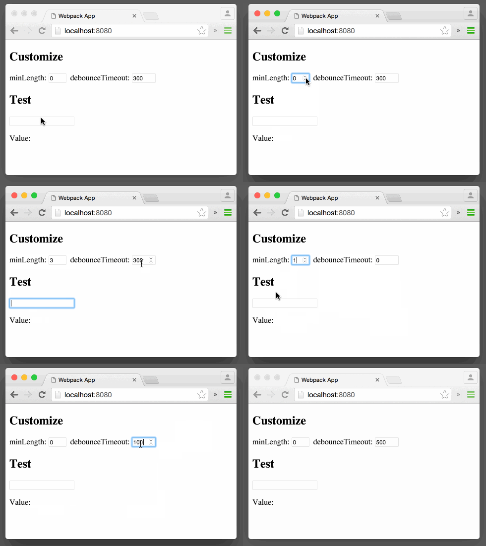
To run example covering all DebounceInput features, use yarn start, which will compile example/Example.js
git clone git@github.com:nkbt/react-debounce-input.git
cd react-debounce-input
yarn install
yarn start

# then
open http://localhost:8080
Tests
# to run ESLint check
yarn lint

# to run tests
yarn test
License
MIT


