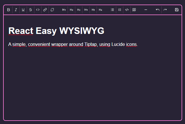
A simple, convenient frontend for tiptap, which itself builts upon ProseMirror. Outputs HTML or JSON.
Icons from Lucide icons.
Implemented modules are:
- The entire TipTap Starterkit
- Link
- Underline
Tiptap, by design, only provides the barebones tools to built a text editor. For my personal website I built a wrapper, and decided I might as well release it for others to use.
To view the demo, clone the repo, run npm i to install dependencies and then run npm run demo.
This package is ESM only, and is built targetting ES2019.
npm install react-easy-wysiwyg
import Editor from "react-easy-wysiwyg";

// Assuming you can import CSS directly, like with Vite, CRA or Next.js
import "react-easy-wysiwyg/styles.css";

const App = () => {

  return (<>
    <h1>My wonderful app</h1>
    <Editor />
  </>)
}Due to the inherently large size of this module, it's highly recommended to lazy load the module in your page, with next/dynamic for example.
If using the app directory, available in Next.js 13, you'll need to mark it's parent as a Client Component.
| Prop | Type | Default | Description |
|---|---|---|---|
content |
object | string
|
The content, either a JSON object as exported by tiptap, or an HTML document | |
onSave |
(string | object) => {} |
On save, this function receives one argument, the content. This is either HTML (string) or an object, based on the exportHTML prop |
|
exportHTML |
boolean |
false |
If set to true, onSave receives an HTML string instead of an object |
editable |
boolean |
true |
If set to false, the editor will render content without editing capabilities. It will still import all moduled needed for editing, however, so a dedicated solution is preferred. |
showWordCount |
boolean |
true |
Whether or not to show the wordcount in the lower right corner |
className |
string |
Allows passing a custom className to the wrapper (which already has the rew-wrapper class, as well as some default styling) |
|
buttons |
object |
buttons {} |
Allows customizing displayed buttons. See buttons |
labels |
object |
labels {} |
Allows changing displayed text. See labels |
onLinkClick |
(e) => {} |
See description | By default, ignores clicked links, unless cmd or ctrl is pressed. |
{
  url: "URL",
  save: "Save",
}There are several options to customize the look of the Editor. For larger changes, you're better off building an interface for tiptap yourself.
This is the easiest, and the one you'll probably always want. It can be as simple as redefining CSS Custom properties.
.rew-container {
  /* Styling defaults */
  --rew-background-color: #282336;
  --rew-color: #fff;

  /* Styling inline code */
  --rew-inline-code-background-color: #000;
  --rew-inline-code-color: #cfcfcf;
  --rew-inline-code-font: monospace;

  /* Styling code blocks */
  --rew-code-background-color: #000;
  --rew-code-color: #cfcfcf;
  --rew-code-font: monospace;

  /* Styling the borders */
  --rew-accent: #ff7edb;
  /* Color of menu seperators */
  --rew-seperator: rgba(255,126,219,.2);
  /* Color of indicators for quote blocks */
  --rew-highlight: rgba(255,126,219,.2);
  /* Background color of 'active' buttons */
  --rew-selected: rgba(255,126,219,.2)
}

@media (prefers-color-scheme: dark) {
  .rew-container {
    /* Same, but for dark mode users */
  }
}
The module is built using CSS Modules, so naming collissions are unlikely. Several 'plain' namespaced classNames are exposed for further styling:
.rew-container {
  /* The outermost <div>, containing both the menu and the wrapper */
}
.rew-menu {
  /* The menu bar at the top, containing all buttons */
}
.rew-wrapper {
  /* The <div> wrapping the content-editable <div> rendered by tiptap */
}
On top of this, the .ProseMirror class can be used for styling the content itself. By default, your 'normal' styles are inherited.
This module allows for custom buttons if you don't like the look of the default icons from Lucide icons. To do so, just provide a buttons prop to the editor:
// All possible options. You only have to provide the ones you want to override.
const altButtons = {
  bold: "B",
  italic: "I",
  underline: "U",
  strikethrough: "S",
  heading1: "H1",
  heading2: "H2",
  heading3: "H3",
  heading4: "H4",
  heading5: "H5",
  heading6: "H6",
  code: "C",
  bulletList: "L",
  orderedList: "LO",
  codeBlock: "CB",
  blockquote: "BQ",
  horizontalRule: "M",
  undo: "U",
  redo: "R",
  link: "L",
  unlink: "UL",
  save: "Sa",
};

<Editor buttons={altButtons} />
If any alt is not defined, the default icon will render. To disable, just set it to any falsy value like false or null.
The content can be any node that react can render (which is basically anything). No logic for rendering is provided, so if using React components, you must pass the rendered result, not the component itself:
const Bold = () => <span>B</span>;
const Italic = () => <span>I</span>;

<Editor buttons={{
  bold: <Bold />, // ✅
  italic: Italic, // ❌
}} />