react-form-mobx


Declarative Form components for React, built on top of MobX
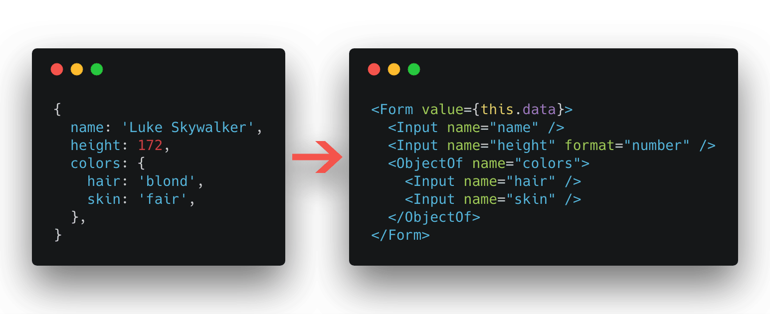
Table of Contents
Philosophy
Declarative, just like React and HTML
Features Included
- Support nested objects and arrays
- Easy to create custom Input (or Select, Checkbox, Radio, etc) components
- Easy to push, update or remove array items
- Built-in validations (eg
required,pattern,enum, etc) - Built-in formats (eg
integer,number,boolean, etc) - Support data transformers / filters
Features NOT Included
- No styles, just the original appearance, but you could add style easily
- No HTTP requests, but you could choose any HTTP request library you like
Live Demo
Getting Started
Installing
yarn add react-form-mobxYou may also need to install react, mobx and mobx-react
yarn add react mobx mobx-react react-form-mobxUsage
import React Component from 'react';import Form Input ObjectOf from 'react-form-mobx'; myData = name: 'Luke Skywalker' height: 172 colors: hair: 'blond' skin: 'fair' { console; }; { return <Form = => <Input ="name" /> <Input ="height" ="number" /> <ObjectOf ="colors"> <Input ="hair" /> <Input ="skin" /> </ObjectOf> </Form> ; }Advanced Guides
Dynamic Array Items
import React Component from 'react';import Form Input ArrayOf from 'react-form-mobx'; myData = name: 'Luke Skywalker' starships: 'X-wing' 'Imperial shuttle' { console; }; { return <Form = => <Input ="name" /> <ArrayOf ="starships"> starships push removeBy <div> starships <button ="button" =>Add Starship</button> </div> </ArrayOf> </Form> ; }Creating Custom Input Component
MyInput.js
import React Component from "react";import Demon from "react-form-mobx"; { return <Demon => props isInvalid errorMessage <label> <input = /> isInvalid && <span =>errorMessage</span> </label> </Demon> ; }MyApp.js
import React Component from "react";import Form from "react-form-mobx";import MyInput from "./MyInput"; { return <Form => <MyInput ="name" /> /* ... */ </Form> ; }References
Form Component
import Form from 'react-form-mobx';Form component, just like HTML form component.
Props
| Property | Description | Type | Default |
|---|---|---|---|
| value | Form data | Object | {} |
| onSubmit | Defines a function will be called when form submit | Function | |
| onValid | Defines a function will be called when form is valid | Function | |
| onInvalid | Defines a function will be called when form is invalid | Function | |
| onValidChange | Defines a function will be called when form valid status changed | Function | |
| onChange | Defines a function will be called when form data changed | Function | |
| inputFilter | Defines a filter function will be called when providing a new value | Function | |
| outputFilter | Defines a filter function will be called when getting output value | Function |
Input Components
import Input Checkbox Radio Select TextArea from 'react-form-mobx';These Input Components mean Input, Checkbox, Radio, Select, TextArea or other custom input components created by Demon.
Props
| Property | Description | Type | Default |
|---|---|---|---|
| name | Field name | String Required |
|
| defaultValue | Default value when value is empty | Any | |
| defaultChecked | Default checked, only work in checkable components (eg: Checkbox, Radio) |
Boolean | |
| format | Data format | "integer", "number", "string", "boolean", "date", "time", "dateTime" | |
| required | Indicates whether field is required | Boolean | false |
| enum | Validate a value from a list of possible values | Array of String |
[] |
| pattern | Validate from a regular expression | RegExp | |
| maxLength | Validate a max length of the field | Number | |
| minLength | Validate a min length of the field | Number | |
| maximum | Validate if the field is less than or exactly equal to "maximum" | Number | |
| exclusiveMaximum | Validate if the field is less than (not equal to) "exclusiveMaximum" | Number | |
| minimum | Validate if the field is greater than or exactly equal to "minimum" | Number | |
| exclusiveMinimum | Validate if the field is greater than or exactly equal to "exclusiveMinimum" | Number | |
| validation | Defines a validator function, should throw error if invalid | Function | |
| inputFilter | Defines a filter function will be called when providing a new value to form | Function | |
| outputFilter | Defines a filter function will be called when getting output value from form | Function | |
| withEmpty | Indicates whether submit empty value or not | "auto", true, false |
"auto" |
The rest of the props are exactly the same as the original DOM attributes.
Notes
withEmpty: If value is empty (saying"",undefined,null,{}or[]):"auto"(Default): Will submit empty value only if pristine value is NOT emptytrue: Will submit empty valuefalse: Will not submit empty value
ObjectOf Component
import ObjectOf from 'react-form-mobx';ObjectOf component provides nested fields.
Props
| Property | Description | Type | Default |
|---|---|---|---|
| name | Field name | String Required |
|
| children | Nested input nodes | Node Required |
|
| onChange | Defines a function will be called when data changed | Function | |
| inputFilter | Defines a filter function will be called when providing a new value to form | Function | |
| outputFilter | Defines a filter function will be called when getting output value from form | Function |
ArrayOf Component
import ArrayOf from 'react-form-mobx';ArrayOf component provides array fields, and could be push, update or remove easily.
Props
| Property | Description | Type | Default |
|---|---|---|---|
| name | Field name | String Required |
|
| children | Nested input nodes or function child that should return a node | Node or Function Required |
|
| onChange | Defines a function will be called when data changed | Function | |
| inputFilter | Defines a filter function will be called when providing a new value to form | Function | |
| outputFilter | Defines a filter function will be called when getting output value from form | Function |
Function Child
If children prop is a callback renderer function, it will provide two arguments:
names<Array>: An array of unique names that could be used as thekeyandnameprops of chidren componentshelper<Object>: A helper object to manipulate the array:push()<Function>: To push a new itemremove(name)<Function>: To remove a item bynameremoveBy(name)<Function>: To create and return aremove(name)currying function
Please checkout Dynamic Array Items for usage example.
Submit, Reset, Clear Component
import Submit Reset Clear from 'react-form-mobx';Submit: Just like HTMLbuttoncomponent. Will emitonSubmit()inFormwhen click.Reset: Just like HTMLbuttoncomponent. Will reset all input values to pristine values inFormwhen clickClear: Just like HTMLbuttoncomponent. Will clear all input values inFormwhen click.
Props
| Property | Description | Type | Default |
|---|---|---|---|
| children | children | Node |
The rest of the props are exactly the same as the original DOM attributes.
Demon Component
import Demon from 'react-form-mobx';Demon component is the core of creating custom input components.
Props
| Property | Description | Type | Default |
|---|---|---|---|
| name | Field name | String Required |
|
| children | Function child that should return a node | Function Required |
|
| forwardedProps | Forward props, Demon will decide to handle or forward them |
Object | {} |
| checkable | Indicates whether the component is checkable | Boolean | false |
| getValueFromChangeEvent | Defines a function to get value in onChange arguments |
Function | (ev) => ev.currentTarget.value |
| getCheckedFromChangeEvent | Defines a function to get checked in onChange arguments |
Function | (ev) => ev.currentTarget.checked |
| getKeyFromKeyPressEvent | Defines a function to get key in onPress arguments |
Function | (ev) => ev.key |
| propOnChange | Defines the prop name of change event | String | "onChange" |
| propOnKeyPress | Defines the prop name of key press event | String | "onKeyPress" |
| propOnBlur | Defines the prop name of blur event | String | "onBlur" |
Function Child
children prop provides two arguments:
-
proxyProps<Object>: Forwarded props object includingvalueorchecked, but excludingname,format,enumand other props only work inDemoncomponent. Can be directly pass to child component (like<input {...proxyProps} />) -
validState<Object>: Valid state helper object, including:errorMessage<String>: Error message. Would be empty if the status is validisValid<Boolean>: Would be true if the status is validisInvalid<Boolean>: Would be true if the status is invalidisTouched<Boolean>: Is touched or not. Useful if you don't want to showerrorMessagewhen field is not touched
Proxied Props
By default, onChange, onKeyPress, onBlur props will be proxied.
onChange:Demonneed to get the changedvalueorcheckedfrom thechangeevent object to update value. You can change the getting function by settinggetValueFromChangeEventorgetCheckedFromChangeEventprop toDemoncomponent.onKeyPress:Demonneed to get thekeyfrom thekeyPressevent object to decide to submit. You can change the getting function by setttingpropOnKeyPressprop toDemoncomponentonBlur:Demonneed to listen to theblurevent to setisTouchedtotrue
Please checkout Creating Custom Input Component for usage example.
DemonButton Component
import DemonButton from 'react-form-mobx';DemonButton component is the core of creating custom button (Submit, Reset or Clear) components.
Props
| Property | Description | Type | Default |
|---|---|---|---|
| children | Function child that should return a node | Function Required |
|
| type | Button type | "submit", "reset", "clear" | "submit" |
| forwardedProps | Forward props, DemonButton will decide to handle or forward them |
Object | {} |
| getKeyFromKeyPressEvent | Defines a function to get key in onPress arguments |
Function | (ev) => ev.key |
| propOnKeyPress | Defines the prop name of key press event | String | "onKeyPress" |
Function Child
children prop provides one argument:
proxyProps<Object>: Forwarded props object. Can be directly pass to child component (like<button {...proxyProps} type="button" />)
License
MIT