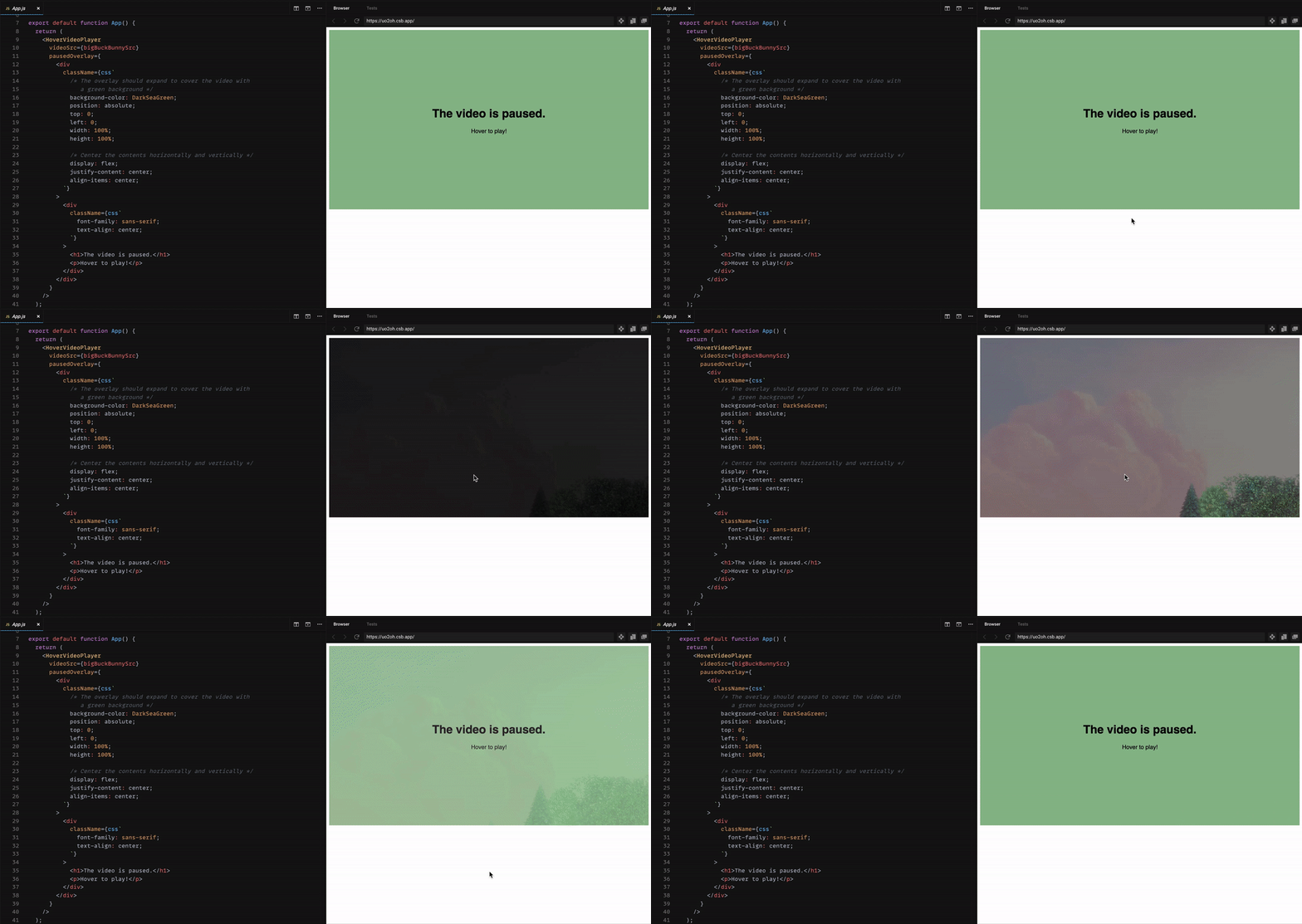
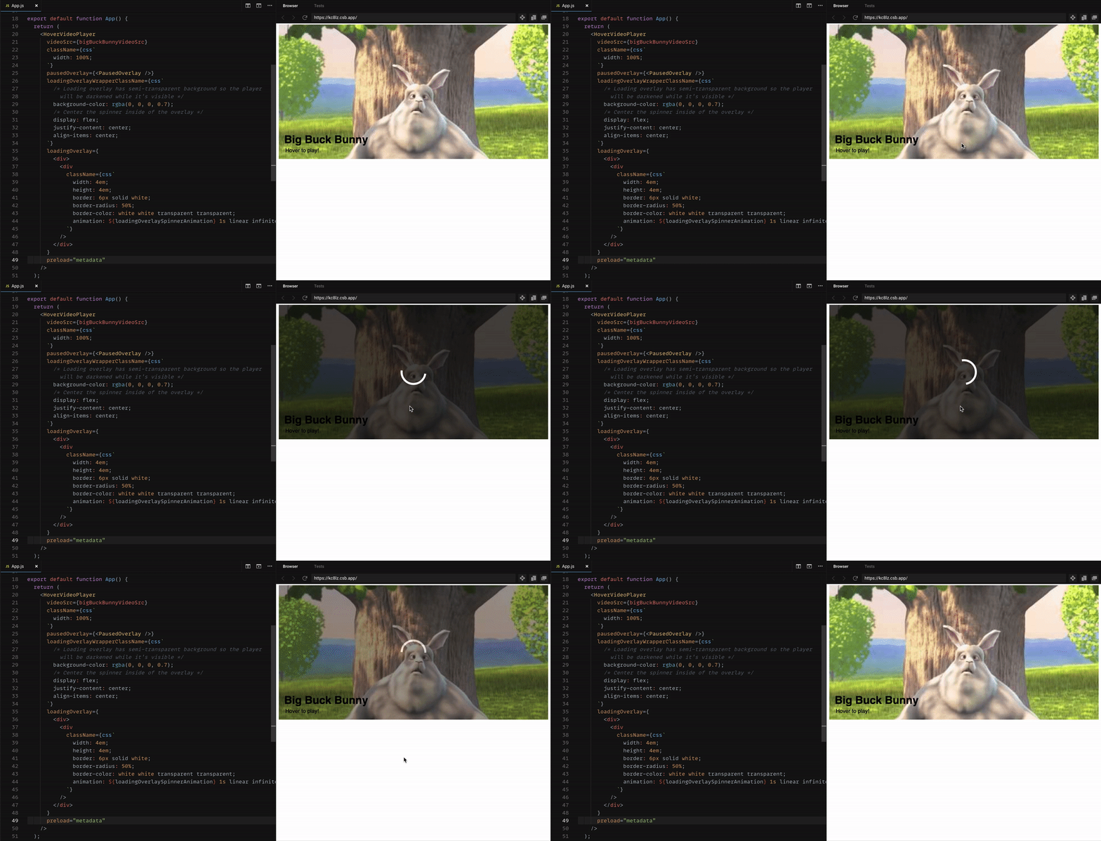
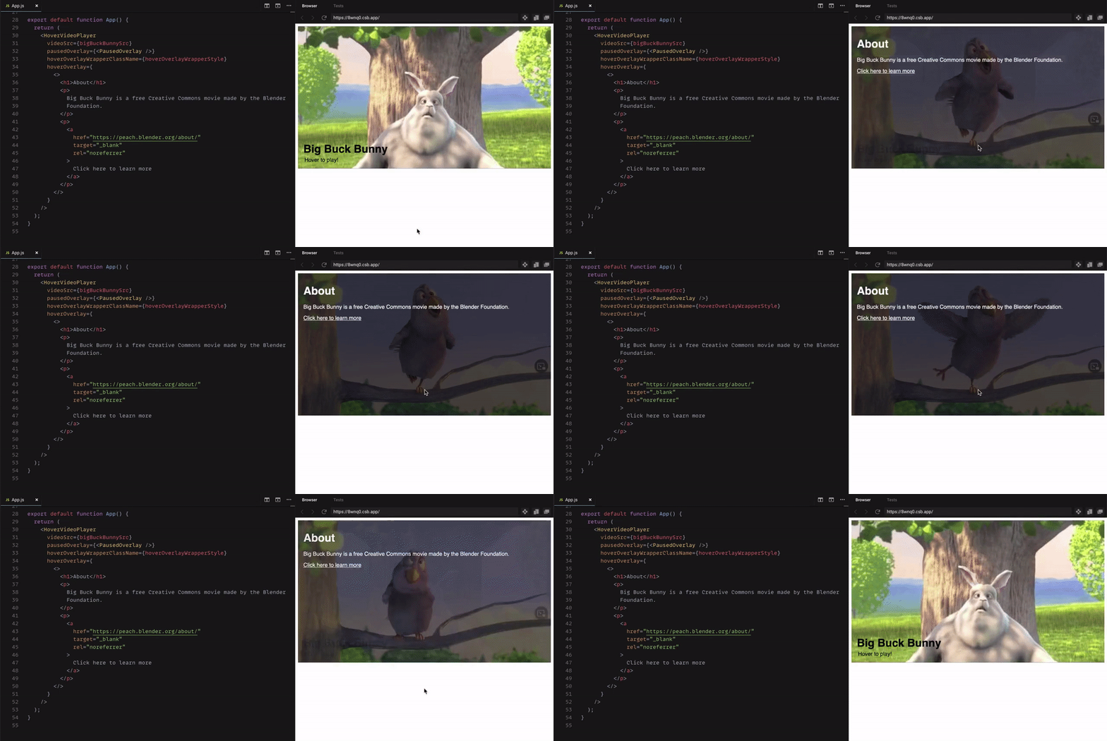
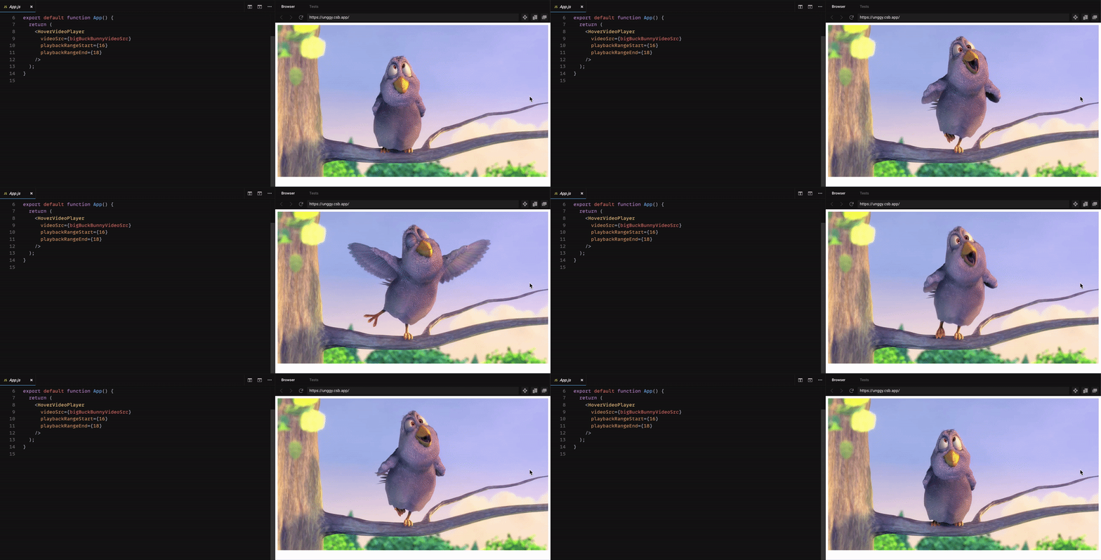
A React component that makes it simple to set up a video that will play when the user hovers over it. This is particularly useful for setting up a thumbnail that will play a video preview on hover.
Want to play around with a real working example? Check it out on CodeSandbox!
- Out-of-the-box support for both mouse and touchscreen interactions
- Easily add custom thumbnails and loading states
- Lightweight and fast
- No dependencies
- Gracefully uses fallback behavior if browser policies block a video from playing with sound on
This component will render a video element which will start playing when an onMouseEnter, onTouchStart, or onFocus event is fired on the hover target and will accordingly be paused when an onMouseLeave or onBlur event is fired on the target, or an onTouchStart event is fired outside of the target. This default behavior can be disabled, overridden, and customized as needed.
Everything is written with extra care to cleanly handle the video element's state as it asynchronously loads and plays.
Want to help? Contributions are welcome! Check out the contributing guide for details
react-hover-video-player 10.0.0 includes some breaking API changes. See here for a breakdown of the changes and how to migrate.
npm install react-hover-video-playerimport HoverVideoPlayer from 'react-hover-video-player';
function MyComponent() {
return (
<HoverVideoPlayer
videoSrc="path-to/your-video.mp4"
pausedOverlay={
<img
src="thumbnail-image.jpg"
alt=""
style={{
// Make the image expand to cover the video's dimensions
width: '100%',
height: '100%',
objectFit: 'cover',
}}
/>
}
loadingOverlay={
<div className="loading-overlay">
<div className="loading-spinner" />
</div>
}
/>
);
}Type: string or a React node | This prop is required
videoSrc accepts a string or a React node containing a set of <source> elements for the video source file(s) which should be used for the video player.
If you only have one video source, you can simply provide a single string for the URL path to the video file like so:
<HoverVideoPlayer videoSrc="path/video-file.mp4" />If you have multiple video sources, you can provide all of them as <source> elements wrapped in a React fragment:
<HoverVideoPlayer
  videoSrc={(
    <>
      <source src="video.webm" type="video/webm" />
      <source src="video.mp4" type="video/mp4" />
    </>
  )}
/>
If you have multiple video sources, make sure you order them by ascending file size so that the smallest video file is first; browsers will always simply pick the first source that they support.
Type: object or array of objects | Default: null
videoCaptions accepts a React node containing one or more <track> elements descibing the caption track sources to use in order to apply closed captions to the video for accessibility.
If you have a single caption track, you can apply it like so:
<HoverVideoPlayer
  videoSrc="video.mp4"
  videoCaptions={(
    <track
      // The URL string for the captions track file
      src="path-to/captions-track.vtt"
      // The code for the language that the captions are in
      srcLang="en"
      // The title of the captions track which will be visible in the captions selection controls
      label="English"
      // OPTIONAL: the kind of captions that this captions track represents (ie, "subtitles", "captions", "descriptions")
      kind="captions"
      // OPTIONAL: whether this track should be applied by default without requiring interaction from the user
      default
    />
  )}
/>
Note that if you do not set default or have more than one track, it is recommended that you set the controls prop to true so that the user may enable the captions or choose the correct captions for their desired language.
If you have more than one track, you can wrap them in a React fragment like so:
<HoverVideoPlayer
  videoSrc="video.mp4"
  videoCaptions={(
    <>
      <track
        src="captions/english.vtt"
        srcLang="en"
        label="English"
        kind="captions"
        default
      />
      <track
        src="captions/french.vtt"
        srcLang="fr"
        label="Francais"
        kind="subtitles"
      />
    </>
  )}
  // Enable the video's controls so that the user can select the caption track they want or toggle captions on and off
  controls
/>Type: string | Default: null
The crossOrigin prop maps directly to the HTML Video element's crossorigin attribute and allows us to define how the video element should handle CORS requests. For most purposes, you should not need to worry about setting this, but if you are having trouble with CORS a good first step may be to try setting it to "anonymous".
The acceptable values are:
-
"anonymous": The video element will send cross-origin requests with no credentials. -
"use-credentials": The video element will send cross-origin requests with credentials.
<HoverVideoPlayer videoSrc="video.mp4" crossOrigin="anonymous" />Type: node | Default: null
This optional prop accepts any renderable content that you would like to be displayed over the video while it is in a paused or loading state. When the video starts playing, this content will be faded out.
A common use case for this would be displaying a thumbnail image over the video while it is paused.
<HoverVideoPlayer
  videoSrc="video.mp4"
  // We should display an image over the video while it is paused
  pausedOverlay={
    <img
      src="image/video-thumbnail.jpg"
      alt=""
      style={{
        // Make the image expand to cover the video's dimensions
        width: '100%',
        height: '100%',
        objectFit: 'cover',
      }}
    />
  }
/>
The overlayTransitionDuration prop allows you to set how long it should take for the overlay to fade out when the video starts playing and fade back in when it stops playing.
Type: node | Default: null
loadingOverlay is an optional prop that accepts any renderable content that you would like to be displayed over the video if it takes too long to start after the user attempts to play it.
This allows you to provide a better user experience for users with slower internet connections, particularly if you are using larger video assets.
Note that the pausedOverlay will still be rendered while the video is in a loading state, so this overlay will simply be displayed on top of that one.
<HoverVideoPlayer
  videoSrc="video.mp4"
  // We should display a custom element on top of
  // the video when it is loading
  loadingOverlay={<div className="loading-overlay">Loading...</div>}
/>
This overlay will only be displayed if it takes more than a certain amount of time for the video to start after we attempt to play it. You can set the precise timeout duration with the loadingStateTimeout prop.
Type: number | Default: 400
overlayTransitionDuration accepts the number of milliseconds that it should take for the paused overlay and loading overlay to fade in and out as the player's state changes.
After the user stops hovering on the player, the video will continue playing until the overlay has fully faded back in to provide the most seamless user experience possible.
<HoverVideoPlayer
  videoSrc="video.mp4"
  pausedOverlay={<div>Paused!</div>}
  // It should take 500ms for the pausedOverlay to fade out when
  // the video plays and fade back in when the video pauses
  overlayTransitionDuration={500}
/>Type: number | Default: 200
loadingStateTimeout accepts the number of milliseconds that the player should wait before showing a loading state if the video is not able to play immediately.
<HoverVideoPlayer
  videoSrc="video.mp4"
  loadingOverlay={<div className="loading-overlay">Loading...</div>}
  // We should only show the loading state if the video takes
  // more than 1 full second to start after attempting to play
  loadingStateTimeout={1000}
/>Type: node | Default: null
hoverOverlay is an optional prop that accepts any renderable content that you would like to be displayed over the video while the player is active from a hover/touch event or when the focused prop is true.
This can be useful if you wish to reveal content to the user when they hover while the video still plays underneath it.
Note that this overlay takes highest ordering priority and will be displayed on top of both the pausedOverlay and loadingOverlay if they are set.
<HoverVideoPlayer
  videoSrc="video.mp4"
  hoverOverlay={
    <div className="hover-overlay">
      <h1>Video Title</h1>
      <p>
        Here is a short description of the video. You can still see the video
        playing underneath this overlay.
        <a href="/video-page">Click here to read more</a>
      </p>
    </div>
  }
/>Type: Node, a function that returns a Node, or a React.RefObject | Default: null
hoverTarget accepts a DOM node, a function that returns a DOM node, or a React ref to an element. The component will apply default event handling to the received target element so the video will play when a user hovers over it with a mouse or touch interaction. If no hoverTarget is provided, HoverVideoPlayer will use the component's container <div> as the hover target.
// Passing a function that returns a DOM node
<HoverVideoPlayer
  videoSrc="video.mp4"
  // Play the video when the user hovers over the element with id "hover-target"
  hoverTarget={() => document.getElementById("hover-target")}
/>

...

// Using a React ref
const wrapperLinkRef = useRef();

<a href="/other-page" ref={wrapperLinkRef} className="link-card">
  <HoverVideoPlayer
    videoSrc="video.mp4"
  // Play the video when the user hovers over the wrapper link
    hoverTarget={wrapperLinkRef}
  />
</a>

...

// Passing a DOM node
// PLEASE BEWARE THAT THIS CAN BE UNSAFE: Only do this if you are confident that the element
// will always already exist on the DOM before this component is rendered.
<HoverVideoPlayer
  videoSrc="video.mp4"
  // Play the video when the user hovers over the element with id "hover-target"
  hoverTarget={document.getElementById("hover-target")}
/>Type: boolean | Default: false
focused accepts a boolean value which, if true, will force the video player to play regardless of any other user interactions it receives. This can be useful for scenarios where you may wish to implement custom behavior outside of standard mouse/touch interactions with the video player.
const [isVideoPlaying, setIsVideoPlaying] = useState(false);

...

<button
  // Clicking this button should toggle whether the video is playing
  onClick={()=>setIsVideoPlaying(!isVideoPlaying)}
>
  Click me to make the video play
</button>
<HoverVideoPlayer
  videoSrc="video.mp4"
  focused={isVideoPlaying}
/>
If you wish to set up a a fully custom implementation that overrides the hover player's default mouse and touch event handling, you can use the disableDefaultEventHandling prop.
Type: boolean | Default: false
disableDefaultEventHandling accepts a boolean value which, if true, will disable the player's default built-in event handling where onMouseEnter and onTouchStart events play the video and onMouseLeave events and touchStart events outside of the player pause the video. This can be useful if you want to build a fully custom implementation of the player's behavior using the focused prop.
const [isVideoPlaying, setIsVideoPlaying] = useState(false);

...

<div
  // Clicking on the player will toggle whether it is playing or paused
  onClick={()=>setIsVideoPlaying(!isVideoPlaying)}
>
  <HoverVideoPlayer
    videoSrc="video.mp4"
    focused={isVideoPlaying}
    // The default mouse and touch event handling on the player is disabled
    disableDefaultEventHandling
  />
</div>Type: function | Default: null
onHoverStart accepts a callback function which will be fired when the user hovers on the player's hover target.
<HoverVideoPlayer
  videoSrc="video.mp4"
  onHoverStart={() => {
    console.log('User just moused over or touched hover target.');
    console.log('The video will now attempt to play.');
  }}
/>Type: function | Default: null
onHoverStart accepts a callback function which will be fired when the user stops hovering on the player's hover target.
<HoverVideoPlayer
  videoSrc="video.mp4"
  onHoverEnd={() => {
    console.log('User just moused out of or touched outside of hover target.');
    console.log('The video will now stop playing.');
  }}
/>Type: boolean | Default: false
restartOnPaused accepts a boolean value which will toggle whether the video should be reset to the start every time it is paused or resume from the previous time it was at.
<HoverVideoPlayer
  videoSrc="video.mp4"
  restartOnPaused // The video should restart when it is paused
/>Type: boolean | Default: true
muted accepts a boolean value which toggles whether or not the video should be muted.
Note that if the video is unmuted, you may encounter issues with browser autoplay policies blocking the video from playing with sound. This is an unfortunate limitation stemming from the fact that modern browsers will block playing audio until the user has "interacted" with the page by doing something like clicking or tapping anywhere at least once.
If playback is initially blocked for an unmuted video, the component will fall back by muting the video and attempting to play again without audio; if the user clicks on the page, the video will be unmuted again and continue playing.
<HoverVideoPlayer
  videoSrc="video.mp4"
  // The video should play sound
  muted={false}
/>Type: number | Default: 1
volume accepts a number on a scale from 0-1 for the volume that the video's audio should play at.
Note that this will only work if the muted prop is also set to false.
<HoverVideoPlayer
  videoSrc="video.mp4"
  // The video should play sound at 50% volume
  volume={0.5}
  muted={false}
/>Type: boolean | Default: true
loop accepts a boolean value which toggles whether or not the video should loop when it reaches the end.
<HoverVideoPlayer
  videoSrc="video.mp4"
  // The video should not loop when it reaches the end
  loop={false}
/>Type: React.Ref | Default: null
videoRef can be used to expose a ref to the video element rendered by HoverVideoPlayer. This is useful if you need to directly access the video element to extend its behavior in some way, but beware that any changes you make could produce unexpected behavior from the component.
const hoverVideoRef = useRef();

useEffect(() => {
  const videoElement = hoverVideoRef.current;

  videoElement.playbackRate = 2;
}, []);

return <HoverVideoPlayer videoSrc="video.mp4" videoRef={hoverVideoRef} />;
Setting a playback range on HoverVideoPlayer allows you to set the times in the video that it should start from and/or play to.
This can be useful if you want to show a smaller preview of a longer video without having to manually edit the file,
perhaps because you wish to still use the full video file elsewhere on the site.
If a playback range is set, the component will add a media fragment identifier to the video's URL to tell browsers to only load the portion of the video within the desired playback range. Note that support for media fragments is not entirely consistent across all browsers, but regardless the component will still be able to play within the desired range, just without the added performance benefit of avoiding downloading the full video file.
Type: number | Default: null
playbackRangeStart accepts a number in seconds for what time video playback should start from. If not set, playback will start from the beginning of the video file.
<HoverVideoPlayer
  videoSrc="video.mp4"
  // Playback should start 2.5 seconds into the video
  playbackRangeStart={2.5}
/>Type: number | Default: null
playbackRangeEnd accepts a number in seconds for what time video playback should end at. If not set, the video will play all the way to the end of the video file.
<HoverVideoPlayer
  videoSrc="video.mp4"
  // Playback should end at 5 seconds into the video
  playbackRangeEnd={5}
/>The base styling for this component's contents are set using inline styling. You can customize or override this styling using various props that accept classNames and style objects.
<HoverVideoPlayer
  /* ~~~ OUTER CONTAINER DIV ~~~ */
  // Applies a custom class to the outer container div wrapping the player
  className="player-wrapper"
  // Applies inline styles to the outer container div wrapping the player
  style={{
    width: '50%',
  }}
  /* ~~~ PAUSED OVERLAY WRAPPER DIV ~~~ */
  // Applies a custom class to the div wrapping the pausedOverlay contents
  pausedOverlayWrapperClassName="paused-overlay-wrapper"
  // Applies inline styles to the div wrapping the pausedOverlay contents
  pausedOverlayWrapperStyle={{
    backgroundColor: '#ff0000',
  }}
  /* ~~~ LOADING OVERLAY WRAPPER DIV ~~~ */
  // Applies a custom class to the div wrapping the loadingOverlay contents
  loadingOverlayWrapperClassName="loading-overlay-wrapper"
  // Applies inline styles to the div wrapping the loadingOverlay contents
  loadingOverlayWrapperStyle={{
    backgroundColor: 'rgba(0, 0, 0, 0.1)',
  }}
  /* ~~~ HOVER OVERLAY WRAPPER DIV ~~~ */
  // Applies a custom class to the div wrapping the hoverOverlay contents
  hoverOverlayWrapperClassName="hover-overlay-wrapper"
  // Applies inline styles to the div wrapping the hoverOverlay contents
  hoverOverlayWrapperStyle={{
    backgroundColor: 'rgba(0, 0, 0, 0.7)',
    color: 'white',
  }}
  /* ~~~ VIDEO ELEMENT ~~~ */
  // Applies a custom class to the video element
  videoClassName="player-video"
  // Applies an id to the video element
  videoId="hover-video"
  // Applies inline styles to the video element
  videoStyle={{
    padding: 24,
  }}
/>Type: string | Default: "video"
The sizingMode prop can be used to apply one of four available styling presets which define how the player's contents should be sized. These presets are:
-
"video": This is the default sizing mode. Everything should be sized based on the video element's dimensions and the overlays will expand to cover the video.- Note that this mode comes with a caveat: The video element may briefly display with different dimensions until it finishes loading the metadata containing the video's actual dimensions. This is usually fine when the metadata is loaded immediately, so it is recommended that you avoid using this mode in combination with the unloadVideoOnPaused optimization prop described below as it will cause the video's metadata to be unloaded frequently.
-
"overlay": Everything should be sized based on the paused overlay's dimensions and the video element will expand to fill that space.- Note that the paused overlay contents will need to have a
display: blockstyle in order for this mode to work correctly.
- Note that the paused overlay contents will need to have a
-
"container": All of the video's contents should expand to fill the component's outer container div. -
"manual": Removes all preset sizing-related styling if you wish to use your own fully custom styling implementation.
<HoverVideoPlayer
  videoSrc="video.mp4"
  style={{
    width: '100%',
    // The container should have a set 16:9 aspect ratio
    // (https://css-tricks.com/aspect-ratio-boxes/)
    paddingTop: '56.25%',
  }}
  // The video and overlays should expand to fill the 16:9 container
  sizingMode="container"
/>Type: string | Default: null
The preload prop maps directly to the HTML Video element's preload attribute and allows us to define how much data a video element should preload before it is played. This prop defaults to null, which will use whatever the browser's default setting is.
The acceptable values are:
-
"auto": We can load the whole video file before playing, even if it never gets used. If you have a large number of videos on the page, beware that this can create performance problems as the browser will attempt to load them all up front at once. -
"metadata": We should only load the video's metadata (video dimensions, duration, etc) before playing. This helps us avoid loading large amounts of data unless it is absolutely needed.- Note that in Safari, video elements with
preload="metadata"applied will just appear empty rather than displaying the first frame of the video like other browsers do. As a result, it is recommended that if you use this setting, you should have paused overlay contents set that will hide the video element until it is playing.
- Note that in Safari, video elements with
-
"none": We should not preload any part of the video before playing, including metadata.- Note that this means that the video's dimensions will not be loaded until the video is played. This can potentially cause a content jump when the video starts loading if you are using the
"video"sizing mode. - Additionally, nothing will be displayed for the video element until it starts playing, so you should make sure you provide paused overlay contents to hide the video element.
- Note that this means that the video's dimensions will not be loaded until the video is played. This can potentially cause a content jump when the video starts loading if you are using the
The official specs recommend that browsers should use metadata as the default, but implementations differ between browsers. As of writing, the defaults for each browser seem to be:
| Browser | Default preload value |
|---|---|
| Chrome | metadata |
| Firefox | metadata |
| Safari | auto |
| Edge | metadata |
<HoverVideoPlayer
  videoSrc="video.mp4"
  // We should only preload the video's metadata
  preload="metadata"
/>Type: boolean | Default: false
Having a large number of videos with large file sizes on the page at the same time can cause severe performance problems in some cases, especially in Google Chrome. This is because after you play a video for the first time, it will continue loading in the background even after it is paused, taking up bandwidth and memory even though it is not in use. If you have too many large videos loading in the background at once, this can gum up the works very quickly and cause significant performance degredation to the point where other assets may stop loading entirely as well. This is where the unloadVideoOnPaused prop comes in: when set to true, it will ensure that video assets will be kept completely unloaded whenever the video is not playing. This may result in the video being slighly slower to start on repeat play attempts, but assuming the browser is caching the video assets correctly, the difference should not be too significant.
Note that this will also keep the video's metadata unloaded when it is not playing, causing content jump issues with the "video" sizing mode.
Additionally, nothing will be displayed for the video element when it is unloaded, so it is highly recommended that you provide paused overlay contents to hide the video when it is paused.
<HoverVideoPlayer
  videoSrc="video.mp4"
  // Fully unload the video when it isn't playing
  unloadVideoOnPaused
/>Type: number | Default: 0
Although unloadVideoOnPaused is usually the best solution for front-end performance issues, some may be concerned about back-end issues; especially if you are self-hosting the video files and you are displaying a lot of videos at once on a page, your server may get barraged by requests for video files as the user moves their mouse around the page even if they don't actually stop to watch any of the videos they hovered over.
This can be solved by using the playbackStartDelay prop; this prop takes a number for the time in milliseconds that the component should wait to actually start loading the video after the user has started hovering over it. Using this prop, you can feel more confident that you are only loading video files that your users actually want to watch.
Note that from a user experience perspective, it is highly recommended that you use a loading overlay if you use this prop; otherwise the user may have to wait for the duration of the delay you set without getting any visual feedback that that their hover action is actually doing something.
<HoverVideoPlayer
  videoSrc="video.mp4"
  // The player should wait 100ms after the user first starts hovering
  // before actually attempting to load and play the video.
  playbackStartDelay={100}
/>Type: boolean | Default: false
controls accepts a boolean value which toggles whether the video element should have the browser's video playback controls enabled.
<HoverVideoPlayer
  videoSrc="video.mp4"
  // Show playback controls on the video
  controls
/>Type: string | Default: null
controlsList accepts a string describing buttons that should be excluded from the video's playback controls. The string can include the following possible values, with spaces separating each one:
-
"nodownload": Removes the download button from the video's controls -
"nofullscreen": Removes the fullscreen button from the video's controls
Be aware that this feature is not currently supported across all major browsers.
<HoverVideoPlayer
  videoSrc="video.mp4"
  // Show playback controls on the video
  controls
  // Disable both the download and fullscreen buttons
  controlsList="nodownload nofullscreen"
/>Type: boolean | Default: true
disableRemotePlayback toggles whether the browser should show a remote playback UI on the video, which allows the user to cast the video to other devices.
<HoverVideoPlayer
  videoSrc="video.mp4"
  // Show controls for casting this video to remote devices
  disableRemotePlayback={false}
/>Type: boolean | Default: true
disablePictureInPicture toggles whether the browser should show a picture-in-picture UI on the video, which allows the user to pop the video out into a floating window that persists over other tabs or apps.
<HoverVideoPlayer
  videoSrc="video.mp4"
  // Show controls for playing this video in picture-in-picture mode
  disablePictureInPicture={false}
/>


