A simple dropdown select picker with support for expo written in typescript. Supports search, one-level of nesting and customisations.
npm install react-native-simple-dropdown-selectWorks with expo
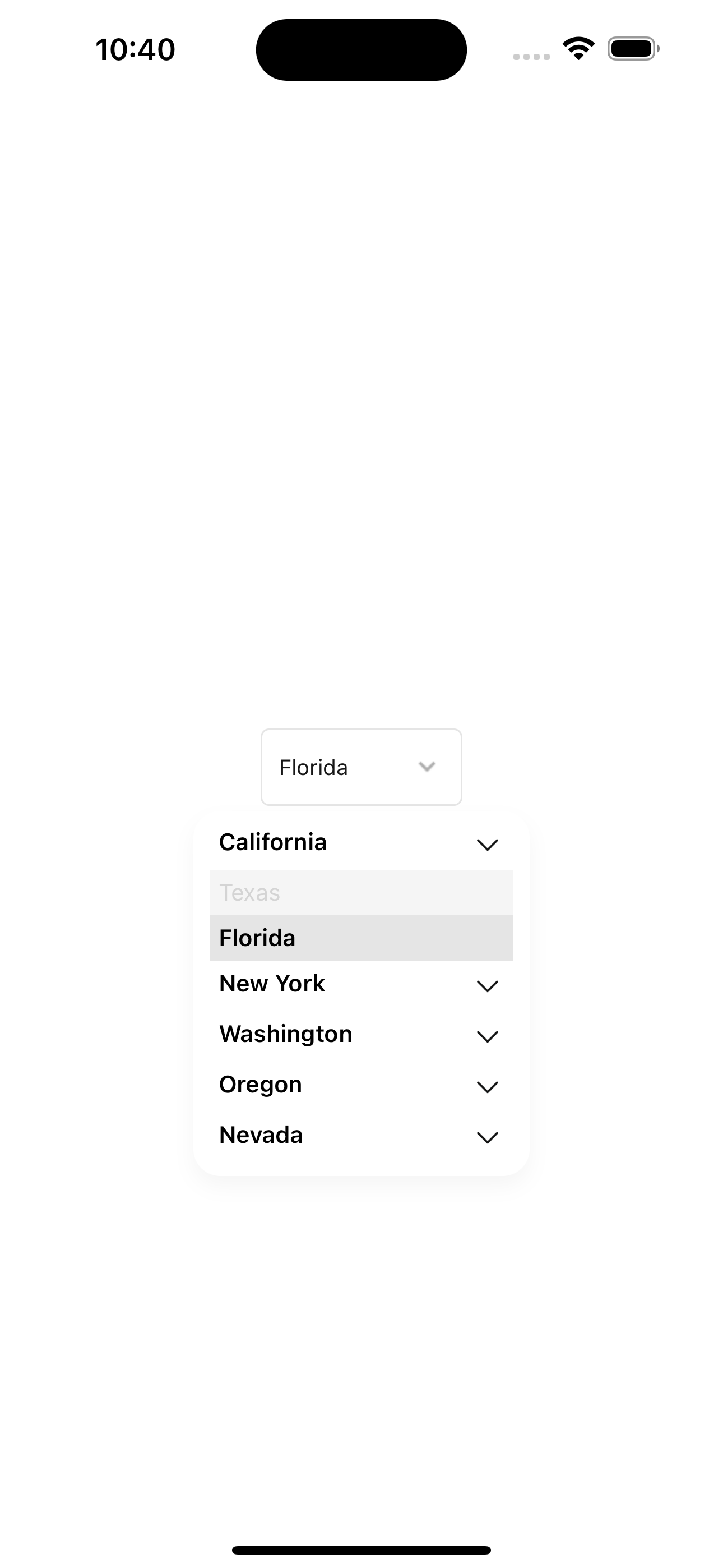
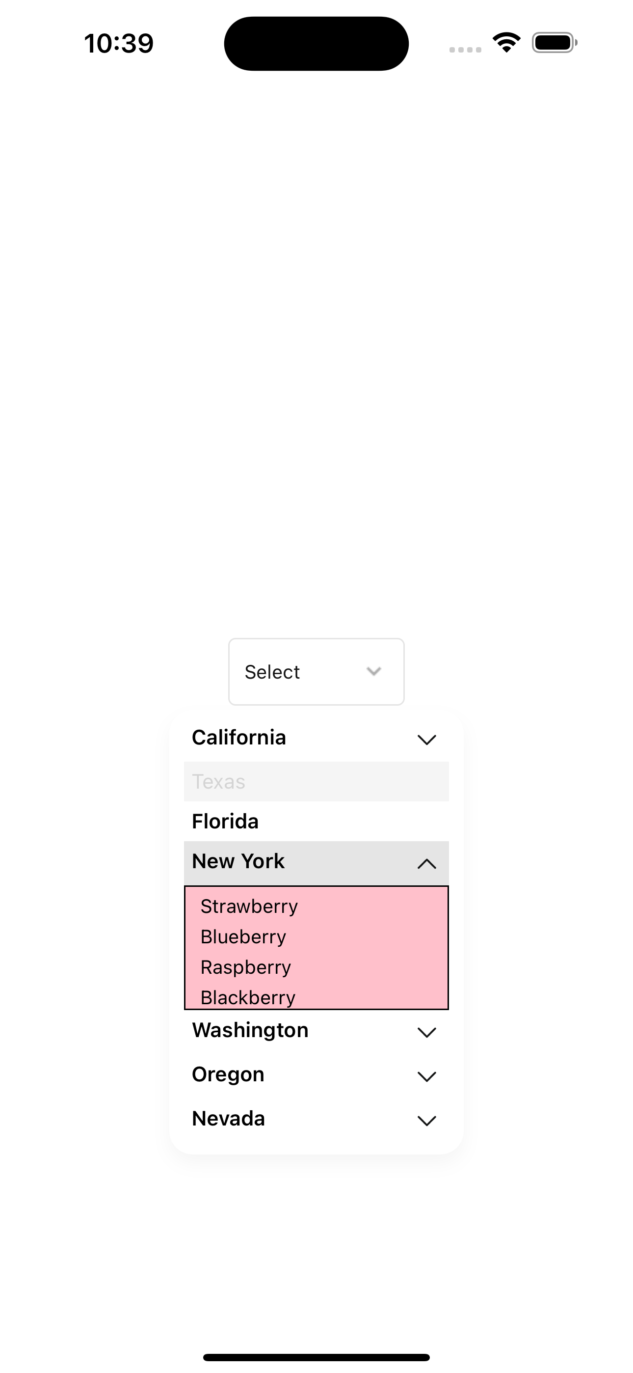
npx expo install react-native-simple-dropdown-select| Dropdown component | Texas item disabled | Florida item has no nested data & is selected. |
 |
 |
 |
| Item with nested data open | Nested data item is selected |
 |
 |
| Search Enabled |
 |
import { DropDownSelect } from 'react-native-simple-dropdown-select';

export default function App() {
  const [open, setOpen] = useState(false);
  const [value, setValue] = useState<any>(null);

  return (
    <View style={{
        flex: 1,
        alignItems: 'center',
        justifyContent: 'center',
    }}>
      <DropDownSelect
        toggle={() => setOpen(!open)}
        selectedData={value}
        open={open}
        data={[
          {
            id: 1,
            name: 'California',
            extraData: ['Apple', 'Banana', 'Orange', 'Mango'],
          },
          {
            id: 2,
            name: 'Texas',
            extraData: ['Tomato', 'Potato', 'Onion', 'Garlic'],
            disabled: true,
          },
          {
            id: 3,
            name: 'Florida',
          },
          {
            id: 4,
            name: 'New York',
            extraData: ['Strawberry', 'Blueberry', 'Raspberry', 'Blackberry'],
          },
          {
            id: 5,
            name: 'Washington',
            extraData: [
              {
                id: 1,
                name: 'Apple',
              },
              {
                id: 2,
                name: 'Banana',
              },
              {
                id: 3,
                name: 'Orange',
              },
              {
                id: 4,
                name: 'Mango',
              },
            ],
          },
          {
            id: 6,
            name: 'Oregon',
            extraData: ['Grapes', 'Cherry', 'Apple', 'Banana', 'Orange'],
          },
          {
            id: 7,
            name: 'Nevada',
            extraData: ['Peach', 'Plum', 'Pear', 'Apricot'],
          },
        ]}
        onSelect={(data) => {
          setValue(data);
          setOpen(false);
        }}
        dropDownContainerStyle={{
          maxHeight: 400,
          minWidth: 200,
        }}
        search
        subViewStyle={{
          backgroundColor: 'pink',
          borderWidth: 1,
        }}
      />
    </View>
  );
}The data prop can change the behaviour of the dropdown select depending on what values it contains.
The basic requirement is for it to have be an array of {id, name}. This will render a list with name displayed as title of items.
Some optional fields are:
-
disabled?: the item will be visible but disabled in the drop down list. -
extraData?: with this field, the dropdown item will have a nested select picker. The parent title will serve as an accordion that toggles the nested picker.extraDatacan either be an array ofstringsornumbersor an array of{id, name}. - any other extra fields. This will not affect the picker but will be included when the onSelect function is called.
The search prop will enable items in dropdown list to be searchable. A search box will appear. Note that nested items in extraData cannot be searched, only top level items.
| Prop | Description | Default |
|---|---|---|
| data | Array of objects of type {id, name, extraData?, disabled? ..any} to display in the dropdown. Can have one layer of nested data with extraData. extraData can be an array of strings or object of type {id, name, ...any}
|
[] |
| selectedData | Object to display as selected. Has same object as a data item but with a value field |
null |
| onSelect | Function to call when an item is selected. Gets passed a data item with a value field |
null |
| label | Label to display above the dropdown | null |
| placeholder | Placeholder text to display when no item is selected or as search input placeholder | null |
| containerStyle | Style object for the container | null |
| dropDownContainerStyle | Style object for the dropdown container | null |
| search | Boolean to enable search | false |
| searchInputStyle | Style object for the search input | null |
| searchContainerStyle | Style object for the search container | null |
| EmptyListView | React element to display when no items are found | null |
| onChangeSearchText | Function to call when search text changes | null |
| SearchIconLeft | React element to display on the left of the search input | search icon |
| SearchIconRight | React element to display on the right of the search input | close icon |
| onEndReached | Function to call when the end of the list is reached | null |
| labelStyle | Style object for the label | null |
| showsVerticalScrollIndicator | Boolean to show the vertical scroll indicator | false |
| selectedBtnColor | Color for the selected title button | #E5E5E5 |
| selectedSubBtnColor | Color for the selected sub title button if nested with extraData
|
transparent |
| btnColor | Default color for all title buttons not selected | #fff |
| subBtnColor | Default color for all sub title button not selected if nested with extraData
|
transparent |
| onSelectTitle | Function to call when a title is selected | null |
| titleStyle | Style object for the title | null |
| titleButtonStyle | Style object for the title button | null |
| disabledButtonStyle | Style object for the disabled button | null |
| disabledTitleStyle | Style object for the disabled title | null |
| subButtonStyle | Style object for the sub button if nested with extraData
|
null |
| subTitleStyle | Style object for the sub title if nested with extraData
|
null |
| SubCheckedIcon | React element to display as the checked icon if nested with extraData
|
check-mark icon |
| TitleIcon | React element to display as the title icon | chevron up |
| subViewStyle | Style object for the sub view | null |
| selectedSubTitleStyle | Style object for the selected sub title if nested with extraData
|
null |
| selectedSubBtnStyle | Style object for the selected sub button if nested with extraData
|
null |
| titleProps | Text props for the title | null |
| subTitleProps | Text props for the sub title if nested with extraData
|
null |
| checkedIconPosition | Position for the checked icon. left or right of title |
'left' |
| SubSeparator | React element to display as the sub separator if nested with extraData
|
null |
See the contributing guide to learn how to contribute to the repository and the development workflow.
MIT
Made with create-react-native-library
