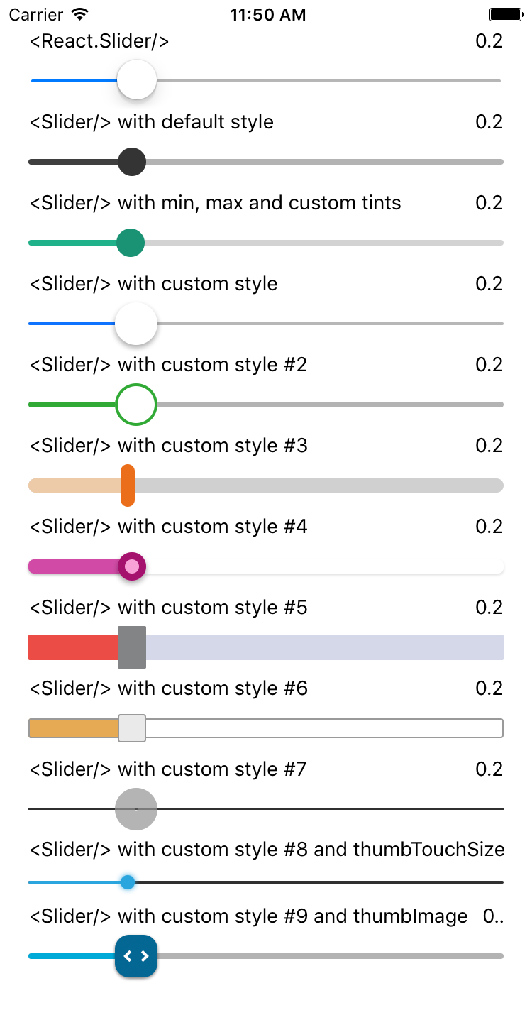
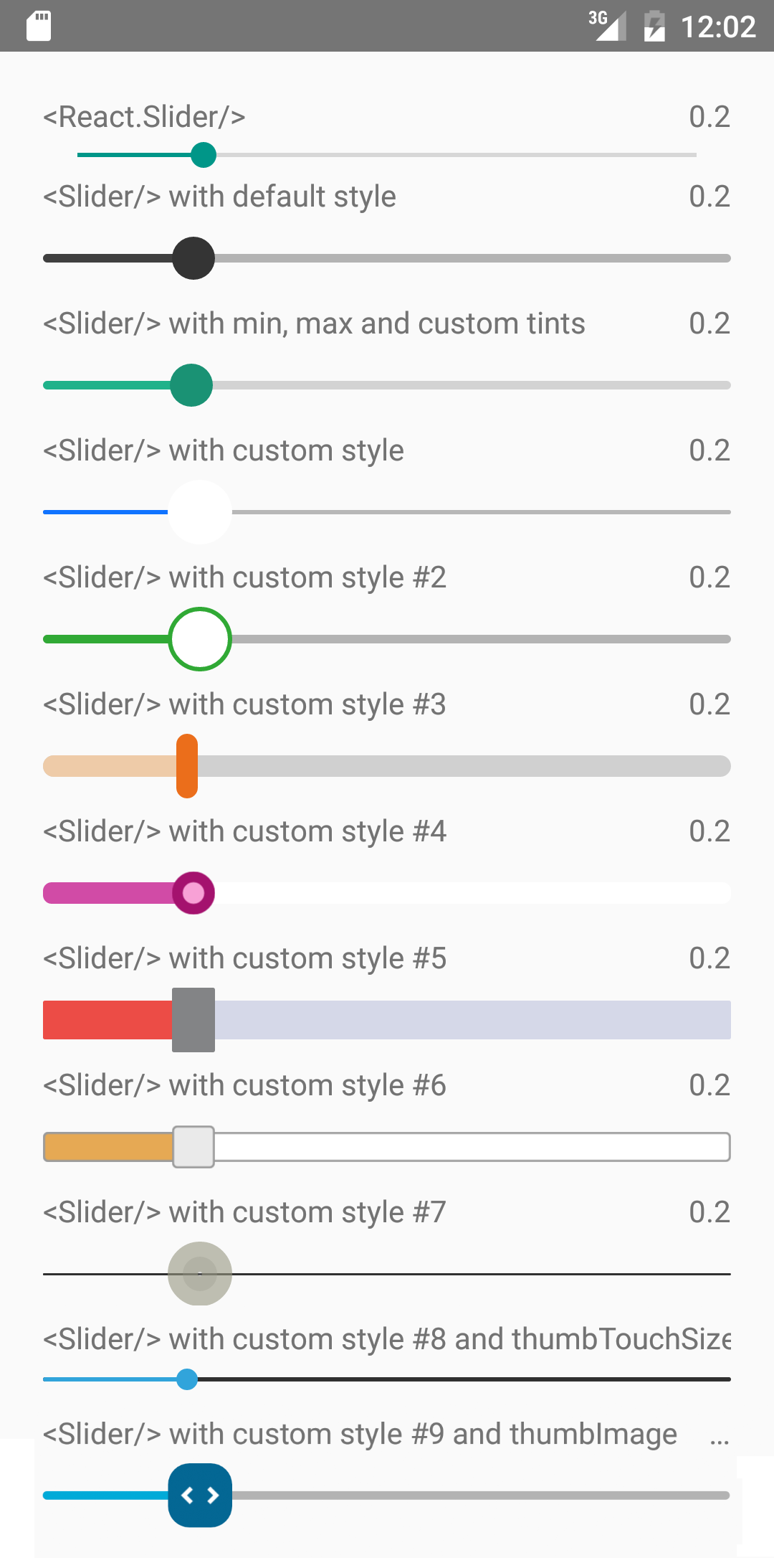
react-native-smooth-slider
A react-native-gesture-handler smoothed <Slider /> , also support trackImage and vertical.
It is a drop-in replacement for Slider.
Install
For RN >= 0.60
npm i --save react-native-smooth-slider react-native-gesture-handlerFor RN < 0.60
npm i --save react-native-smooth-slider@1.2.x react-native-gesture-handler@1.2.2And be aware of https://github.com/software-mansion/react-native-gesture-handler/issues/1164 if you use react-native-web and want to slide on web.
Usage
import React from "react";
import Slider from "react-native-smooth-slider";
import {AppRegistry, StyleSheet, Text} from "react-native";

// if react-native-gesture-handler@1.x, no need <GestureHandlerRootView />
// but just <View />, ref to
// https://docs.swmansion.com/react-native-gesture-handler/docs/guides/migrating-off-rnghenabledroot/
// You should put <GestureHandlerRootView /> in your root component,
// example below is just playing the role of a root component
import {GestureHandlerRootView} from 'react-native-gesture-handler';

class SliderExample extends React.Component {
  state = {
    value: 0.2
  };

  render() {
    return (
      <GestureHandlerRootView style={styles.container}>
        <Slider
          value={this.state.value}
          useNativeDriver={true}
          onValueChange={value => this.setState({ value })}
        />
        <Text>
          Value: {this.state.value}
        </Text>
      </GestureHandlerRootView>
    );
  }
}

const styles = StyleSheet.create({
  container: {
    flex: 1,
    marginLeft: 10,
    marginRight: 10,
    alignItems: "stretch",
    justifyContent: "center"
  }
});

AppRegistry.registerComponent("SliderExample", () => SliderExample);
Props
| Prop | Type | Optional | Default | Description |
|---|---|---|---|---|
| value | number | Yes | 0 | Initial value of the slider |
| disabled | bool | Yes | false | If true the user won't be able to move the slider |
| minimumValue | number | Yes | 0 | Initial minimum value of the slider |
| maximumValue | number | Yes | 1 | Initial maximum value of the slider |
| step | number | Yes | 0 | Step value of the slider. The value should be between 0 and maximumValue - minimumValue) |
| minimumTrackTintColor | string | Yes | '#3f3f3f' | The color used for the track to the left of the button |
| maximumTrackTintColor | string | Yes | '#b3b3b3' | The color used for the track to the right of the button |
| thumbTintColor | string | Yes | '#343434' | The color used for the thumb |
| thumbTouchSize | object | Yes | {width: 40, height: 40} |
The size of the touch area that allows moving the thumb. The touch area has the same center as the visible thumb. This allows to have a visually small thumb while still allowing the user to move it easily. |
| moveVelocityThreshold | number | Yes | 2000 | Prevent onValueChange if velocityX or velocityY (vertical is true) of nativeEvent is over the moveVelocityThreshold |
| onValueChange | function | Yes | Callback continuously called while the user is dragging the slider and the dragging movement speed is below the moveVelocityThreshold | |
| onSlidingStart | function | Yes | Callback called when the user starts changing the value (e.g. when the slider is pressed) | |
| onSlidingComplete | function | Yes | Callback called when the user finishes changing the value (e.g. when the slider is released) | |
| style | style | Yes | The style applied to the slider container | |
| trackStyle | style | Yes | The style applied to the track | |
| trackImage | source | Yes | Sets an image for the track. | |
| thumbStyle | style | Yes | The style applied to the thumb | |
| thumbImage | source | Yes | Sets an image for the thumb. | |
| vertical | bool | Yes | false | Set this to true to be a vertical slider. |
| useNativeDriver | bool | Yes | false | The useNativeDriver parameter in Animated used by react-native-gesture-handler when the user change the value. Default value is false, because some Android phone PanGestureHandler causes Animated Value to jump when using native driver |
| animateTransitions | bool | Yes | false | Set to true to animate values with default 'timing' animation type when value in next props is different. |
| animationType | string | Yes | 'timing' | Custom Animation type when value in next props is different. 'spring' or 'timing'. |
| animationConfig | object | Yes | undefined | Used to configure the animation parameters when value in next props is different. These are the same parameters in the Animated library. |
Methods
setValue(value)
In some use case e.g. "tension rod", it's more convenient to use method instead of prop to restore original positon of the tension rod. Below is a vertical tension rod example screenshot.
Donate
To support my work, please consider donate.
MIT Licensed


