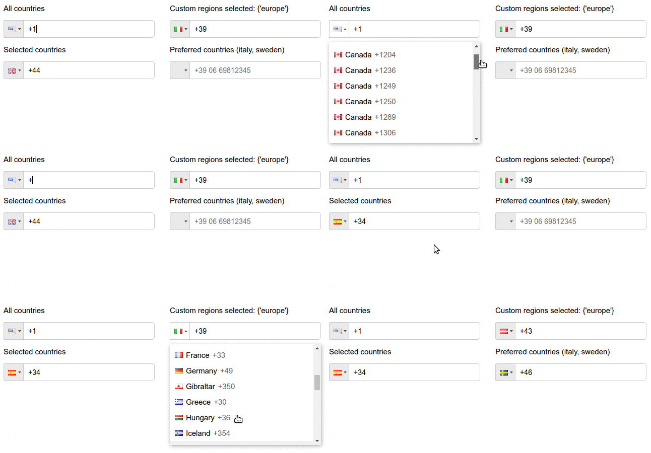
react-phone-input-mui
react-phone-input-2 for Material UI v1+
Highly customizable phone input component with auto formatting.
Original look:

With Materiall UI's TextField:

Installation
npm install react-phone-input-mui --saveUsage with Material UI
Mandatory props: value and onChange for controlling field; component, ideally TextField
import React from 'react';import ReactPhoneInput from 'react-phone-input-mui';import TextField withStyles from '@material-ui/core'; const styles = field: margin: '10px 0' countryList: ...themetypographybody1 ; { const value defaultCountry onChange classes = props; return <React.Fragment> /* Simple usage */ <ReactPhoneInput = = // = /> /* Configure more */ <ReactPhoneInput = = = = = = = /> </React.Fragment> ;} stylesPhoneField;Original usage docs
import ReactPhoneInput from 'react-phone-input-2'import 'react-phone-input-2/dist/style.css' <ReactPhoneInput = = =/>Your handler for the onChange event should expect a string as
parameter, where the value is that of the entered phone number. For example:
{ this}Options
| Name | Type | Description | Example |
|---|---|---|---|
| excludeCountries | array | array of country codes to be excluded | ['cu','cw','kz'] |
| onlyCountries | array | country codes to be included | ['cu','cw','kz'] |
| preferredCountries | array | country codes to be at the top | ['cu','cw','kz'] |
| defaultCountry | string | initial country | 'us' |
| value | string | input state value | |
| placeholder | string | custom placeholder | |
| searchPlaceholder | string | custom search placeholder | |
| containerClass | string | class for container | |
| inputClass | string | class for input | |
| buttonClass | string | class for dropdown button | |
| dropdownClass | string | class for dropdown container | |
| searchClass | string | class for search field | |
| containerStyle | object | styles for container | |
| inputStyle | object | styles for input | |
| buttonStyle | object | styles for dropdown button | |
| dropdownStyle | object | styles for dropdown container | |
| searchStyle | object | styles for search field | |
| inputExtraProps | object | props to pass into the input | |
| autoFormat | bool | on/off phone formatting, true by default | |
| disableAreaCodes | bool | disable local codes for all countries | |
| disabled | bool | disable input and dropdown | |
| disableDropdown | bool | disable dropdown only, false by default | |
| disableCountryCode | bool | false by default | |
| enableLongNumbers | bool | false by default | |
| countryCodeEditable | bool | true by default | |
| enableSearchField | bool | enables search field in the dropdown | |
| disableSearchIcon | bool | hide icon for the search field | |
<ReactPhoneInput =/>Regions
| Name | Type | Description |
|---|---|---|
| regions | array/string | to only show codes from selected regions |
| Regions |
|---|
| ['america', 'europe', 'asia', 'oceania', 'africa'] |
| Subregions |
| ['north-america', 'south-america', 'central-america', 'carribean', 'european-union', 'ex-ussr', 'middle-east', 'north-africa'] |
Regions selected: {'europe'}
<ReactPhoneInput ='it' =/>Regions selected: {['north-america', 'carribean']}
<ReactPhoneInput ='ca' =/>Localization
| Name | Type |
|---|---|
| localization | object |
<ReactPhoneInput = =/> <ReactPhoneInput = =/>Custom masks
| Name | Type |
|---|---|
| masks | object |
<ReactPhoneInput = =/>Supported events
| onChange | onFocus | onBlur | onClick | onKeyDown |
Country data object not returns from onKeyDown event
| Data | Type | Description |
|---|---|---|
| value/event | string/object | the event or the phone number |
| country data | object | the country object { name, dialCode, countryCode (iso2 format) } |
Phone without dialCode
{ this}Contributing
Code style changes not allowed
License
Based on react-phone-input
