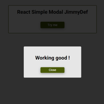
Modal is a customizable React component for displaying modal dialogs. It provides an easy way to create modals with various configurations, including title, content, confirm and close buttons, and more.
You can install the package via npm:
npm install react-simple-modal-jimmydefHere's a basic example of how to use the Modal component:
import React, { useState } from 'react';
import Modal from 'react-simple-modal-jimmydef';


const App = () => {
  const [isModalOpen, setModalOpen] = useState(false);

  const openModal = () => setModalOpen(true);
  const closeModal = () => setModalOpen(false);
  const confirmAction = () => {
    // Add your confirmation logic here if needed
    closeModal();
  };

  return (
    <div>
      <button onClick={openModal}>Open Modal</button>
      <Modal
        isOpen={isModalOpen}
        onClose={closeModal}
        title="Modal Title"
        onConfirmClick={confirmAction}
        showCancelButton={true}

      >
        <p>This is the modal content</p>
      </Modal>
    </div>
  );
};

export default App;The Modal component accepts the following props:
| Prop | Type | Required | Default | Description |
|---|---|---|---|---|
| isOpen | Boolean | yes | FALSE | Indicates whether the modal is open. |
| onClose | Function | yes | Function called to close the modal. | |
| title | String | yes | The title of the modal. | |
| onConfirmClick | Function | no | Function called when the confirm button is clicked. | |
| confirmLabel | String | no | Alternative text for the confirm button. | |
| showCancelButton | Boolean | no | TRUE | Indicates whether the cancel button should be displayed. |
| cancelButtonLabel | String | no | "Cancel" | Alternative text for the cancel button. |
| showCloseButtonIcon | Boolean | no | FALSE | Indicates whether the icon close button should be displayed. |
| closeButtonIcon | String | no | "./cross.svg" | Path of the image for the close icon button. |
| children | ReactNode | no | Content to be displayed in the modal. |
The following CSS classes are available for customization:
-
rsmj_Overlay: Styles for the modal overlay. -
rsmj_Modal: Styles for the modal content. -
rsmj_Title: Styles for the modal title. -
rsmj_ChildrenSection: Styles for the section containing the children content. -
rsmj_ButtonSection: Styles for the section containing the buttons. -
rsmj_ConfirmButton: Styles for the confirm button. -
rsmj_CancelButton: Styles for the cancel button. -
rsmj_CloseButton: Styles for the close button. -
rsmj_CloseButtonIcon: Styles for the close button icon.
This package includes TypeScript declarations to provide type checking and autocompletion for TypeScript users.
The TypeScript declaration file (Modal.d.ts) located in the dist directory provides the types for the Modal component props:
The Modal component is built with accessibility in mind. It sets the aria-hidden attribute on the root element when the modal is open and handles focus management appropriately.
This project is licensed under the MIT License.
If you have suggestions for how this component could be improved, or want to report a bug, open an issue! I'd love all and any contributions. For more details, check out the contributing guidelines.
Thank you for using my Modal component! If you have any questions or feedback, feel free to reach out.

