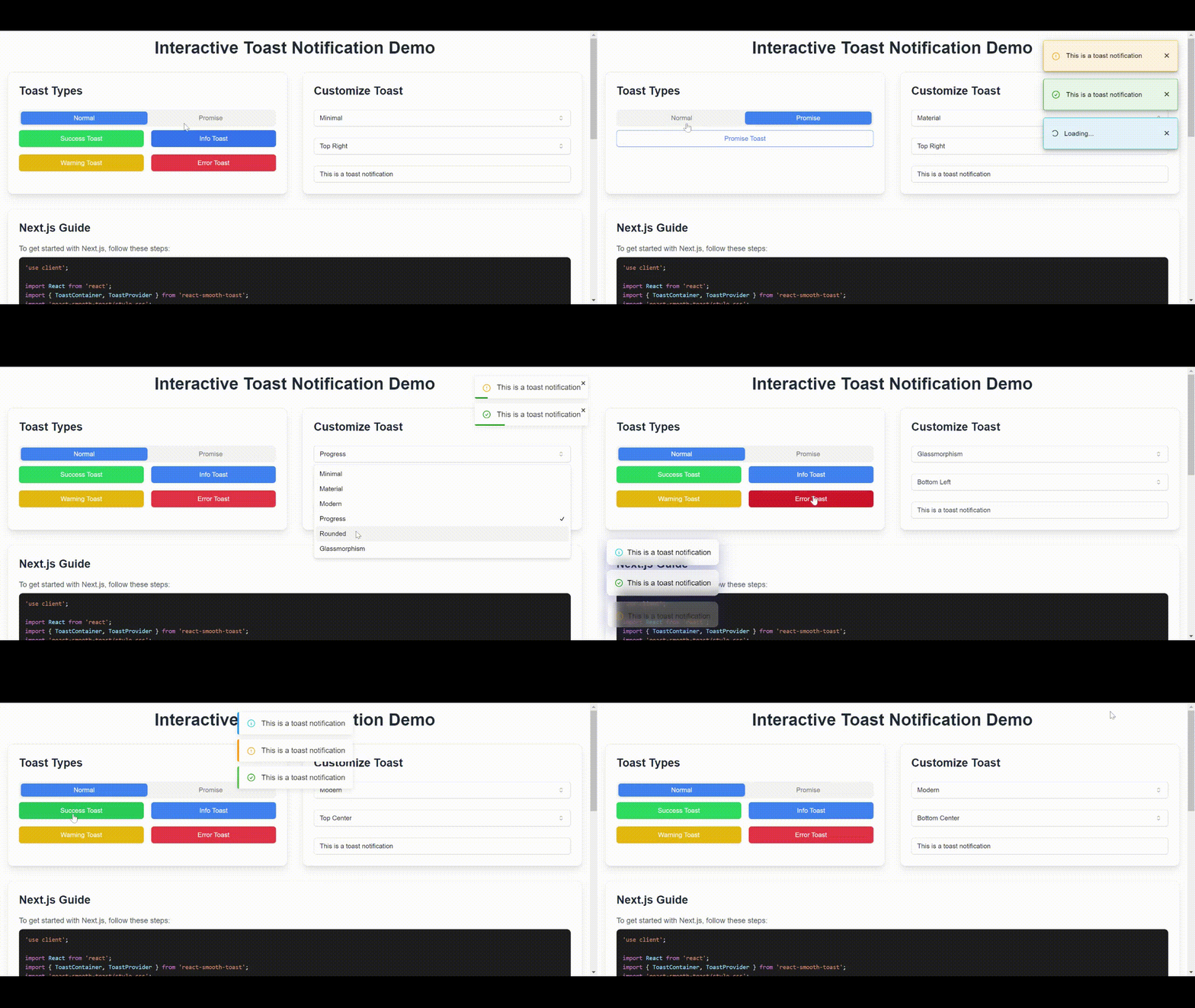
All in one light weight toast notification library for React built with TypeScript. This library provides an easy-to-use API for displaying toast notifications with customizable icons, styles, positions, and animations.
Note: No Breaking Changes
-
Enhanced Progress Bar variant to have different color based on the type of the toast.
-
Added
pauseOnHoverprop to theToastContainercomponent to pause the toast countdown when hovering over the toast. -
Added
groupIdandgroupCountprops to theToastContainercomponent to control the behavior of grouped toasts. Now you can control how many toasts will be shown in the group. It will have a info tooltip on hover to show the total number of toasts in the group. -
Added
SpinnerIconto theToastcomponent to show a loading spinner when the toast is pending.
-
Multiple Toast Types: Supports
success,error,info, andwarningtoasts. -
Multiple Toast Variants: Supports
minimal,material,modern,progress,rounded,glassmorphism,dark,gradientand more variants coming soon. -
Multiple Toast Positions: Supports
top-left,top-right,bottom-left,bottom-right,top-center,bottom-center. - Customizable: Easily customize icons, class names, styles, and positions.
- Animations: Built-in smooth entry and exit animations with pure CSS options.
- Responsive: Toasts are positioned correctly on different screen sizes.
- Easy Integration: Simple setup with context and hooks.
Install the library using npm:
npm install react-smooth-toastTo use the toast notifications, wrap your application with the ToastProvider from the library.
// src/index.tsx or src/main.tsx
import React from 'react';
import ReactDOM from 'react-dom/client';
import App from './App';
import { ToastProvider } from 'react-smooth-toast';
import 'react-smooth-toast/style.css';

ReactDOM.createRoot(document.getElementById('root')!).render(
  <React.StrictMode>
    <ToastProvider>
      <App />
    </ToastProvider>
  </React.StrictMode>
);Include the ToastContainer component to render the toasts in your UI. You can set the position of the container.
// src/App.tsx
import React from 'react';
import ToastContainer from 'react-smooth-toast';
import useToast from 'react-smooth-toast';

const App: React.FC = () => {
  const toast = useToast();

  const showToast = () => {
    toast.success('This is a success message!', { duration: 4000 });
    toast.error('This is an error message!', { icon: '❌' });
    toast.info('This is an info message!', { className: 'custom-class' });
    toast.warning('This is a warning message!', { style: { backgroundColor: 'orange' } });
  };

  return (
    <div>
      <button onClick={showToast}>Show Toasts</button>
      <ToastContainer position="top-right" variant="minimal"/>
    </div>
  );
};

export default App;Wraps your application and provides context for the toast notifications.
A component that renders the list of toasts.
Props:
-
position: (optional) Defines the position of the toast container. Options are'top-left','top-right','bottom-left','bottom-right'. Default is'top-right'.
A custom hook that provides functions to trigger toasts of various types.
Methods:
-
success(message: string, options?: ToastOptions): Displays a success toast. -
error(message: string, options?: ToastOptions): Displays an error toast. -
info(message: string, options?: ToastOptions): Displays an info toast. -
warning(message: string, options?: ToastOptions): Displays a warning toast.
Options for customizing toasts.
-
id: (optional) Unique identifier for the toast. -
type:'success' | 'error' | 'info' | 'warning'. -
message: The message to be displayed in the toast. -
icon: (optional) A React node to display as an icon. -
duration: (optional) Duration in milliseconds before the toast is dismissed. Default is3000ms. -
style: (optional) Inline styles for the toast. -
className: (optional) Custom class name for additional styling.
Customize icons and styles for individual toasts:
toast.success('Success!', {
  icon: <YourCustomIcon />,
  style: { backgroundColor: 'green' },
  className: 'my-custom-class'
});Position the toast container anywhere on the screen using the position prop:
<ToastContainer position="bottom-left" variant="minimal"/>Here's a quick example of using the toast notifications in your app:
import React from 'react';
import ToastContainer from 'react-smooth-toast';
import useToast from 'react-smooth-toast';

const App: React.FC = () => {
  const toast = useToast();

  return (
    <div>
      <button onClick={() => toast.success('Operation successful!')}>Success</button>
      <button onClick={() => toast.error('Something went wrong!')}>Error</button>
      <button onClick={() => toast.info('Here is some information.')}>Info</button>
      <button onClick={() => toast.warning('Warning! Be careful.')}>Warning</button>
      <ToastContainer position="top-right" variant="material"/>
    </div>
  );
};

export default App;- Add more variants
- Add more animations
- Add more positions
- Add more options
- Reduce bundle size
Contributions, issues, and feature requests are welcome! Feel free to check the issues page if you want to contribute.
This project is licensed under the MIT License - see the LICENSE.md file for details.
Feel free to use and modify this library to fit your needs! Happy coding! 🚀

