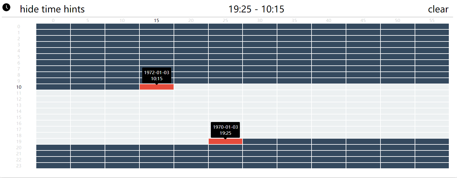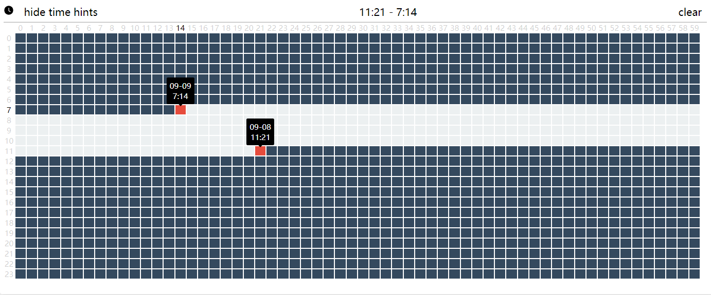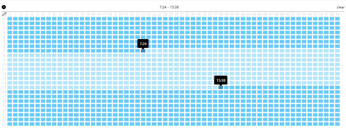
Time picker represented in table form
- React.JS
- Moment.JS
npm run install --save react-table-time-pickerimport React, { useState } from 'react';
import { render } from 'react-dom';
import moment from 'moment';
import TimePicker from 'react-table-time-picker';
function App() {
return (
<div>
<TimePicker
attachElement={(
<input />
)}
/>
</div>
);
}
render(<App />, document.getElementById('root'));| Name | Type | Default | Description |
|---|---|---|---|
| zIndex | Number | 1 | css z-index |
| maxWidth | Number | undefined | css max-width |
| maxHeight | Number | undefined | css max-height |
| position | ['top','right','bottom','left'] | medium | position of the time picker relative to its attach element |
| defaultValue | [moment,moment] |
[moment(), moment()] | moment instance of begin time and end time |
| onValueChange | Function | () => {} | call back when both start time and end time are selected,two-tuple [moment,moment] which represents start and end time will be passed as arguments |
| size | ['small','medium','big'] | medium | size of the time picker |
| width | Number | according to size | if you are not satisfied with the preset width according to size props,custom it with this prop |
| height | Number | according to size | if you are not satisfied with the preset height according to size props,custom it with this prop |
| fontSize | Number | according to size | if you are not satisfied with the preset fontSize according to size props,custom it with this prop |
| attachElement | HTMLElement | - | the attachment for the time picker |
| originColor | CSS Color | #66ccff | color of the table cell |
| includedColor | CSS Color | rgba(102, 204, 255, 0.5) | color of the table cell when included between the begin time and end time |
| selectedColor | CSS Color | #458bad | color of the table cell when selected as begin time or end time |
| confirmModal | Boolean | true | whether to pop up a confirm modal when begin time and end time are both selected |
| className | String | empty string | className of the time picker wrapper element, note that this prop is designed to help detecting the propagation of events produced inside the time picker |
| hourStep | Number | 1 | hour interval option |
| minuteStep | Number | 1 | minute interval option |
- Interval options are now supported
- Tooltips will now give a explicit hint in cross day cases
- Tooltip hiding option supported