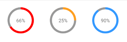


React Native Progress Circle

- Custom colors
- Custom size and border radius
- Light-weight: No other dependencies besides
react-native
yarn add rn-circle-progress
or
npm install rn-circle-progress
import ProgressCircle from "rn-circle-progress";

return (
  <ProgressCircle
    percent={30}
    radius={50}
    borderWidth={8}
    color="#3399FF"
    shadowColor="#999"
    bgColor="#fff"
  >
    <Text style={{ fontSize: 18 }}>{"30%"}</Text>
  </ProgressCircle>
);
| Name |
Description |
Type |
Required |
Default Value |
| percent |
The percentage used for displaying the progress |
Number |
✓ |
|
| radius |
The radius in px of the component (including border) |
Number |
✓ |
|
| borderWidth |
The border width in px
|
Number |
✓ |
|
| color |
The border color |
String |
|
 '#f00'
|
| shadowColor |
The background color of the border |
String |
|
 '#999'
|
| bgColor |
The inner background color of the component |
String |
|
 '#e9e9ef'
|
| children |
The children to render inside this component |
Node |
|
null |
| containerStyle |
The custom styling which will be applied to the container of the children
|
Style |
|
null |
| outerCircleStyle |
The custom styling which will be applied to the outer circle |
Style |
|
null |
M JUNAID
MIT


