Svelte Star Rating
What is this
A simple svelte component that shows a rating from 0 to 5 with svg stars. Just need to pass a number. No dependencies required.
Installation
As with any other node package in svelte:
npm install svelte-star-ratingBut remember to install it as a dev dependency when using it with SvelteKit (or Sapper):
npm install svelte-star-rating --save-devUsage
The package exports a svelte component.
The component takes a number of props:
| Prop | Type | Default | Required | Description |
|---|---|---|---|---|
| rating | Number | - | Yes | The rating. Any number from 0 to 5.0 |
| config | Object | {} | No | Config options for the component. See below |
| style | String | - | No | CSS styles passed directly to the container component |
About the config object:
| Option | Type | Default | Description |
|---|---|---|---|
| emptyColor | String | '#7f7f7f' | The color for the empty parts of the stars |
| fullColor | String | '#ffcf00' | The color for the filling of the stars |
| showText | Boolean | false | Show the rating number next to the stars or not |
| size | Number | 20 | The size of the stars. Pass a number of pixels. |
About the style prop: It accepts a string of css styles, written as inline-css. It is passed directly, unchecked, to the main div as inline-css. Use it cautiously.
Be aware
- Passing a rating higher than 5.0 or lower than 0.0 will throw an error.
- The component is reactive since v1.3.0 (if rating value changes, the component will change the displayed rating).
- Any css-valid color is accepted (hsl, hex, rgb, string, etc.).
- Stars are 1:1 proportionate (width equals height, so both equal the size property).
- If the rating number text is shown (
showText: true), font size is half the star size or 16px, whatever is higher.
Also:
- The component doesn't handle in any way the number passed as rating: If you operate on the number, you may end up with a value of
3.02 + 0.01 = 3.0299999995, for example, due to the way JavaScript works. It's up to you to manage this before passing the number.
Example
Use it as follows:
Simple
<script>
  import StarRating from 'svelte-star-rating';
</script>

<StarRating rating={3.35} />
Output:
Advanced
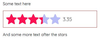
<script>
  import StarRating from 'svelte-star-rating';

  const rating = 3.35;
  const config = {
    emptyColor: 'hsl(240, 80%, 85%)',
    fullColor: '#f05',
    showText: true,
    size: 42,
  };
  const style = 'border: 1px solid firebrick;padding: 12px;';
</script>

<StarRating {rating} {config} {style} />
Output:


