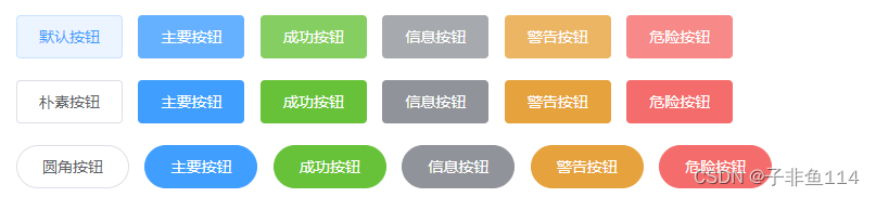
     <z-btn>默认按钮</z-btn>
    <z-btn type="primary">主要按钮</z-btn>
    <z-btn type="success">成功按钮</z-btn>
    <z-btn type="info">信息按钮</z-btn>
    <z-btn type="warning">警告按钮</z-btn>
    <z-btn type="danger">危险按钮</z-btn>
    <br />
    <z-btn plain>朴素按钮</z-btn>
    <z-btn type="primary" plain>主要按钮</z-btn>
    <z-btn type="success" plain>成功按钮</z-btn>
    <z-btn type="info" plain>信息按钮</z-btn>
    <z-btn type="warning" plain>警告按钮</z-btn>
    <z-btn type="danger" plain>危险按钮</z-btn>
    <br />
    <z-btn round>圆角按钮</z-btn>
    <z-btn type="primary" round>主要按钮</z-btn>
    <z-btn type="success" round>成功按钮</z-btn>
    <z-btn type="info" round>信息按钮</z-btn>
    <z-btn type="warning" round>警告按钮</z-btn>
<z-btn type="danger" round>危险按钮</z-btn> <z-switch
v-model="show"
:width="80"
activeColor="#f00"
inactiveColor="#00f"
></z-switch>export default {
name: "App",
components: {},
data() {
return {
show:false
};
},
}; <z-slider v-model="num" :min="10" :max="200"></z-slider>